ABOUT STOP PRESS
Stop Press is ISBN Magazine’s guide to happenings in Hong Kong. From art to auctions and from food to fashion, to entertainment, cinema, sport, wine and design, scroll through the best of the city's dynamic cultural offerings. And if your event merits mention in our little book of lifestyle chic, write to us at stoppress@isbn-magazine.com
ani-manga memories at sotheby's hong kong
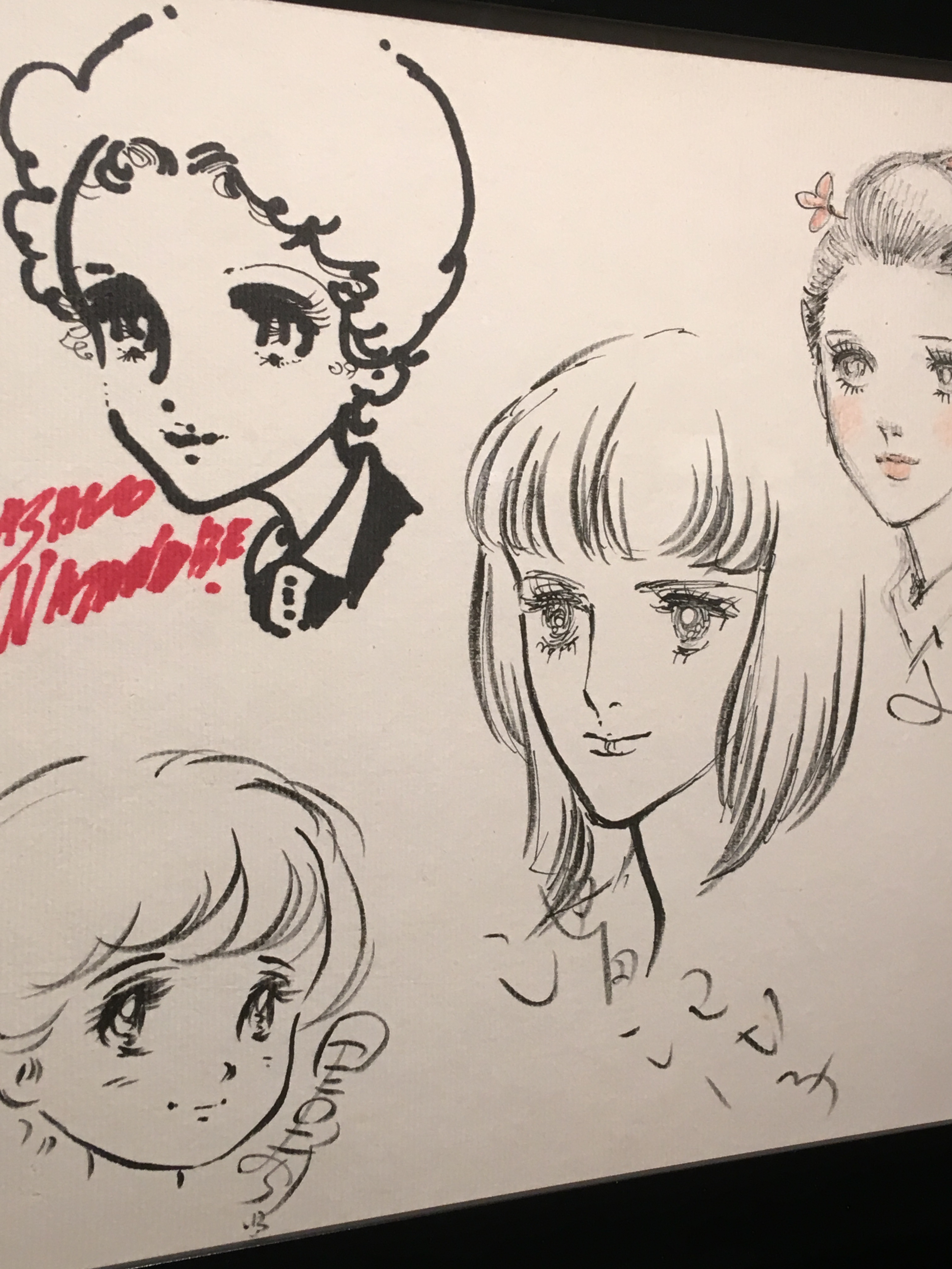 Sotheby’s Hong Kong's Contemporary Showcase “Manga” auction is currently showing at its S | 2 gallery with an accompanying digital sale (from May 5-11). Browsing among the more than 90 highlights from Studio Ghibli and Toei Animation, we made a revealing discovery comprising a quartet of leading female Japanese manga artists starting with Masako Watanabe, the first woman mangaka to be decorated with Japan’s prestigious Order of the Rising Sun in 2006. The other three are Eiko Hanamura, Riyoko Ikeda and Machiko Satonaka, all of whom have signed beneath their works.
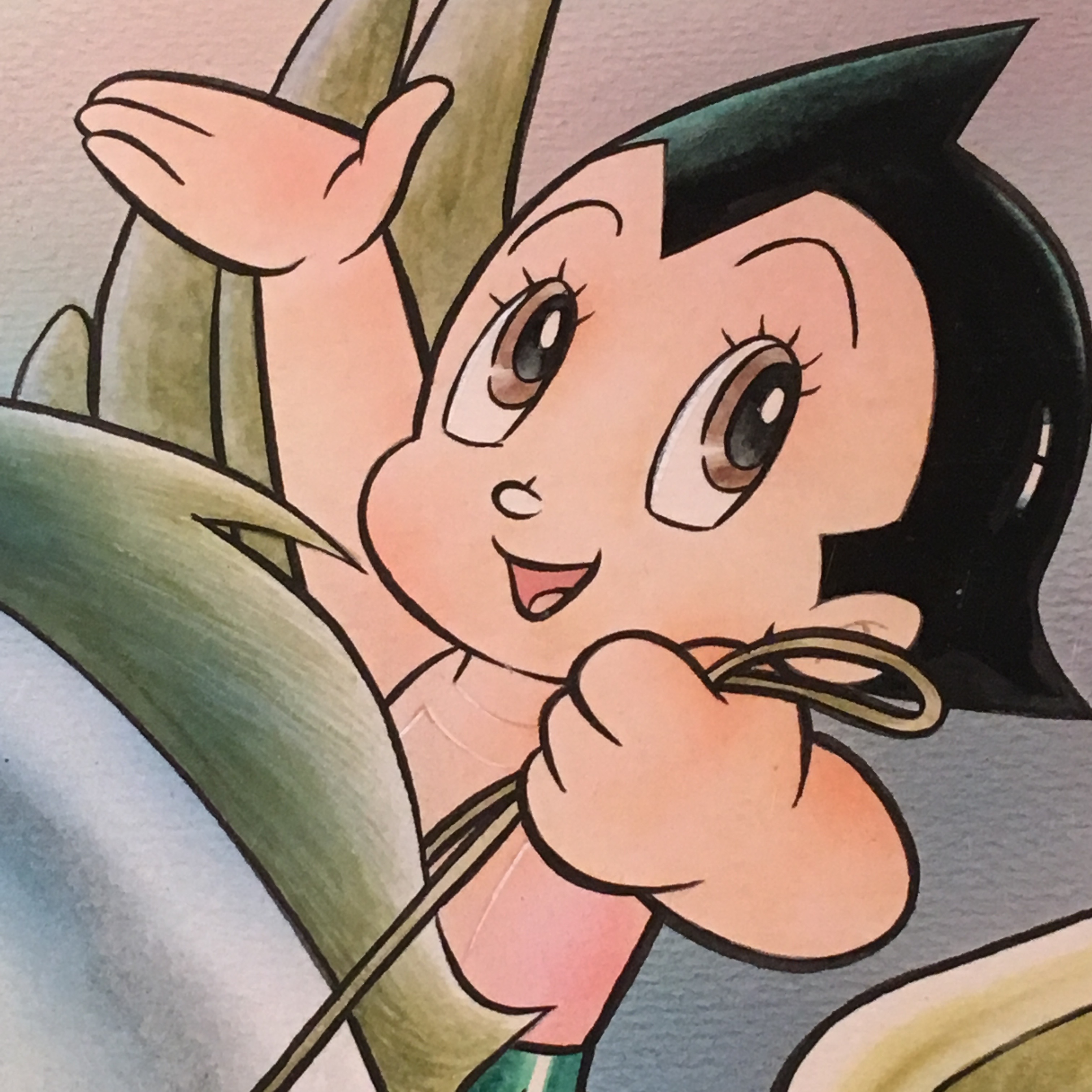
The exhibition, billed as the largest Manga portfolio ever offered at auction, has the anticipated 'Manga-fication' of legends such as the 'godfather of manga' Osamu Tezuka, often called the "Walt Disney of Japan'. Tezuka, who invented the large, distinctive eyes of manga, created such franchises as Astro Boy, Princess Knight, Kimba the White Lion, Black Jack, Phoenix and Dororo.
 There's also other 'ubiquicons' of anime culture such as the earless robotic 22nd-century cat Doraemon (created in 1969, appointed Japan's first 'anime ambassador' in 2008, and the highest-grossing anime film franchise in Japan); Pokémon, Pikachu (one of the lead characters in Pokémon video games), Dragon Ball (perhaps the most famous manga-turned-anime and published from 1984); One Piece, (published 1997, written by Oda Eiichirō and currently the best-selling manga series in history) which follows the adventures of Monkey D. Luffy whose body gains the properties of rubber; and Slam Dunk (the most popular sports-themed manga written by Takehiko Inoue).

There's also a unique selection of drawings and original Animation Celluloid Pictures (cel-ga) by some of the most prestigious anime houses such Studio Ghibli and Toei Animation featuring Sailormoon, Kiki's Delivery Service, Detective Conan, Saint-Seika: Knights of the Zodiac, Neon Genesis Evangelion, The Return Lum, Mobile Suit Gundam, Apanman, Crayon Shin-Chan, Castle in the Sky, and My Neighbour Totoro.
Go get the ani-manga memories on and snatch a bargain or 60 in the process.
Exhibition Details 29 Apr – 8 May 2020
MON – FRI 10am - 6pm; SAT 11am - 5pm (Closed on SUN and Public Holidays)
Venue: Sotheby’s Hong Kong Gallery, 5/F, One Pacific Place, 88 Queensway, Hong Kong
Guest Visit - By Appointment Only
Email HKGallery@Sothebys.com to make an appointment prior to your visit.
For other inquiries, contact +852 2886 7887.
Digital Auction: May 5 - May 11
Images: ISBN-Magazine
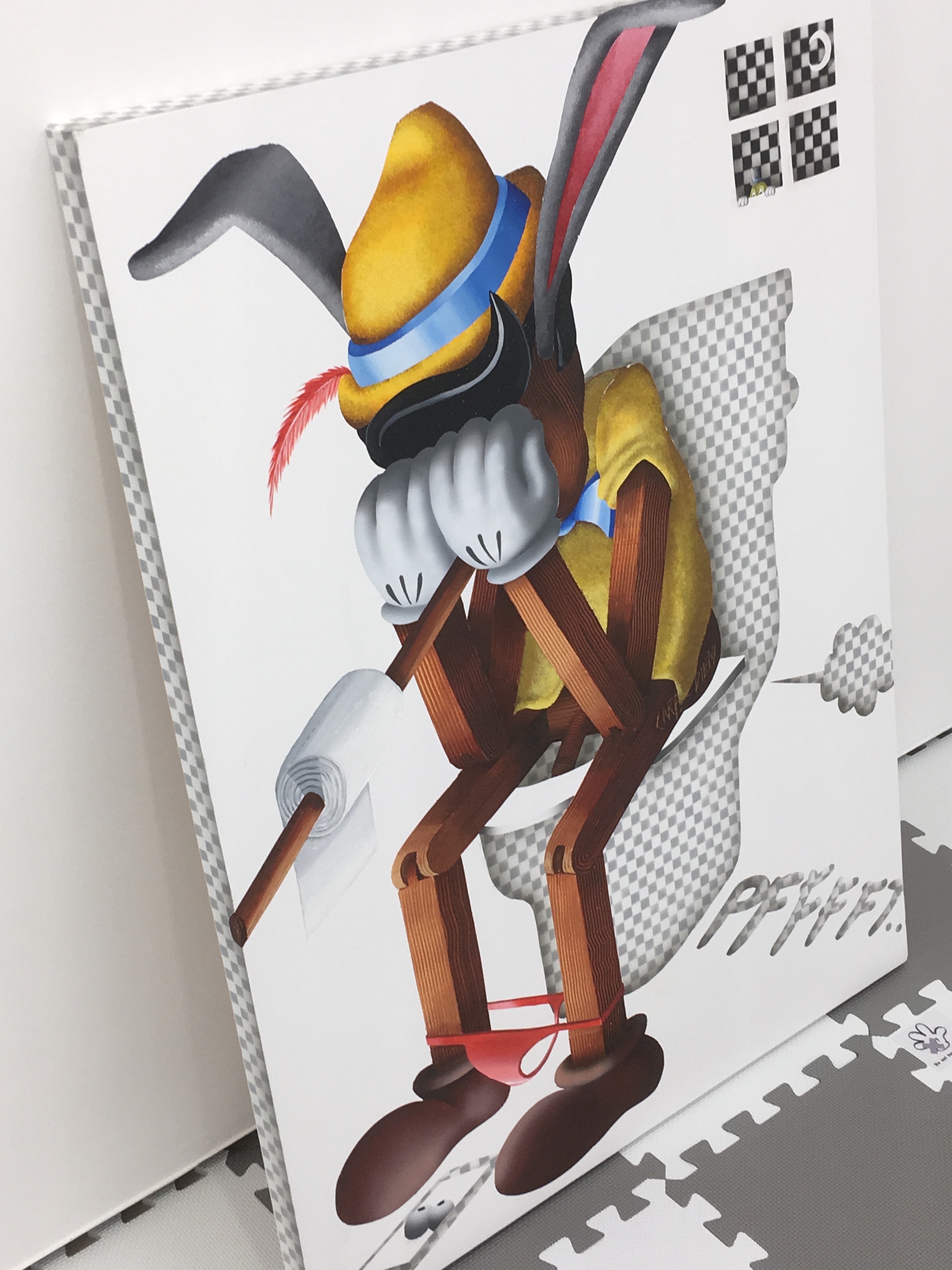
surveillance pinocchio
In these times of Covid-19 and almost total lockdown, visits to galleries are few and far between. Still accessible, and appropriately uplifting, is Whitestone Gallery Hong Kong's Little Fables, a group exhibition featuring the dynamic work of six young artists - Sebastian Chaumeton (UK), Jiang Miao (China), Etsu Egami (Japan), Yuji Kanamaru (Japan), Asa Go (Japan / Korea) and Karen Shiozawa (Japan).
Whilst fables are generally read by children so to teach them how to behave in the society, there are also cultural values embedded in fables coming from different countries and regions, and moreover, some of them even have themes of adulthood that are revealing the dark side of the world.
In this exhibition, the artists compose their own fables. Despite great work across the board, the obvious and catchiest highlight is Sebastian Chaumeton’s art installation that consists of his latest paintings and sculptures, making references to social media, meme culture, art history, politics, etc. He renders all through the puppet Pinocchio and Kermit and appropriates everything from Rodin's The Thinker to the clamour for toilet roll in stores in the wake of the global pandemic.
In addition, young artists Etsu Egami and Karen Shiozawa (the latter a sort of Banksy's little girl goes into the woods, was sold out in the first three days) are showing in Hong Kong for the first time, both of whom explore notions of self-discovery or invoke dreamy landscape. Jiang Miao (whose work channels everyone from Miwa Komatsu to Gutai and Takashi Murakami) and Yuji Kanamaru are both presenting new work. Using themes related to life and death, the artists communicate with the audience through “heavenly eyes”, and animals that carry different meanings. Lastly, Asa Go’s work from 2007 will take people on the path of imagination, being mesmerised in her version of fable. A vivid, tight and fresh show of new talent. (Extended until May 18, 2020).
Whitestone Gallery Hong Kong, 7-8/F, H Queen's Road Central, Hong Kong. whitestone-gallery.com
yonfan q&a: no. 7 cherry lane - best screenplay, venice film festival 2019
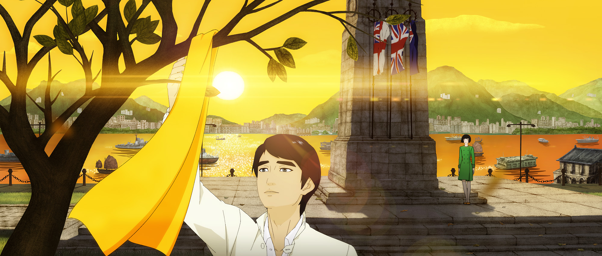
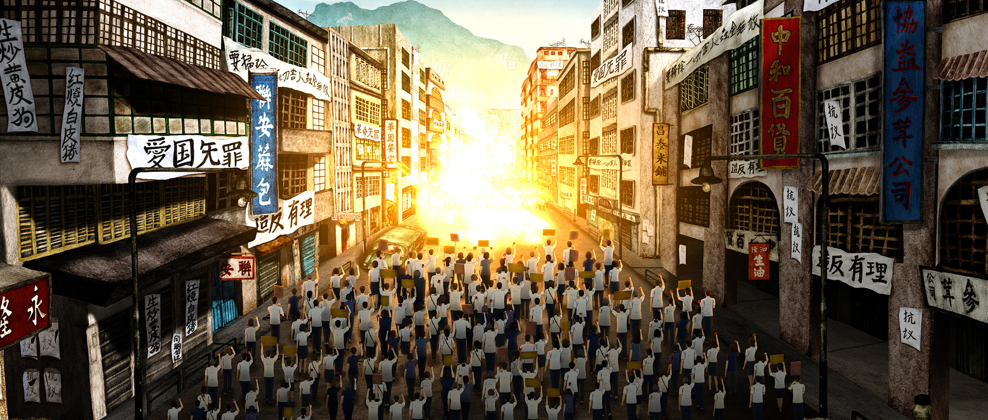
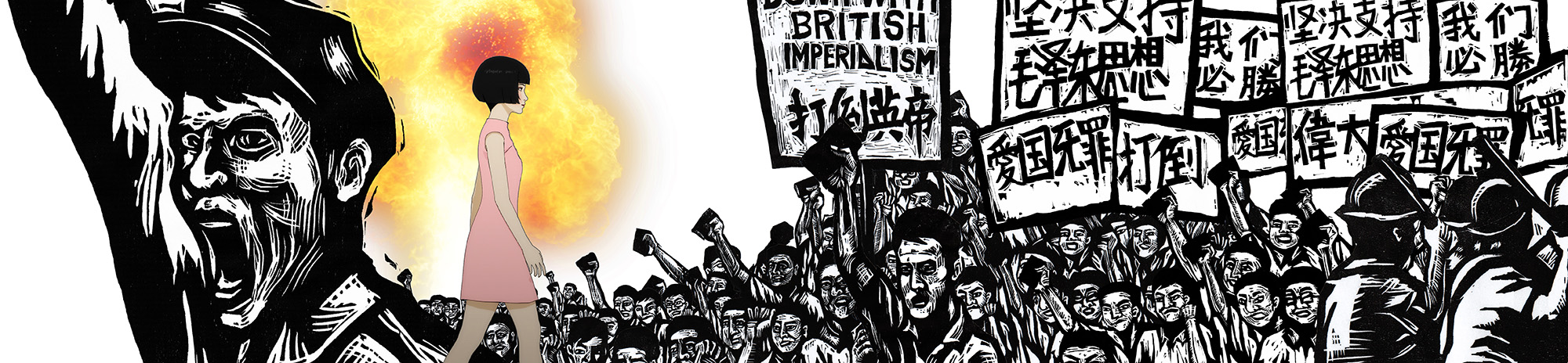
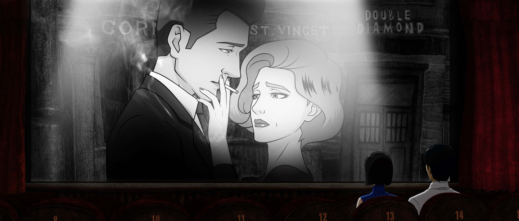
One of Asian cinema's auteurs, Hong Kong-based director Yonfan's No. 7 Cherry Lane, his first film in 10 years, his debut animation, and the first Hong Kong film since 2011 to vie for the Golden Lion top prize, won Best Screenplay award at this month's Venice Film Festival. Set in Hong Kong in the 1960s, the film tells of a love-entangled triangle between a mother, her daughter and an English-language tutor, whose visits to the cinema bring them magical moments and reveal forbidden passions. The era coincides with Hong Kong's turbulent times of 1967. Yonfan writes, directs and produces his own films, and also serves as art director on his projects. Two months earlier, ISBN met Yonfan and discussed the process of making his first animation and why the film feels like the director's love letter to Hong Kong, and to Art.
ISBN: You have described No.7 Cherry Lane as a love poem to Hong Kong. It also feels like a 125-minute love poem to Art.
YONFAN: I described my film as a love letter to Hong Kong, not a poem. Poetry is too big a word with which to decorate my humble self. I love the word art. It can be anything - high and low, beauty and the beast, rich and poor, east and west, physical and spiritual, democrat and republican... all the contradictions that give the motivation force, and that makes the art. I am fortunate to know my definition of art. Many people think art means only beauty that pleases one’s senses, but it is not. Art is also not a commodity that is defined by name and money. So if you say No.7 Cherry Lane is my love letter to art, I think you have chosen the right description.
ISBN: There are so many intertextual references in the film - to cinema, literature, to art, to philosophy, and more. Did you manage to include everything you wanted or did you make sacrifices?
YF: Through the years I have tried to learn not to be greedy. But with No.7 Cherry Lane I put many ingredients intoone movie - di erent styles of paintings, a mixture of eastand west culture, music in a classical form that clashes with that clashes with street music and even Chinese Opera, so perhaps I'm greedy putting everything in one oven to cook. I don’t know whether it works or not, but it’s good experience.
ISBN: The classic Marcel Proust novel Remembrance of Things Past is one of the first references made in the film. When and where did you first encounter this book and under which circumstances?YF: That evokes good memories. In 1970, I read the manuscripts of Wen Tong-he’s [Qing dynasty Confucian scholar] diary for Marina Warner’s first book, The Dragon Empress, in a Cambridge university library. I decided to spend a year doing the job. I hitchhiked to the university town and got a lift with an English undergraduate from Peterhouse [the oldest college at the university]. He invited me for tea in his room and told me about Proust. That was the first time I had ever heard about Remembrance of Things Past. Later that year, I saw volumes of the book in the library and thought how intellectual it would be to read it. I started with Swann’s Way but after two pages I decided I was not the literary type. I can still remember that kind, handsome young student though, who resembled one of the characters from Romeo and Juliet, and his name is Justin Shepherd.
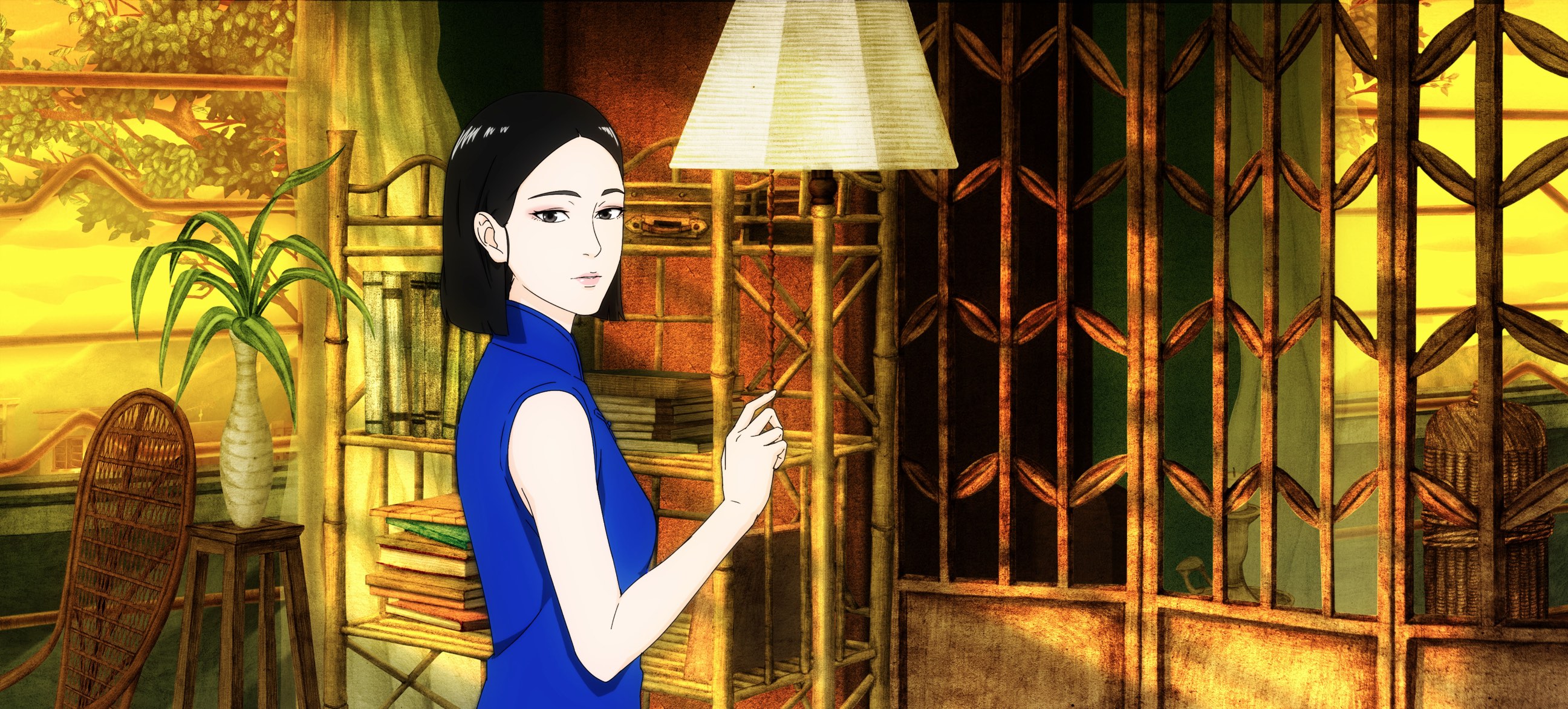
ISBN: Much of the film’s drama (both intimacy and intensity) takes place within Mrs Yu’s lounge, and the scenes move very deliberately within it. Tell us about how you ‘constructed’ that high-key yet humble interior space and ‘found’ the speed, or stealth, with which to shoot?
YF: I really cannot tell how I wrote all those scenes and the dialogues in the movie. Probably it’s the magnification of my own ‘remembrance of things past’. You asked about my first experience with Marcel Proust, and coincidentally, it’s almost the same situation as happenedin the movie. I think probably the whole film is based on people and things and conversations with which I am truly familiar. Although this movie happens in a post-modern 1967, it was the period I knew best. I was 20 that year.
ISBN: At one point, a classic Chinese song morphs into a three-minute street rap by Mrs Yu’s 18-year-old daughter Meiling. It’s a remarkable and most unexpected juncture in the film yet epic in effect. What prompted this development and how challenging was it to execute and write lyrics for?
YF: No.7 Cherry Lane is a story about yesterday, today and tomorrow, and we have an original theme song Southern Cross to accompany it. To complete the cry out of the mother, the daughter and the lover, I asked BOYoung to write a rap song for the present and future. But for the past, I thought a traditional tune was needed.
That old-fashioned Chinese song is an excerpt from my musical work 50 years ago. In 1969, I was leaving America to go to Europe and I travelled to the University of Iowa. There I met Paul Engle and his wife Nieh Hualing in the renowned International Writers Workshop. A true poet from Hong Kong, Wen Jianliu, wrote the lyrics for me so I could make the music. I lost the full version of his poem and my melody, but a remnant of it stayed in my memory. Every time I hum it people think it’s old-fashioned. Against all the odds, I used it in the film together with the street-rap music simply because it felt appropriate. Wen Jianliu passed away young, he was 32, and I never became a music composer. But I was once a private student of Sir John Pritchard, music director of the London Philharmonic Orchestra.
ISBN: Many films are personal or autobiographical in nature. But No.7 Cherry Lane feels acutely personal and poignant, as taut and epic and emotional as a violin string. It is an intensely captivating experience to watch - both agony and ecstasy in heart, mind, soul and feeling. Did you write all the material yourself, and how difficult was it to accomplish the writing given its level of sensitivity?
YF: I would say the story of No.7 Cherry Lane is simple, but the love in it is so desperate and my venture into the animation genre is a revolutionary cinematic step. You might call it a personal ego trip but I must take all the responsibility for this work, and that includes the writing. Usually, it takes a long time for me to think, but the actual writing is spontaneous.
 ISBN: How easy/difficult was it to ‘direct’ and ‘edit’ this animation as compared with more conventional cinema? Can you illustrate that point by describing a specific scene, part, or line, from the film, by way of example?
YF: I started with my three published short stories, then made a scene-by-scene, shot-by-shot list and gave it to my animator Hsieh Wen-ming in Taipei to do the animatic storyboard. Then I gave that to my other animation master, Zhang Gang in Beijing, to make the picture move. Zhang told me he would do a 3-D animation, and after I approved all the movements of the 3-D version he would then hand-draw a 2-D animation with 60 artists. I believe in 2-D images because they leave more to the imagination.
ISBN: The opening line from Jane Eyre: “There was no possibility of taking a walk that day”, is one of the most iconic in all of Western literature. Your film voices it three times. What is your relationship to that line and why not once, or twice, but thrice?
YF: I repeat the line three times simply because it resonates. The first time is by the narrator, the second time is in Meiling’s imaginary state of mind, and the third time she says it in a desperate, loving way to challenge the man she adores. I just think it’s wonderful.
ISBN: Where would you ‘place’ No.7 Cherry Lane within the canon of your work and how much did the experience of making such an innovative and artful film increase your already passionate love for cinema? Would you ever consider making a sequel?
YF: I wrote a very big part of their lives and what happens afterwards - love, hate and regrets - in novella form already. But I don’t believe in sequels. That is left entirely to people’s imagination. Every movie I made, I thought would be my last picture. No.7 Cherry Lane is no exception.
Images: Courtesy of Yonfan
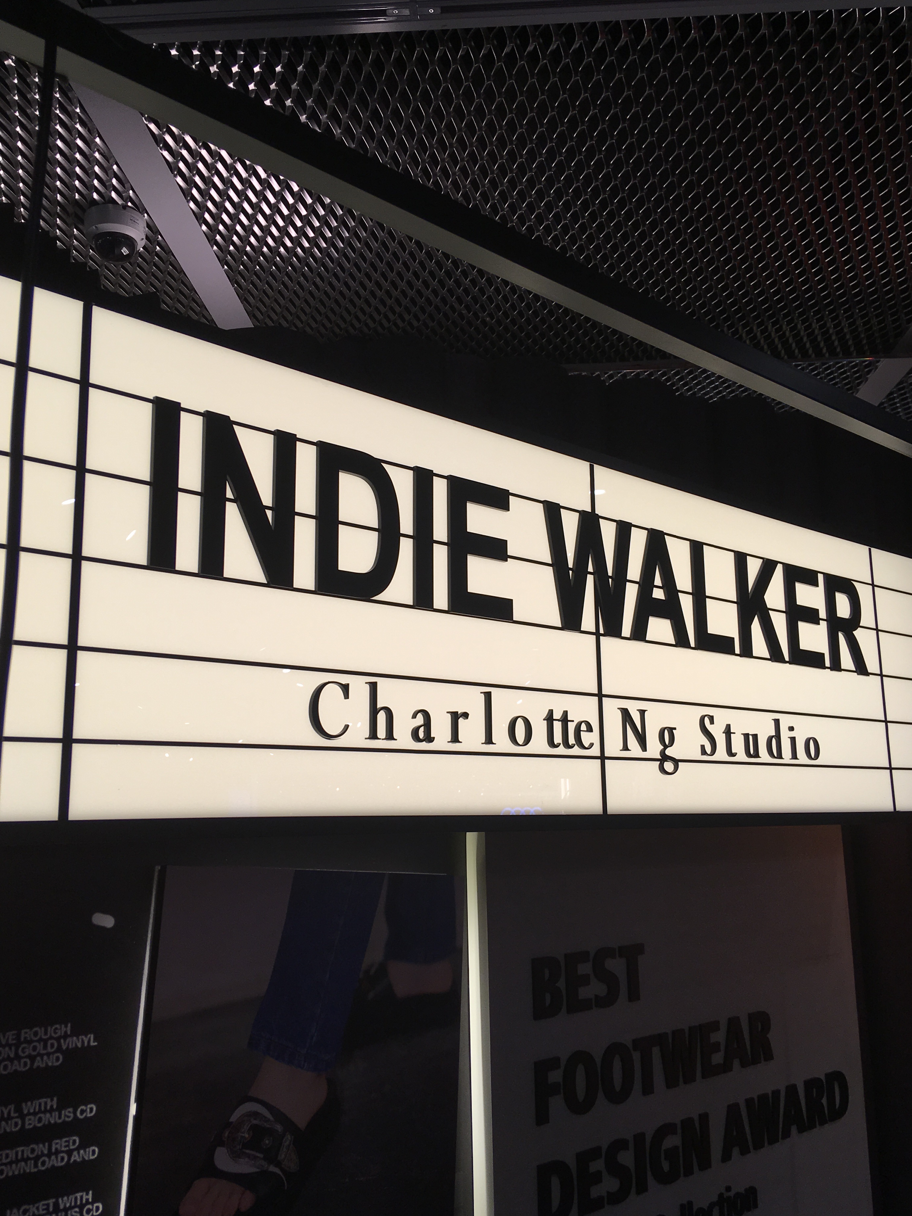
charlotte ng studio steps out in style with i.t shoe collaboration
Hong Kong fashion designer Charlotte Ng has a lot on her plate. One week before debuting her capsule shoe collection Indie Walker for I.T blue block in Hong Kong's Festival Walk, she's also considering whether she's got the boots right for her own SS19 collection, Rythmization, and the photographs shot for the campaign. Ng just launched her eponymous Charlotte Ng Studio label yesterday, prior the I.T collaboration.
Between lunchtime courses of courgette soup, orange roughy with ratatouille and glasses of Sangria at La Cabane restaurant on Hollywood Road, Ng, wearing a pair of her I.T cutout black leather loafers with a belted dress and split blouse from her own collection, highlights a mismatch between the liberty and adventure of the clothes in her new campaign that doesn't translate to the feet; in Ng's SS19 collection, the model wears military-style corps boots in black/silver metallic but rather than free the spirit, they seem to weigh her down; as though she's ready for her moment of freedom but is all dressed up with no place to go.
 "My collection is about a woman ready for adventure," Ng says. She rolls the thought around her head and the Sangria like she's repositioning accessories on a dress. "I'll reshoot the boots," she decides, make them less rigid, more devil-may-care.
It's no small irony that we're discussing shoes with such vigour. "I don't really consider myself a shoe designer," says Ng, a former Institute of Fashion and Textiles graduate from Hong Kong Polytechnic University, despite winning the Best Footwear Design category at the Hong Kong Young Fashion Designers' Contest, 2018 (YDC), in which she also won a prize as runner-up in the Best Fashion Designer category. The footwear award is a Hong Kong Trade Development Council initiative, sponsored by retail group I.T, in which the winner creates a capsule collection available at the brand's stores.
Designers were judged on the following criteria: creativity and originality, market potential, workmanship, use of fabric, and overall visual appeal. What distinguished Ng's fashion collection was a harmonious quality to the concept, a balanced, wearable, layered, mix-and-match look which exhibited mainstream playfulness alongside a more couture-y aristo-Scottish asymmetrical chic, emphasising cut, print, textiles and process. In other words, it ticked a bunch of relatable boxes. The whole collection was influenced by Radiohead's song Everything In Its Right Place, and Ng had even taken sound waves from the track as inspiration for design on the shoes and some of the looks.
Over molten chocolate dessert and coffee, Ng considers her evolution in the context of her new collection. "For SS19 I am inspired by a sort of cow-girl character who seems always brave and tough enough to handle everything by herself. Studs, eyelets, long strings, metal ends, rope, belt and slits show what is happening in her adventure." Versatility matters too. "Items in the collection are flexible, and some of them can be worn in two ways. I want women to be empowered by this collection to have their own style, personality and unique attributes."
Of which Ng seems imbued with plenty. Post-lunch she's sitting on a chair designed by Jean-Paul Gaultier at The Annex, Nan Fung Place, showing as part of French May's Le French Design, so Starck, so Bouroullec..., exhibition of iconic furniture and design. She takes her phone and reveals pictures taken on a recent trip to Paris, inside and outside the Centre Pompidou, with images ranging from geometric, symmetrical street scenes and surfaces to the work of German painter Gerhard Richter. Ng has drawing, art and photographic talent. And she paints. And perhaps as preface or motivation to her Rythmization collection, she creates her canvases in the park, outside. She shares with us an abstract work that evokes both Thomas Ruff and Richter. "I call it 'The Fantasy Moment'," she says.
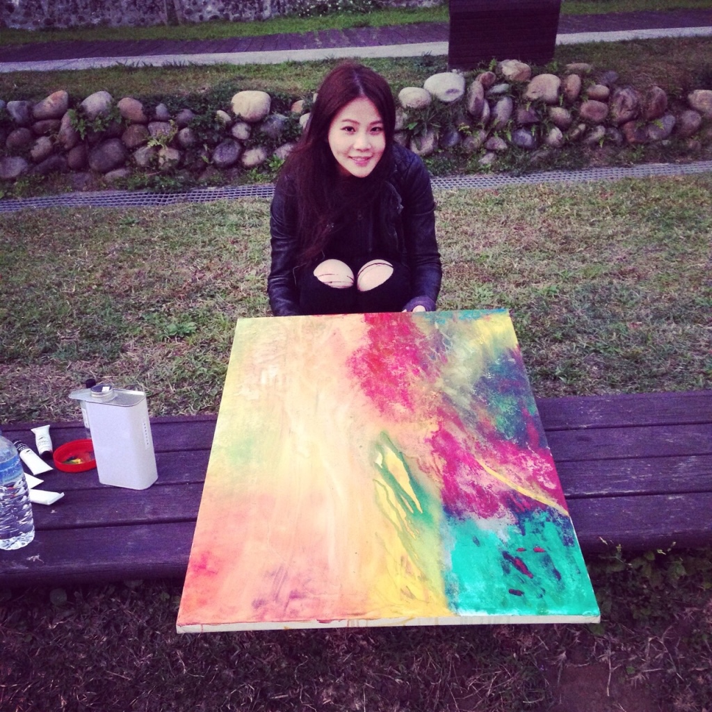
Ng recalls how her original idea had been to mix two very different feelings of colour and brush texture (hard/strong, vs supple and soft) and technique, hoping the two would 'react' in the middle of the work under the application of chemical liquid. "Where the colours met in the middle I poured on chemical liquid and let them react and mix together. It's a random process but I like the way they reacted and finally resulted in harmony. It's a very simple painting but I liked the process of creating it."
It's a revealing admission - as much for the approach she takes to her art as she does to her fashion.

Which leads us to the matter of branding, and more specifically, how one's name or label should look, i.e. how black-black or light the ink, how thick, which typeface, which font size, any icons by way of animals or graphic design trick or gimmick. "I have thought about this a great deal," says Ng. "I'm thinking that maybe the name on the label could be combined from different elements, or even have something more artful about it. But when I looked at my name, I felt the two 't's stand out somehow, so I wanted to emphasise that part of the name by having a space after the 'o' and before the double 't'." At which point we discuss capsule collections or pop-ups and bespoke or private-client couture-y confections which could take the abbreviated brand name 'tte'.
The first time ISBN spoke with Ng after September's awards last year, she had stressed how important creativity was to her fashion. "It should be the dominating principle when we design. It would be depressing to sacrifice creativity." However, keeping up with the ever-changing demands of the fashion world had made her feel somewhat unfocused. "It was the Radiohead song Everything in Its Right Place that reminded me to strive always to breakthrough. I simply wanted to convey abstract emotions in the sound waves of their song into design in the hope it may inspire and encourage others through visual stimulation."
Ng cites Japan's Rei Kawakubo as the majority of her inspiration and stimulation. "Her avant-garde aesthetics show the greatest creativity in fashion. Every single piece of her work is just like an art piece."
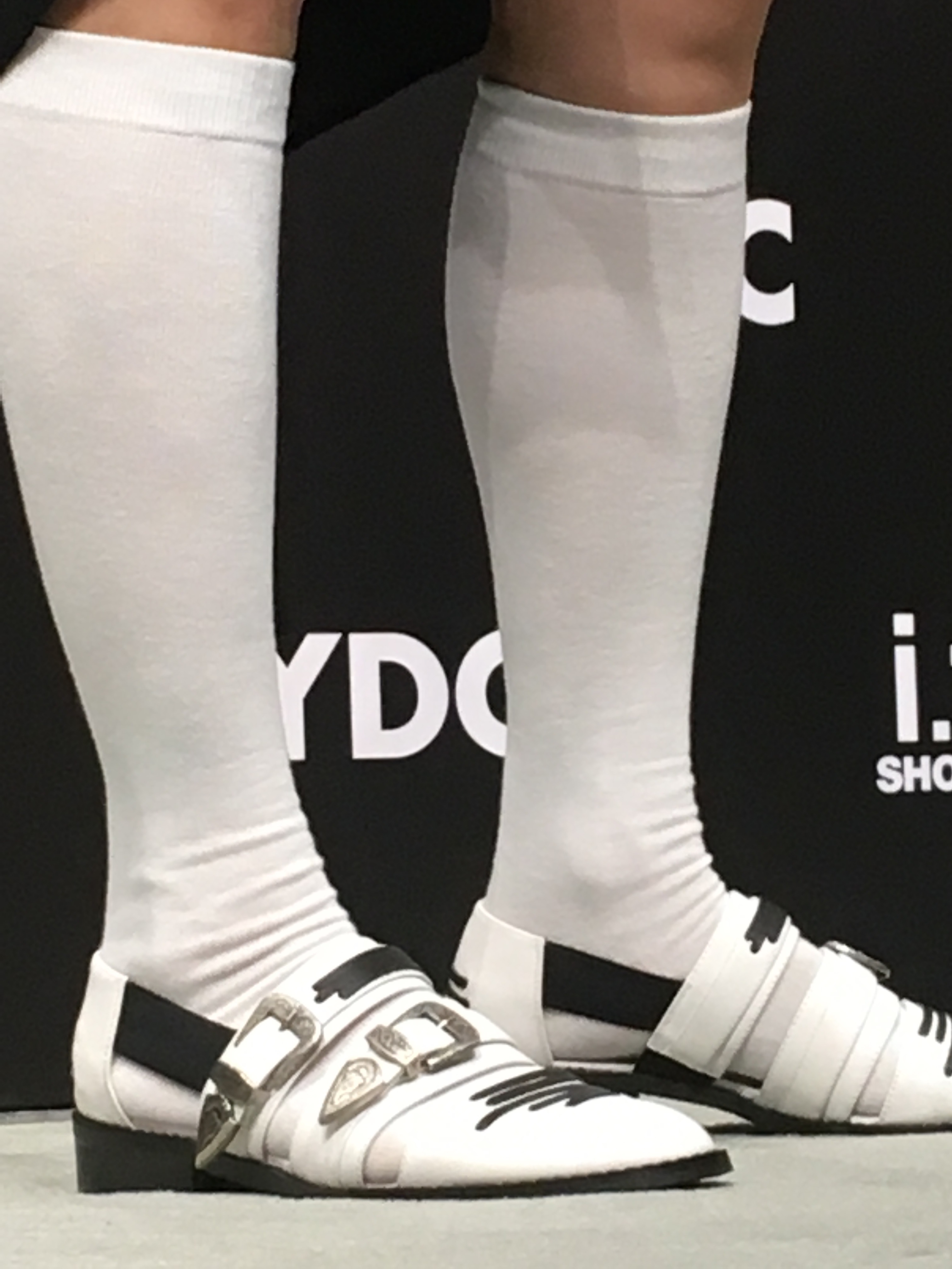
One week later at I.T blue block Fashion Walk on June 11, the i.t. shoes x YDC Best Footwear Design Award Capsule collection arrives and goes on sale. It comprises two styles; loafers, and sandals/slides, with lines on the surface inspired by musical sound waves and the metal element inspired by plugs used for audio equipment. Celebrity Charmaine Fong and dynamic stylista Chloe Mak arrive to support the winning designer, both looking appropriately snazzy and dandy in Ng's shoes. "I hope the collection encourages people to be brave and move forward, set out your own path and live your own life fully," says Ng. "I'm delighted that my winning design has been commercialised and launched in the market. This marks a significant step in the development of my personal fashion brand."
Of which we're keen to learn two things. First, which music inspired her upcoming third collection AW19, debuting in September, and second, for one so seemingly shoe-shy, what form will her award-winning next steps take.
Images: ISBN; The Fantasy Moment, courtesy Charlotte Ng Studio; HKTDC
murakami vs murakami at hong kong's tai kwun contemporary
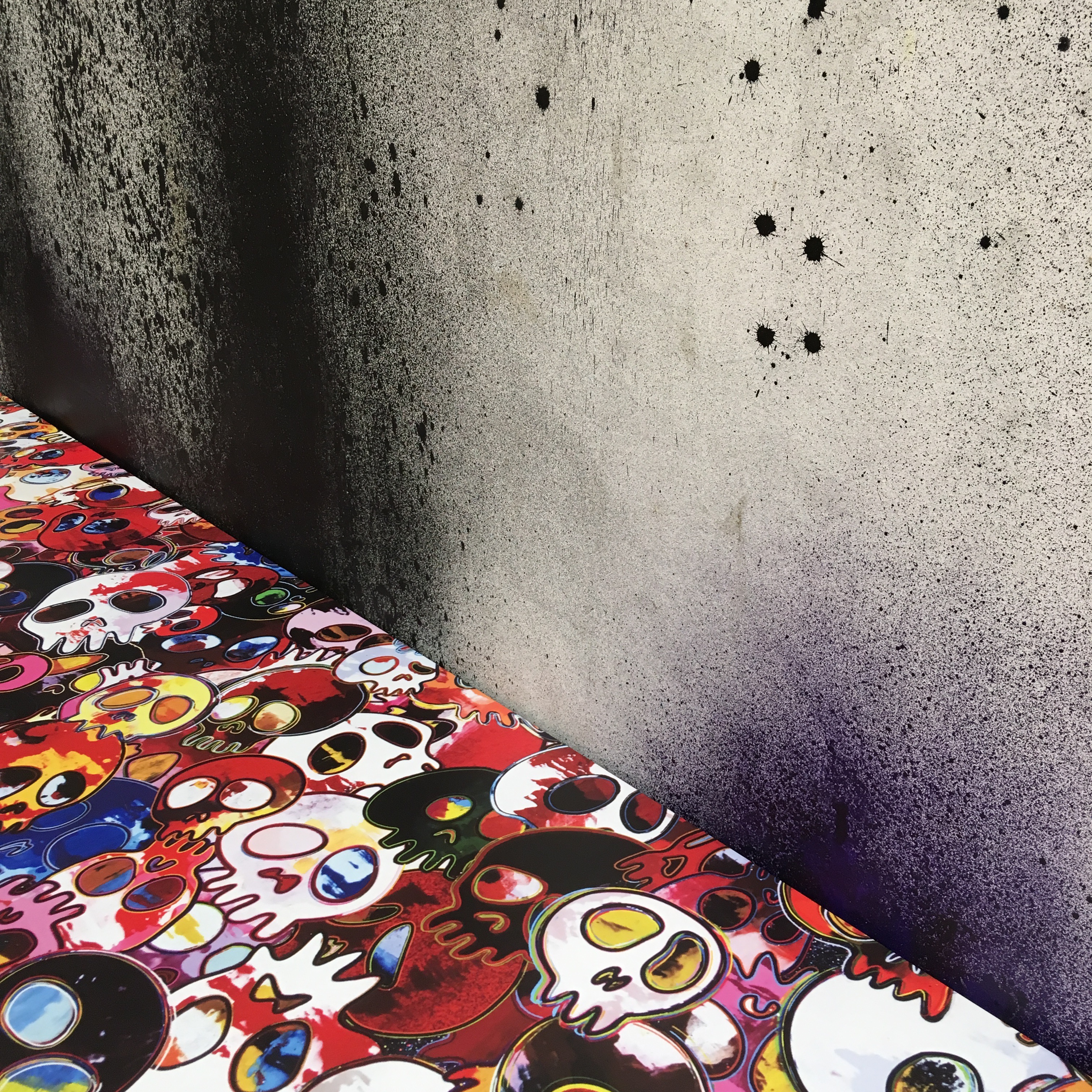
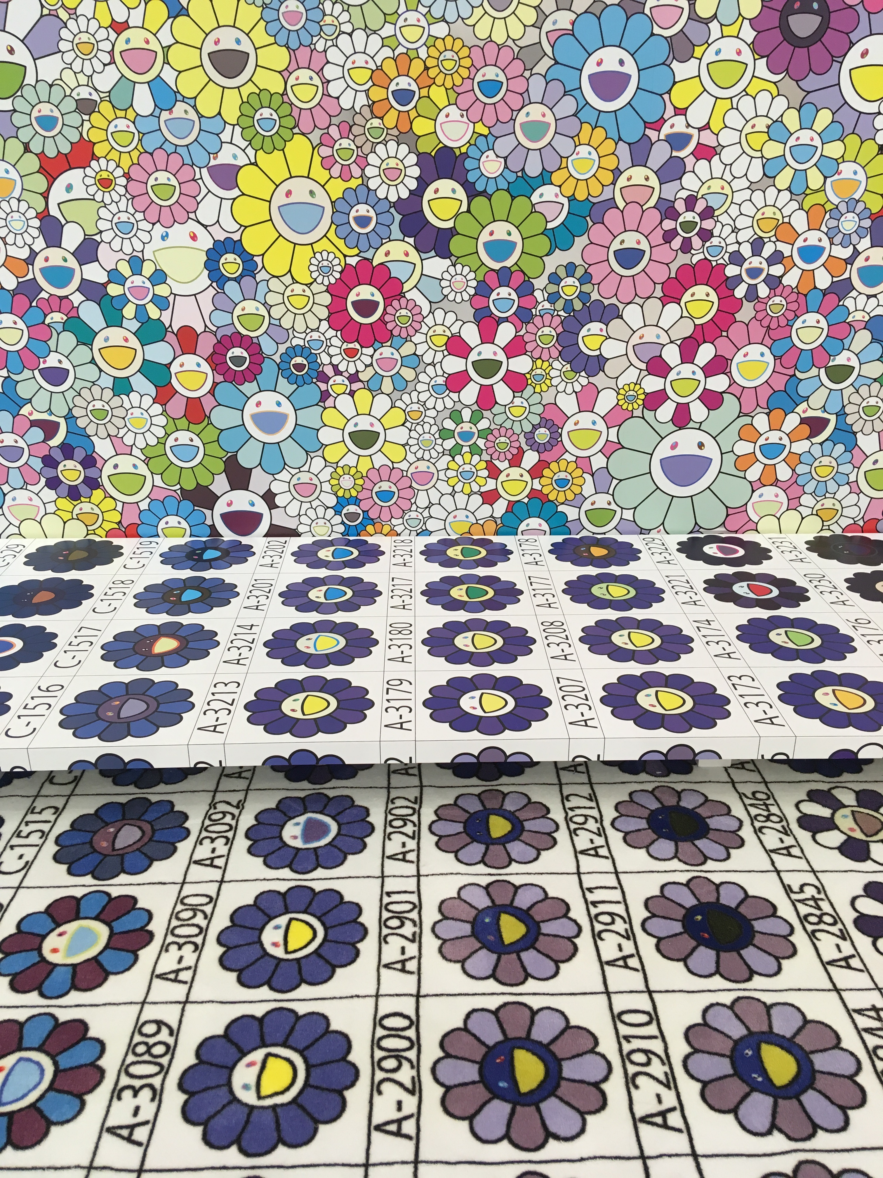
After so many years of viewing the seemingly shiny, happy, ubiquitous iconography of Takashi Murakami’s splashy canvases and figurines in the white-walled confines of private art galleries, or the stature of Louis Vuitton’s Fondation in Paris, it’s somewhat remarkable to be made to reappraise one’s relationship to the work by the artist’s expansive, ambitious and intimate show, Murakami vs Murakami at Tai Kwun Contemporary, developed in tandem with curator, Tobias Berger, which opens tomorrow, June 1.
And where the surrounds in one of the vast rooms bear the distressed, splattered black and grey hues of gloom and doom. Murakami feels as though he has channelled the peeling, sabotaged walls lining the back alleys of nearby and aesthetically gentrifying yet atrophying old-Sheung Wan, and invoked their ’ruin porn’ as backdrop. Such huge scale, yet poignant local intimacy, brings new perspective to the panglossian palettes of his inanely smiling flowers and endless anime-style characters and 'emojiggery'. It’s the dark side, a darker avant-grade, or de-mojification; Murakami as contemporary Munch Scream, simultaneously delineating the agony and ecstasy of aesthetic creation, and of life, or living, itself. Are the flowers smiling at all, in fact, or last-gasp laughing as panacea to the excruciating pain of existence. There’s always a punchline with Murakami.
What lends this show inestimable value over price are the insights; Murakami’s thoughts about contemporary art, creating icons, working with Berger and Tai Kwun, are posted around the rooms, thus aiding and abetting our understanding of what we see, and helping us discover and decipher Murakami’s mind - and strategic positioning - in relation to the art world. There is a room filled with work Murakami has collected from other artists - an eclectic gallimaufry from Julian Schnabel and Andy Warhol to Yuan Yuan and Tohl Narita (creator of Ultraman).
There’s even fashion. Or outfits after a fashion, shown for the first time at exhibition anywhere in the world. Murakami has created mannequins especially for this project (versions of himself) and adorned them with “kaburimono” (whimsical headwear) and zany, cosplay-esque regalia. It’s almost anti-fashion, unwearable except as a bet, and may be another inimitable Murakami punchline as reaction to the rarefied world of contemporary art.
Whatever the raison d’etre, the show is the best possible remedy for those who thought they knew - and often dislike - much of Murakami’s so-called 'superflat' work. Celebratory, challenging and super-dimensional, Murakami vs Murakami makes for full-on Murakamifcation, but is ultimately about You vs You as viewer.
MURAKAMI IN HIS OWN WORDS
WHAT IS CONTEMPORARY ART?
I think the appreciation of contemporary art is an experience that has gone mainstream only over the past 20 years or so, because there didn’t used to be so many museums specialising in contemporary art around the world. In my recollection, in the past, one had to visit specific museums or events in the United States or Europe to see contemporary art. But these days, there are a number of museums popping up not only in all the major cities in the world, but also in regional towns as part of economic revitalisation. As a result, it has become possible to casually experience contemporary art, and in return its audience base has been spreading.
There is a wide range of works available, from easily enjoyable to those that resist deciphering. When I was in high school, I think films used to satisfy my desire for something abstruse. There was a theatre specialising in esoteric films, and I would frequent the establishment on dates or with friends, enjoying the subsequent change of opinions.
Nowadays, things may have shifted so that people go to contemporary art museums to see video art and art films. In fact, I think artworks in general are increasingly abstruse, whether they are paintings or sculptures. So even as contemporary art has become more casual and approachable to a larger audience, the artistic expressions themselves still contain a lot of complexity: I think you could say that it is a genre that appreciates such profoundest. On the one hand, art strives for constancy but the mode of expression is ever-changing along with the needs of time. In the past, painting may have been subsidiary to religious architecture or a means for the wealthy to memorialise that would be replaced by photography: such transitions are self-evident.
So what about my exhibition is contemporary? I myself would say that it’s the nature of my work, wherein at first glance it seems plain and simple yet it contains the inner workings that touch the essence of art. That is, I believe my work visually explores the stupidity and a sense of guilt that we human beings are currently experiencing through simplistic anime-style imagery.
On the surface my work may give a happy impression, filled with countless smiling flowers or anime-style characters; if you notice the darkness on the underside of my work, however, I think you will find the heightened contrast of expressions that is at the base of what makes an artwork powerful and enduring. If you just unthinkingly look at my work, you will only see a happy world. But if you are willing to take on the complicated task of deciphering it, I think you will come to notice my multi-layered messages.
So, after you have read this text, please look back on the exhibition you have just traversed. You might now recognise a slight disconnect from the impression you might have had upon entering the show. And if you now revisit and look at each work, you might discover a piece of the puzzle in each. That, I think, is the true thrill of contemporary art appreciation.
ICONOGRAPHY
Is it possible to create an icon that holds as art? This theme was the reason why I started making Mr. Dob. I wanted to verify the “survival secret”, or universality, of cute characters such as Mickey Mouse, Sega’s Sonic the Hedgehog, Doreamon, Miffy, Hello Kitty, etc, while crossbreeding it with the universality of artists that have managed to survive in art history, such as Cezanne, Duchamp, Warhol, Picasso, etc . Executing and analysing this idea was my initial purpose for the DOB project.
TAI KWUN | HERZOG & de MEURON
Was it two years ago that I first visited Tai Kwun Contemporary at the invitation of Curator Tobias Berger? I was so excited that the building was designed by my absolute favourite architects, Herzog & de Meuron; even at first glance, both the exterior and the interior were superb!
The exterior is a repetition of abstract forms made of several types of carved aluminium. The interior is organised to deftly guide the flow of visitors and the exhibition space on the top floor has such a sense of openness that you can’t help wanting to place large-scale works in it. The best thing about the building is that the concrete of the internal staircase is hand-chiselled all over in detail, giving it a marvellous texture. The creativity of the architecture directly appealed not only to my five senses but to the sixth, making me want to aspire to the heigh of artistry. I hope you would come along on a journey through my brain across time and space found in these contrasts.
Images: ISBN
izzue you is: hong kong label's historic debut at london fashion week
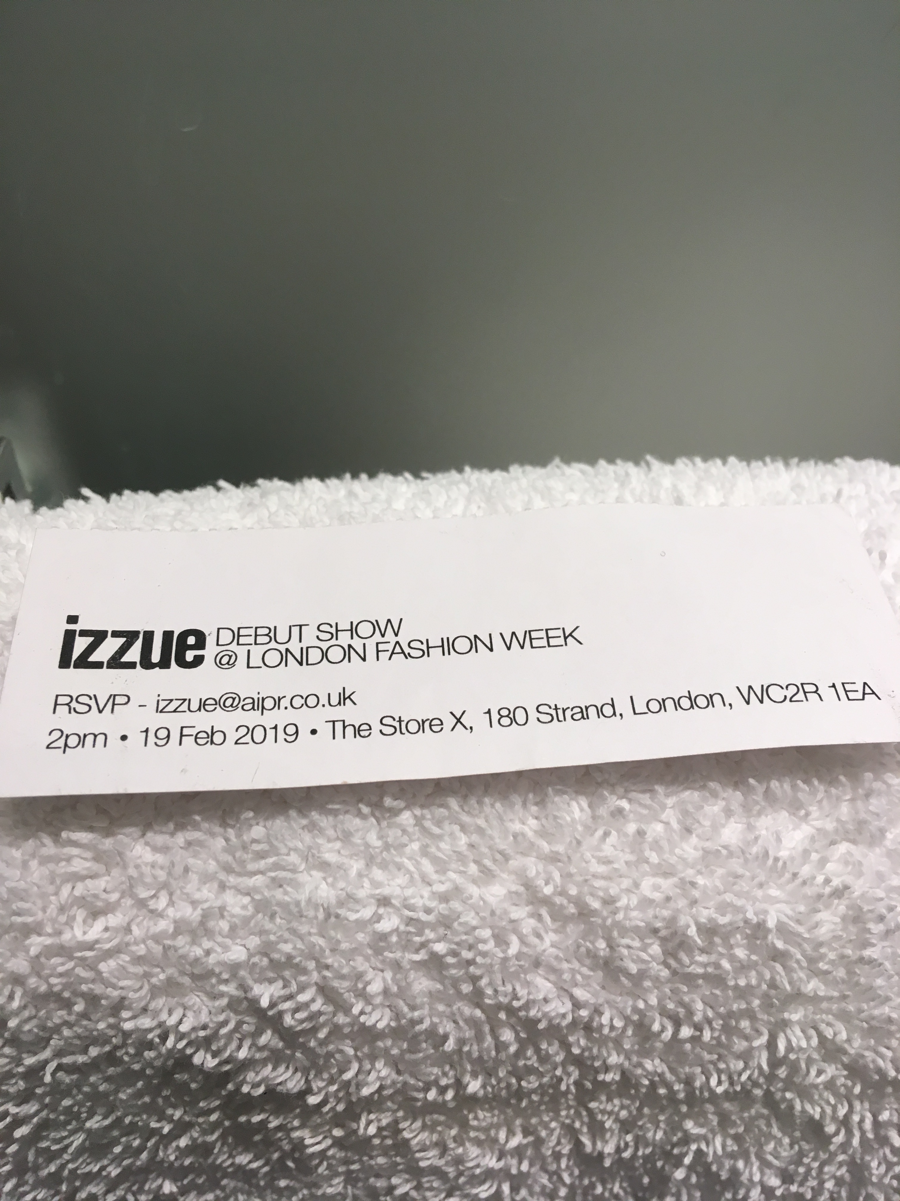 Hong Kong-brand Izzue, part of I.T Group, talked the talk and walked the walk with double happiness for its grand AW2019 debut at London Fashion Week on The Strand, while simultaneously launching a new capsule collection of clothing in collaboration with Central Saint Martins designers at Selfridges on Oxford Street.
The British capital is the perfect fit for the brand, which is celebrating its 20th anniversary, as London's gritty and avant-garde street-style has often influenced the design and thinking of Izzue. And befitting such an occasion, a small but influential coterie of notables had gathered to watch the early afternoon runway, which marked the first time a local Hong Kong brand had staged a show at London Fashion Week.
The A-listers included British singer Lily Allen, designers John Rocha and Markus Lupfer (who sells through I.T Group), blogger, writer and fashionista Susie Bubble, Korean pop star Kim Jae-hwan of Wanna One, and Chinese singer and actor Zhou Rui. Even artist Oscar Murillo, the man art dealer David Zwirner calls “the next Jean-Michel Basquiat”, was there with wife and child.
And just as Izzue’s journey has transformed the label from a local player into a leading Asian fashion brand with more than 90 stores throughout Greater China, Singapore, Canada and the United Kingdom, and also now part of Selfridges contemporary womenswear curation, so the show took on the theme of a journey, and the challenges consumers face as we navigate contemporary life. It delivered escapism for stylish global galavanters, while still being firmly rooted in the realities of the here and now and the classic “Live It Real” Izzue mantra.
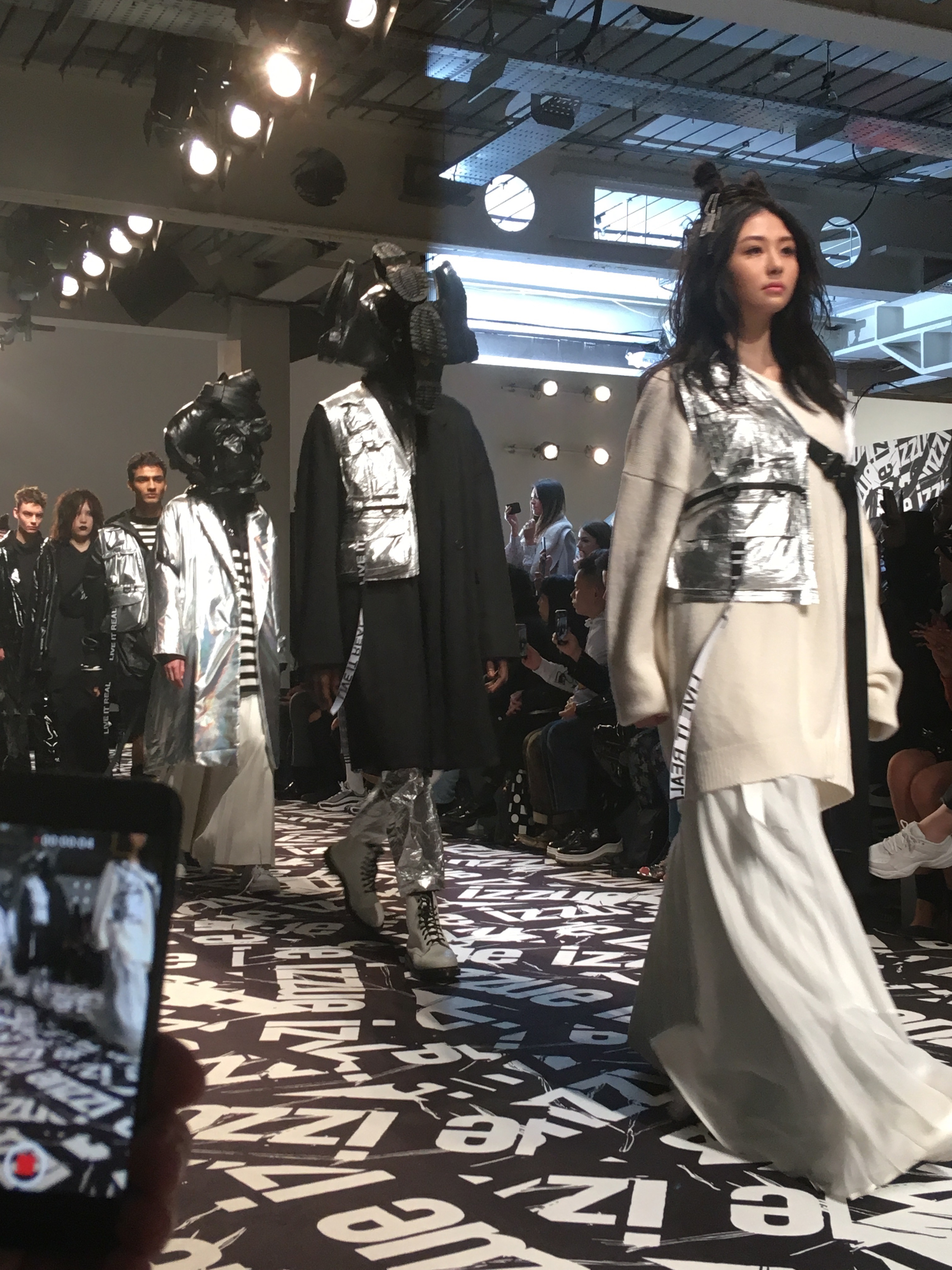
The show asked if one were to take a 1,000-day journey or escape, which essential possessions would one rescue and most rely on? Reflecting the zeitgeist, the show questioned what motivates feelings of insecurity or displacement in today’s youth and how they can most readily combat these emotions – clothes as both statement and armour, performance and protection.
Izzue invoked its inimitable brand codes – striped tees, trench coats, MA-1 jackets, shirt/blazers (#izzueessentials), and tilted them a little. Just as time erodes and experience unravels, so the wearers were forced to re-purpose or re-fashion their clothes, hence why the cut and form of each look was deconstructed; Hoodies were dissected, and reconstructed, rendered in bold red and orange, bikers were elongated, and tailoring worked in experimental PVC. Acclaimed Georgian artist Shalva Nikvashvili created sculptural headpieces to accompany the runway looks. It wasn’t so much a protest, more of declaration of daily fashion practicality and fact.
The champagne or trophy moment saw the boss’s daughter, actress and model Shum Yuet, (above) proudly lead out the models wearing dazzling white and metallic. Some show. Shum finale. Izzue you is or Izzue you ain't my baby?
IMAGES: ISBN-Magazine
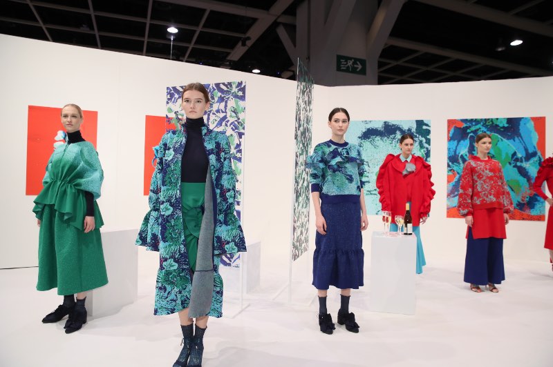
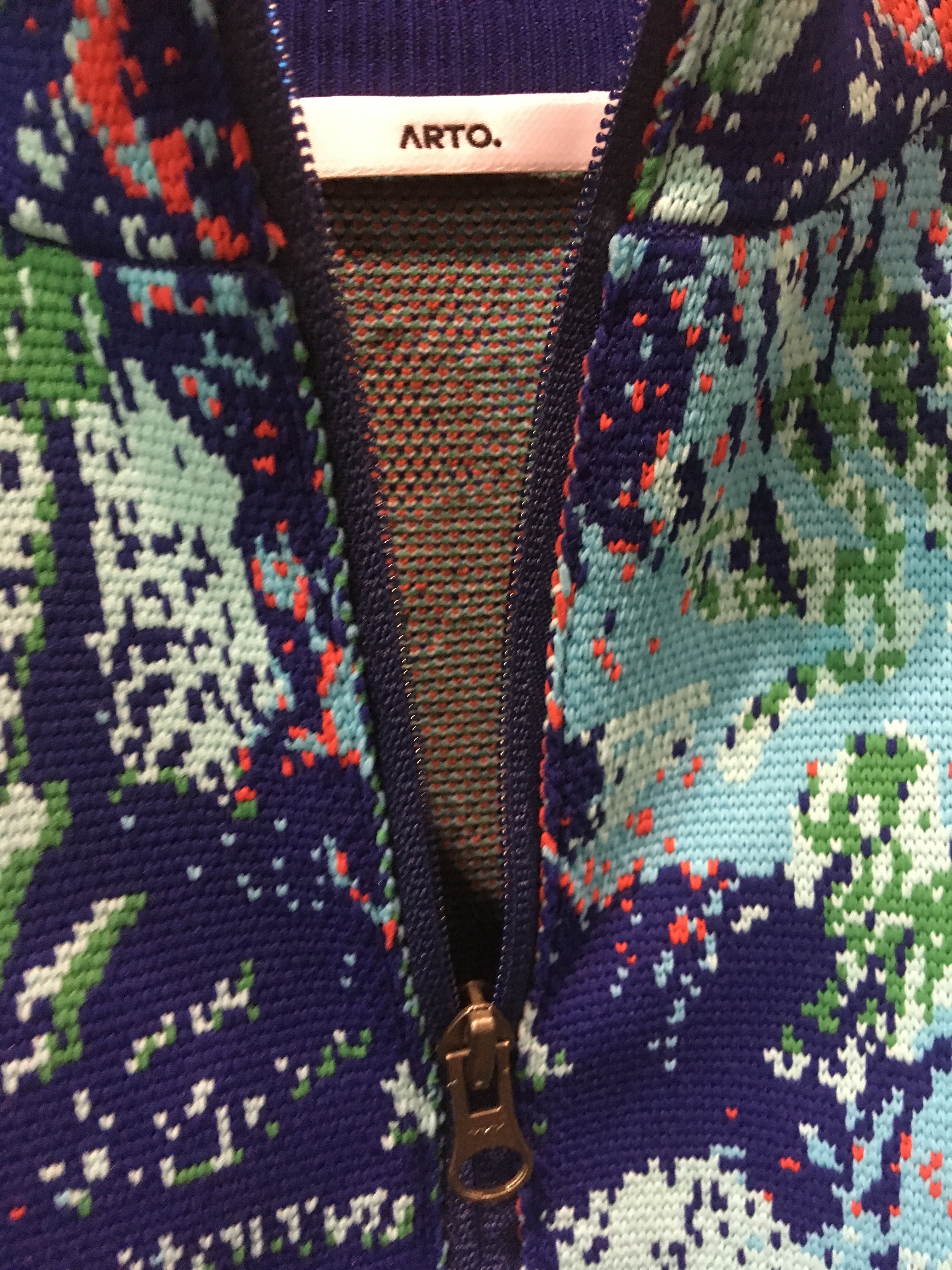
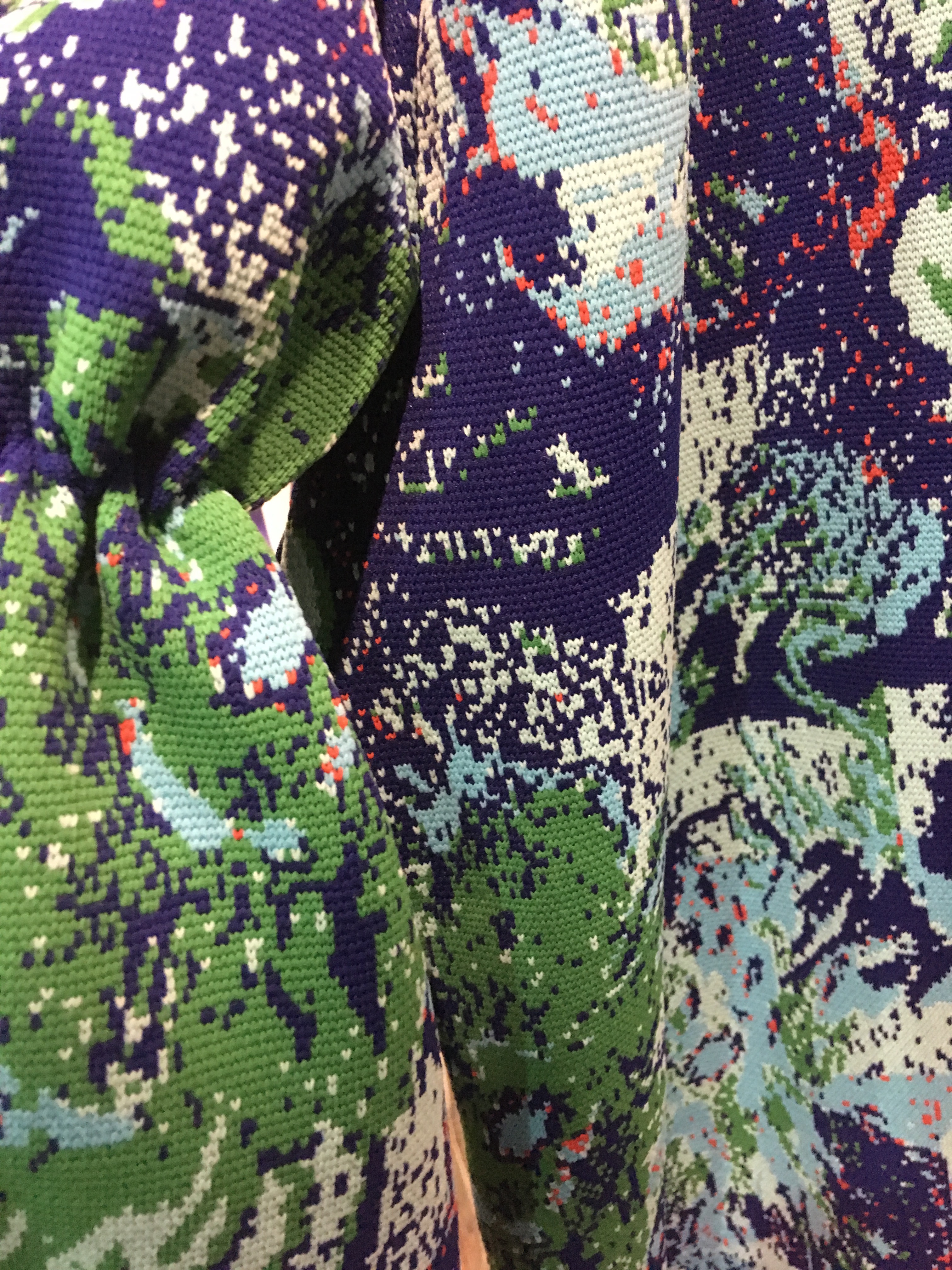
arto wong f/w19 - playing to the gallery
Fashion designer Arto Wong received the New Talent Award and was named Overall Winner at the Hong Kong Young Fashion Designers’ Contest (YDC) 2017 for her "Zero to Unlimited" collection which invoked the notion of molecular transformation (left). The New Talent Award gave her the opportunity to retail her debut collection in Hong Kong’s multi-brand fashion mecca Joyce last year, visit Japan for three months, and simultaneously launch her own-label ARTO.
ISBN sat front row as Wong debuted her follow-up F/W19 collection at Hong Kong Fashion Week in January. Unlike a conventional runway parade, this presentation featured Wong's work in the form of a story told against a backdrop of a theatre-like stage for audience and buyers alike. And, in keeping with the burgeoning art market in Hong Kong, the models were shown viewing artworks as though in a gallery, which were in fact Wong's own moodboards (think Francis Bacon, Katsushika Hokusai, David Hockney meets Jackson Pollack) for the collection.
What inspired this F/W19 collection - how much is it a natural evolution from the last?
The overall style is the extension of the previous season. Ruffles, colour, and graphic components still make-up the important design elements.
What's been the best and worst of winning the YDC?
First, I'm one of numerous talent designers in the same year who won different fashion contents. The award gave me the chance to broaden my horizons and network. What has surprised me is the number of people and parties who would like to support Hong Kong designers and start-up brands - that exceeded my expectation. I think more and more passionate Hong Kongers would like to help build a reputation for Hong Kong Fashion. It is a huge motivation for me and other designers to run a brand and chase their fashion dreams.
How does the attitude here compare with Tokyo?
I had a study trip for three months which included experiencing Tokyo Fashion Week. One big difference between Hong Kong and Japan's fashion week's is public awareness. What I experienced in Japan is that many reporters from titles like Women's Wear Daily, I-D magazine, digital media, and TV shows reported all the shows and interviewed all the designers. Thus, the atmosphere in terms of promoting their own talents, and their own country label, is really strong.
The fashion world is changing so fast - even since you won. How confusing is it to keep up?
In the past, people who talked about fashion were not only focusing on the "look" or "style" of clothes, they were also paying attention to notions of quality and craftsmanship. With the rise of fast fashion and so-called KOL [Key Opinion Leader] culture, what makes the public spend money is "style" and "trend". One way to describe it would be to say, "Bad money drives out good".
What's the best compliment anyone paid you about the collection you won the prize with?
People who say, "I can recognise your collection even if it was launched one year ago". The image has taken root in their minds.
What did you learn about design/creativity/commerce after selling through Joyce?
Customers were surprised that knitwear could be designed in such a volumed style. I was glad to get such feedback as one of my brand missions is to broaden public horizons and perceptions towards knitwear. On the commercial side, wearability and comfort are the main factors a designer needs to consider. No matter how brilliant the designs are, customers will not pick them up if they can't deal with the clothes in a comfortable way.
And how different was this one?
F/W19 is a completed collection. The preparation process for this is totally different from preparing a capsule collection. In the coming season, I need to widen the product range so as to balance the commercial needs with the brand identification. You will see there are also some 'entry-level' or 'essential' knitwear items in this collection.
We see the influence of Francis Bacon, at least some of his colour palette, and also Hokusai's Great Wave of Kanazawa some Jackson Pollack, perhaps even David Hockney in this FW19 collection.
You always say the loveliest things. I'm not sure that's a conscious decision but I'm delighted you can find those references in the work.
What advice would you give any aspiring fashion designer studying at HK PolyU or HK Institute of Textiles, or SCAD, right now?
Establish your own identity! There are no 'perfect' items fit for ever single customer. So, keep your passion on fire, work hard and play hard.
Images: ISBN-Magazine; HKTDC
kiko and yuka mizuhara debut ok x i.t blue block collaboration in hong kong
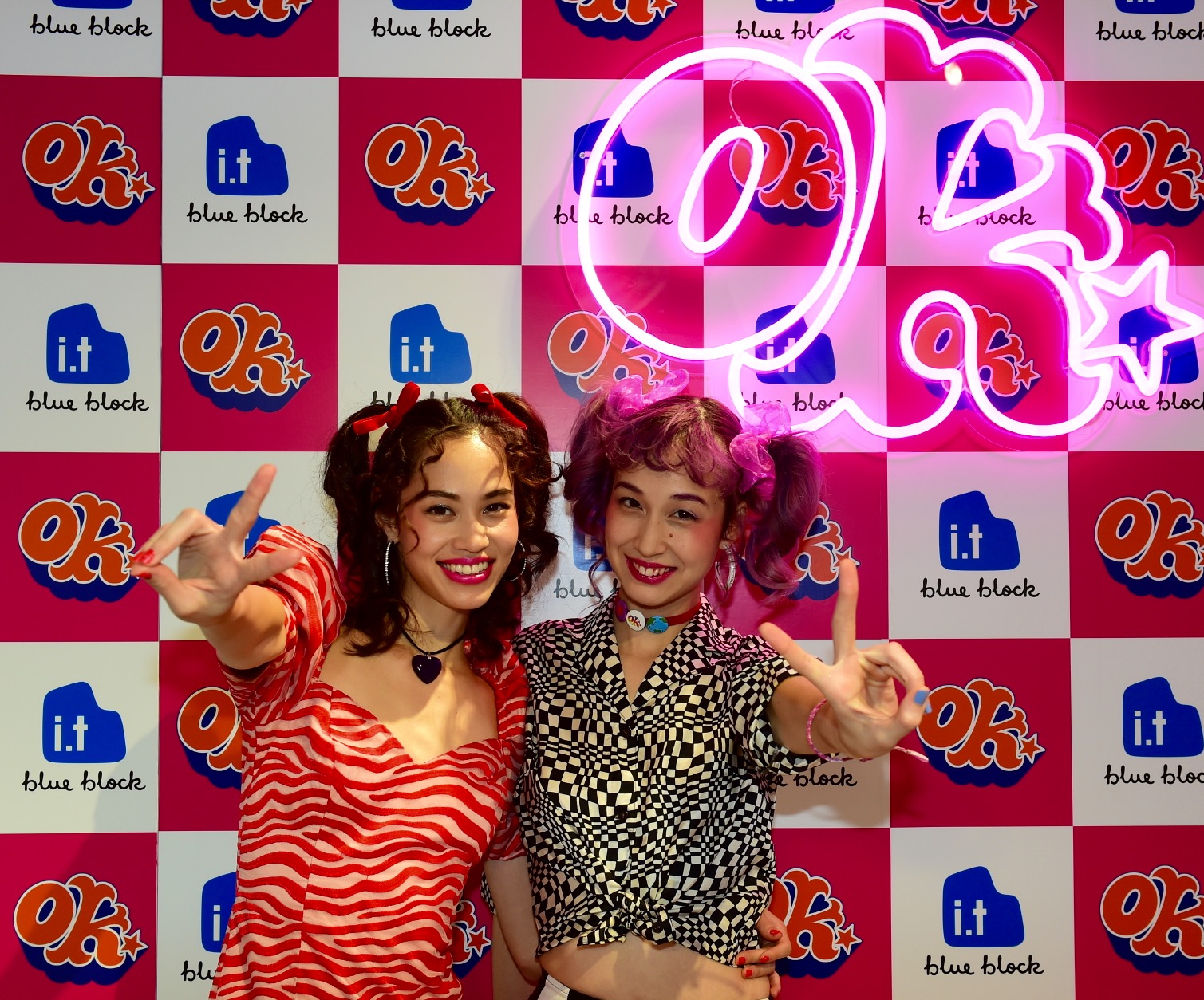
Texas-born, Tokyo-raised and -based, 21st-century It-girl Kiko Mizuhara bestrides a multiverse of creative possibility and cultural engagement. The Korean-American who graced the inaugural cover of I-D Japan in 2016 with the tagline ‘The Future of Japan”, and whose Instagram handle matter-of-factly declares @i_am_kiko and counts five-million followers, can Hepburn [her father named her ‘Audrie’ after the actress] any Holly Golightly moment; can Birkin a bag, Gabrielle a tweed jacket, Coach any ‘Charlie’ , and Chung [Alexa] fashion ambassadorships at will, with a gamut of elite names, from Chanel and Dior [she was appointed the brand’s first Asian ambassador] Moschino, Marc Jacobs and Michael Kors to Jil Sander, Uniqlo, Diesel, Adidas and Opening Ceremony. She was the lead actress in Tran Anh Hung’s Norwegian Wood, the baptismal film of the prolific Japanese author Haruki Murakami's work, in 2010. She's also a regular muse for iconic Japanese photographer Nobuyoshi Araki. She sings, too. And appears in both Japanese and Western music videos, notably two years ago as an outer space ‘Stargirl’ in I Feel it Coming by Canada’s The Weeknd - a video with more than 440 million YouTube views - and just two months ago on La Di Da for The Internet. Mizuhara is aesthetic impresario and 'empress-ario" incarnate. And in the trackless empyrean of insouciant style, she's done what all-else have found unthinkable and downright impossible: out-Sevigny'ed the original It-girl Chloë. For Mizuhara has it all, she has it all, and then she has some more. From Kiko to It-finity.

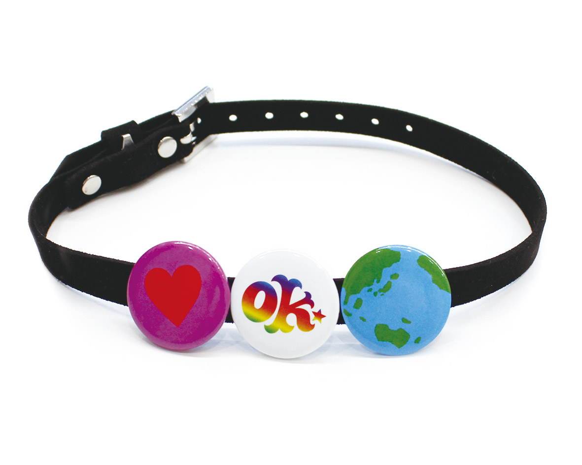
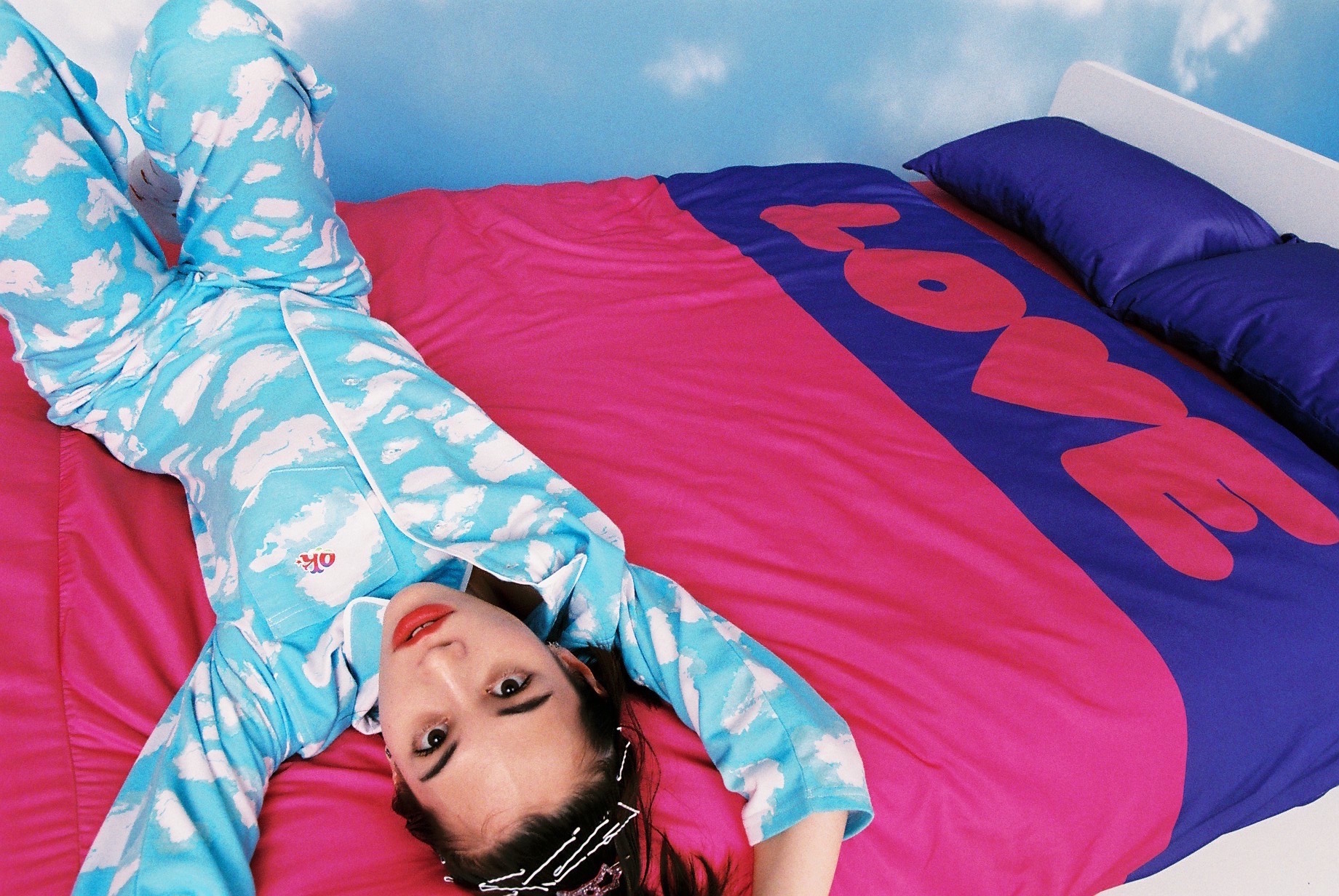
And now this veritable alkikomista has her own label, OK, acronym for Office Kiko, which she launched digitally last year on her birthday (October 15). The real-life store appeared in April in Harajuku, Tokyo then debuted in Taiwan two months ago, and is now in Hong Kong through an OK x i.t blue block collaboration in Hysan Place, Causeway Bay. Mizuhara designed the collection with younger sister, Yuka, also a creative force who DJ's and models in Tokyo. Kiko calls Yuka her "angel". The result is a series of clothes - t-shirts, swimwear, yukatas, accessories and even a special showroom featuring OK bedding, slippers, socks, and decorations in vibrant style. It's girliest, cutest eye-candy of the fun-girl and fan-girl-est kind; think marshmallowy soft, cumulous cotton-wool clouds, butterflies, tulips and cerulean skies. A veritable kikotopia, or ok-topia - of childhood memories, warmth, belonging and fun.
But Kiko being the stylepreneur of street and soigné, she knows a trick or two about leveraging saccharine into serious gaze and growing it up. “Well, the yukata," she tells us, "maybe instead of traditional geta [sandals] you could wear it with high heels, or even Docs. And then, off the shoulder, with a slip-dress. Accessorise new style rules for it."
Which is what Kiko has done throughout her luminous lifetime in the public eye, and why every Tom [Hilfiger], Dick [Mille] and Harry [Winston] no doubt wants a little of Mizuhara's hyper-wattage to enliven and embolden entry-points to their brands. Mizuhara was behind the so-called 'pizza outfit' worn by Beyoncé, which she designed for Opening Ceremony's F/W 2013 collection. Rihanna wore Kiko's designs, too. Sitting next to Mizuhara and her sister on a bed in the OK x i.t. blue block pop-up, Kiko's kineticism is explicit; she detonates charisma like continuous camera flash. She even surpasses her own Instagram. As the face that could launch a thousand luxurious ships the potential for would-be collaborations seems infinite; a Chanel 'Code Kiko' watch; a Louis Vuitton 'Kiko' vanity case, the 'Kiko' Coach bag, or a Dior men's black-tie silhouette with the word 'Kikodorable' emblazoned down the satin stripe and over the ribbon-ties on her shoes; head-to-toe Kiko, made-to-Mizuhara.
Audrey Hepburn's Holly Golightly says in Breakfast at Tiffany’s that it's "better to look at the sky than live there” and Kiko concurs. “I wanted to do clouds because everywhere I go I watch the sky. It always makes me happy. When you’re having a stressful day and you look up at the sky you chill out and feel better,” she beams. Which explains her approach to the collection. “Most of my fans are young, like 12, 14, 16, and they think I’m in high-fashion and that it will be expensive. It’s not. And I didn’t want to do anything too complicated or hard to wear. It has to be easy and every product is buyable and affordable and young people get it.”
It’s this high/low, Kiko Gohighly, Kiko Go-lowly approach which endears Mizuhara to her legions of followers and encourages inclusion. Did Mizuhara, who grew up reading magazines over books, ever feel inspired in any way by the example of Rookie blogger, stylista, magazine maven and now actress Tavi Gevinson in the US?
“I was not really inspired by Tavi but I know what you mean; I feel we don’t have that kind of girl power idea, and we didn’t really have that feeling in Asia before now, but this project kind of gives that. We’re doing Hong Kong, Taiwan, Indonesia, and Thailand, and it’s amazing to see all these girls enjoying our products and being themselves.” She pauses and assesses the sky on the bedroom wall. “We will continue to do different looks with OK, a different feel, totally different, but I don’t know if I’ll continue making products. OK can be a place, or like an events platform, to collaborate with lots of artists, like my friends on this project, a lipstick artist and my best friend photographer (Monika Mogi), or it can be a book, a magazine, a musical, an experience of all kinds, a lifestyle.” When you’re Mizuhara, ideas teem. “I’m trying to connect all the pieces in my head. And it’s really hard to connect all of my ideas.”
In a stream-of-consciousness sixty-second moment she references a photography project with Yuka, “we photograph each other and we want to rent a space to show it”, a book, a collaboration with Japanese shoe-brand Esperanza, (which debuts on October 1); a project with Japanese video artist and cybergeisha Mariko Mori [that's a maybe], a collaboration with a Thai transgender artist, and an album Kiko’s “trying to make” with her sister, as she feels “music in general has become so boring. It’s not creative at all. We want to remind them that we used to have, and still can, make great music and inspire people.”
Nostalgic with new-mondial spin, the Kikoverse is happiness you can wear and share. How long before Tokyo christens a new district Harakiko and Harayuka, or a new creative space yukakiko and kikoyuka. Lead on, girls. Up, up and away, and more than super OK.
OK x i.t blue block, 6/F, Hysan Place, Causeway Bay. (Until September 18).
Images: Courtesy of Office Kiko
ad hoc - arto wong debuts own-label in joyce
One year on from winning Hong Kong's Young Designer Competition (YDC) in 2017, and the week before her collection launches in Joyce boutique, Pacific Place, on August 30, Arto Wong Hiu To sits in Aberdeen Street Social quaffing a detox beetroot cocktail and assessing her lot. Which sounds considerable; having won the competition (she was also the winner of a best New Talent award on the same night) and committed to the collaboration with Joyce, Wong stepped out of her design job and decided to launch ARTO., her eponymous label, which wears a full-stop for emphasis.
The 'on-point' Wong - off-duty when we meet in the pouring rain and dressed in jeans, Docs and t-shirt - aims to empower independent, confident and intelligent women, who want to make a difference and appreciate the inspirations behind her brand. Combining the art world, social movements, culture and nature's inherent beauty, Wong's specialism is knitwear allied to a contemporary, innovative sensibility that presages power, energy and ingenuity.
The Joyce collection, which will also launch in Shanghai's Plaza66, is inspired by the idea of molecular transformations and their infinite potential to combine. Wong used that power to give her Zero to Unlimited collection a sense of grandeur. Structural ruffles and an eye-catching explosion of dots featuring electric blue and shocking orange accentuated the vivid motif. Wong used Japanese polyester to achieve a weightless yet voluminous silhouette, and the collection carries the tagline, "no matter how small you are, you can create unlimited possibilities."
How much is the molecule a metaphor for Hong Kong's young fashion designers trying to stamp their singular styles on a global, regional, or even local stage. "It’s something I’m having to consider," says Wong. "Being a Hong Kong designer is about creating something unique that other people can’t find in other markets. It must be distinct." Such counter-trend thinking - which was little in evidence among her many peers who showed at last year's competition, and indeed this year's Hong Kong PolyU BA catwalk show in May - distinguishes Wong's work. Where other Hong Kong designers point-and-shoot all too explicitly, and often unsuccessfully, for the lucrative trend-driven accessory market, Wong aspires towards head-to-toe balance and sense, delineated by playful experimentation . "In my design process I don't think about what others want. I do what I want and what I like."
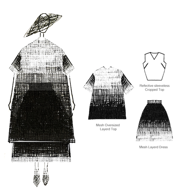
That sense of challenge also manifests on September 4 at PMQ's Smart Fashion Runway, 'Canvas of the Night Sky', sponsored by CreateHK, in which 10 fashion designers are paired with visual designers in a cross-disciplinary collaboration which sees them present a mini story on stage. In Wong's case, she's partnered with 3JBK, and has created a woven outfit (right) rather than knitwear. "The outfit is designed with a gradual colour effect by layering mesh and reflective fabric. It's my first time handling this kind of material," says Wong. "The idea is that I expect the outfit's appearance will change under various different visual installations and create a new chemistry." Whatever the result, the creations will be exhibited for five days to the public.
How much did Joyce attempt to change the chemistry of her YDC designs for their collection? "Joyce was light, and pretty open," she enthuses before unravelling the particulars. "They wanted me to downsize some aspects of the looks; also to modify my winning collection, so it was not so bulky, or so layered." The trophy piece, or at least the most expensive, retails north of HK$5,000. "It's made from Japanese polyester – that’s why the cost is a bit higher. Having that Japanese association might be expensive, but is better for my branding," notes Wong.
Wong will hope to sell her collection to buyers around the world, given she faces the financial brick wall of establishing a physical retail space in Hong Kong. "I don't imagine when to have a bricks-and-mortar store, because of rent, logistics, etc... It's most efficient to be in showrooms in different places at the outset."
Part of last year's victory was the chance to visit G.V.G.V in Tokyo, and spend time with VIP judge and designer, MUG. Wong will visit in October, and she's busy preparing some pieces from her spring/summer 2019 collection to take along, or even wear. "It's about emotion. The inspiration this time is flowers," she says. "You know how they form and then the motion of them opening and closing. It means something new is coming, something living, too. So that's my theme. It echoes closely my molecule idea, too."
It will be a small collection, around 10 to 15 different pieces, and between beetroot infusions, Wong admits she's still weighing up the portfolio's balance. "I'm considering whether I should design a total look, or just pieces, separates, like just a top. Because, the total look can also be somewhat boring. So I'm still wondering about this idea."
How do seasons affect her design process in terms of autumn/winter or spring/summer? "More and more I’ve been questioning why we must always conform to those timings as designers. Making spring/summer collections in September/October and making winter collections in March. I question this timeline more now. Maybe in the future, someday, maybe I can control that process better, more like Alexander Wang who does that. Or Martin Margiela, too. He always showed when he felt ready to show. Maybe there can be a sort of Arto Wong, ad hoc idea. I love the ad hoc approach to projects and collections. But yes, commercial weight will always direct timelines."
Nothing was quite so ad hoc as the shoes Wong designed for her winning collection last year (left). Looking part-Elizabethan, or Regency, and part like they belonged to London's Victoria & Albert or the Kyoto Costume Institute, they had topical unisexuality and tomorrow's chic about them. Did the Chinese/English press go crazy for her retro-Regency novelty and experimentation? "No", she sighs. "Not at all. In either the English or Chinese press, no-one picked up on that. I had decided the shoes should be all about ruffles, because I wanted a linkage between the molecules and this idea, like the idea of layering, so I wanted that ruffled effect." Wong isn't making shoes for either her Joyce collection or her spring/summer 2019, but we urge her to. "A complete brand should include everything and most important of all, handbags," she says, laughing. "But I want to focus on the look first - then at some point, I may create handbags and shoes but not now."
Menswear is something she might even do sooner. "There's a challenge in the men's market and I want to do men's fashion. There can be more innovative things," she says, without going into details."You need to create something new in that sector. So I like the idea of that challenge - not a large collection, but a few pieces I may well do soon."
As the rain pelts down and Wong's mind races, what's the most surprising aspect of her character that people wouldn't ordinarily know? "I like to capture emotion, and one thing I love concerns smell. I'm very sensitive to a sense of smell. Books and magazines have smells, and I love those smells. And when you open new things they have smells." Favourite smell? "In my house, where my mother does the housework. [Laughter]. She loves to clean, so it always smells fresh, and clean. So sometimes when I'm outside and smell something fresh I feel like I'm at home."
Does any romance or sentimentality influence her design aesthetic? "No. I don't think too much about romanticism. I don't fantasise that way. I'm more functional and playful. I want more exciting things and I wouldn't think of romance for that. I like to find places that have a lot of narrative or story, like PMQ, or Tai Kwun, here in Hong Kong. That way you're shopping at places that have a provenance and a history." Sounds a lot like somewhere else we know. "Just like Joyce, of course!".
Images and design: Courtesy of Arto Wong
last chance to see posterised: poster art from poland
The world's first ever international poster exhibition was held not in New York, or Paris (where the work of Henri de Toulouse-Lautrec and later Leonetto Cappiello was prominent at the turn of the 20th century), or even London, Berlin, Shanghai or Tokyo, but the unlikely destination of Cracow, Poland, and in 1898.
In the early decades of the 20th century, the Polish government made large-scale use of posters, and commercial enterprises were using the medium to meet the needs of industry.The influence of Russian artists such as Kazimir Malevich and his school of Suprematism along with Wassily Kandinsky, and his first abstract watercolour, were symptomatic of modern art's new mantra which was to ask 'why' and not 'how', as had previously been the case, and went on to influence artistic development in Poland.
The Second World war interrupted creative flow but still the government used the poster medium as a communication channel, spreading Soviet propaganda until October 1956.
By the 1960's, Polish poster purveyors were managing to combine rich, dynamic artistry with a strong commercial bent and in so doing created a Polish 'way' of thinking about the poster and its creative/capital novelty. The movement, which was led by Henryk Tomaszewski, became known as the 'Polish School of Posters'.
As Poland remained for decades behind Russia's iron curtain, the poster became the only credible window onto the outside world. Reacting to global and cultural issues and supporting social campaigns, posters became proactive, hyper responsive and declarative language of their own, and an international language of cross-cultural understanding.
Organised by the Polish Consulate General in Hong Kong, the University of Art in Poznan, Poland, is showing Posterised with venue partner PMQ. The exhibition is an introduction to the most influential, award-winning contemporary Polish poster artists from Poland - Mieczysław Wasilewski, Władysław Pluta, Małgorzata Gurowska (one of the few females in the show and strongly influenced by Malevich) and Lex Drewinski, to name but a few.
There's also a wonderful novelty about this show, which closes on June 10. The participants, many of whom have never visited Hong Kong, were also asked to carry out a project entitled Tribute to Hong Kong, which is their own homage to the city and its long history. The result, much like the Polish work, is dynamic, uplifting, revelatory and innovative; the sheer bravado will put a smile on your face.
Posterised. Poster Art From Poland, runs until Sunday, June 10, 2018, 11am-8pm . Venue: PMQ元創方 |Qube 2 F, 35 Aberdeen St, Central, Hong
Kong. Images: courtesy of the University of Poznan, Poland
true blue: last chance to see yves klein and french new realism from nice at city hall
Le French May in Hong Kong this year hits a summery St Tropez-like moment with its opening exhibition. School of Nice - From Pop Art to Happenings documents the last major art movement in post-war France and illustrates Nice's remarkable contribution to the history of art in the 1960s and 70s. With all work taken from the city's Museum of Modern and Contemporary Art (MAMAC), the show features paintings, photographs, sculptures and objects, by artists who created so-called New Realism, considered Europe's answer to America's Pop Art.
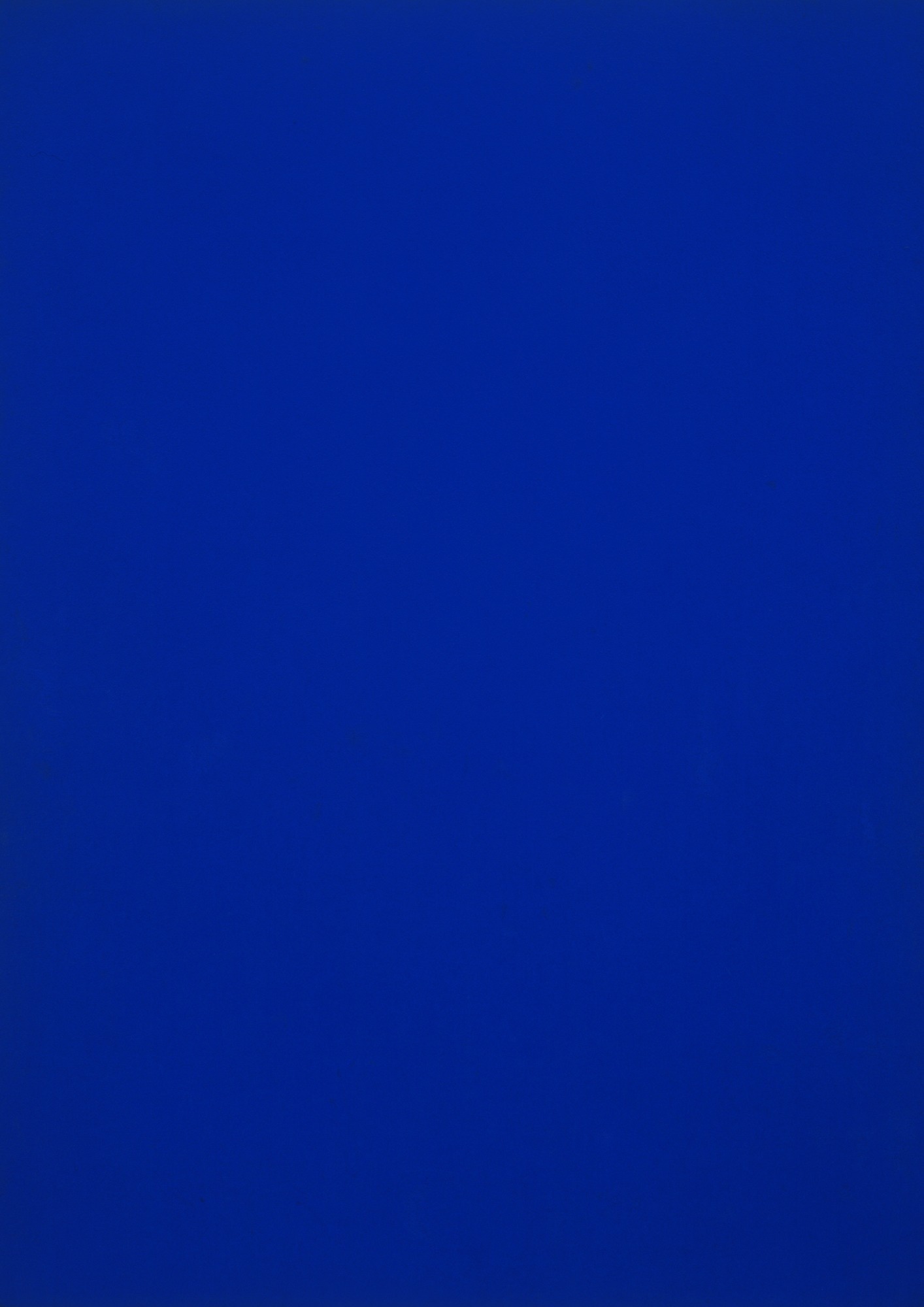
Among a bunch of significant artists, Yves Klein stands out, and there are a handful of his works on show. Klein may well be the most strategically creative and playful artist since Marcel Duchamp. He lived a hard and fast life and died young at 34. Klein didn't so much break rules as ignore them, part of the Neo-Dadist school of art, dispensing with frames, making performative art, and producing works defined by his luminous, Cote d'Azur-influenced blue. And not just any blue but his own. Klein's creative rush was so profound he copyrighted the colour ultramarine IKB, or International Klein Blue, and produced shows of his signature blue monochromes, thereafter painting globes, sponges, busts of Venus - even wanting to paint Cleopatra's Needle blue. Showman, shaman, charlatan, prankster, inventor, marketer and more, Klein divided art opinion. To some he was an alchemistic genius but to others too full of his own artistic posturing, too Lah-di-dah in his Lah-Dada.
At a solo show in 1957 in St Germain des Pres, Klein released 1,001 helium-filled blue balloons; in The Void, the following year, the gallery space in which he showed was empty, yet still it lured more than 2,500 visitors. His famous black-and-white photograph Leaping Into The Void in 1960, (viewable at City Hall) shows Klein suspended mid-air seemingly in flight. He was, but the friends holding a tarpaulin to break his fall were erased from the image.
1960 also marked the year of Klein's most discussed work, Anthropometry of the Blue Period. On March 9, at 7pm, Klein walked into the International Gallery for Contemporary Art at 253 Rue Saint Honore, wearing formal evening clothes. Three women, nude, walked behind him with three pails of blue IKB paint. Simultaneously, a chamber-music orchestra played Klein's composition Symphony Monotone Silence, one chord held for 20 minutes, followed by 20 minutes of total silence. Reports of the event mention one guest heard uttering a parody of Sacha Guitry's witticism on Mozart. "Oh, privilege of the genius! After a piece by Klein, the silence that follows is also signed by him".
For the next 40 minutes Klein guides the creative ritual of the three human brushes, smearing their bodies with IKB, and rolling them on the floor pressing their bodies against the paper and thus, imprinting their "anthropometrics" on it. "What is art for?" one of the audience members asks Klein. "Art is health!" he responds to everyone's amusement.
Why Klein's obsession with the colour blue? Blue, he used to say, evokes the sea and the sky, the utopian and the infinite; all the most abstract things in tangible and visible nature. Klein was experimental in all. He used wind, rain, gold and fire to compose so-called cosmogonic art. He tried to demonstrate that art is nothing if it is not thoroughly unrealistic. It was his passion. Like the remarkable quality of his ultramarine IKB paint, his work seems alive, it shimmers. Klein once said: "At first there is nothing, then there is a profound nothingness, after that a blue profundity." See this true-blue chromatic devotion while you still can, in which Klein created a utopian art category all his own: Infinitism.
Until May 27, Exhibition Hall, Hong Kong City Hall, 9am to 11pm, Monday to Sunday. Free Admission
Image: Pigment Par Bleu, © Succession Yves Klein, ADAGP, Paris
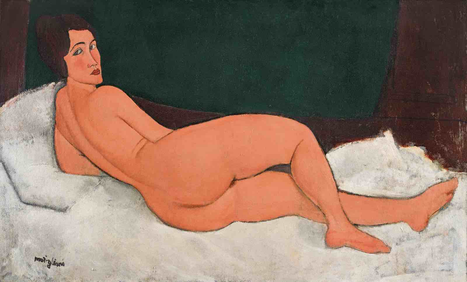
Modigliani's US$150-million muse goes to auction
Is 1917 the most subversive year in the history of art? An adolescent two-fingers directed at the old guard, and the Paris Salon, yet simultaneously, a bold and pre-punky rupture that set a new precedent for the century to come. In the year Sigmund Freud's Introduction to Psychoanalysis saw light of day, the art cognoscenti experienced aesthetic delirium when Marcel Duchamp presented a urinal, which he called Fountain, the most provocative of his so-called Ready-Mades at the Independents of New York exhibition, and declared it 'art'. The seismic gesture still rumbles the art world today as much as it did then.
Sculptural titan Auguste Rodin died the same year, although not from the shock of Duchamp's scatological prank we assume, and with his death the history of art turns a prestigious page just as Duchamp is subverting it. Edgar Degas follows on Rodin's heels. Remarkably, French impressionist Claude Monet is still painting water lilies in his beloved Giverny garden and will go on doing so for another nine years. Meantime in Holland, an avant-garde movement is born when Piet Mondrian and Theo van Doesburg publish the first edition of art magazine De Stijl (The Style). Simultaneously, they establish Abstract Geometric painting and Mondrian's Neoplasticism, a reaction to the Cubism invented by Picasso and Braque. Meanwhile, French artist Ferdinand Leger, gassed at Verdun one pristine, sunny morning during the war paints The Game of Cards, while recovering from burns at Villepinte Hospital in the suburbs of Paris. The work depicts men playing cards between attacks in the trenches, nothing Cezanne hadn't dealt with before, yet in Leger's image, the French soldiers are depicted as disjointed robots, dehumanised like the steel of their helmets and shells.
So for real fiesh and blood of the highest - and most artfully kinetic - order in 1917, if you'd be standing at Berthe Weill gallery, 50 Rue Taitbout in the 18th arrondissement of Paris on the early evening of December 3, you'd have been in the thick of the action, at one of art's most epicentral moments. Police were said to have been "free with their hands" when they confiscated pictures and drawings by Amedeo Modigliani (all nudes) during his vernissage at the gallery. Acting on complaints, they confiscated several paintings by the Paris-based Italian painter "because they were offensive to modesty".
One of which, Nu Couché, sur le côté gauche, above, carried a brief text by the poet Blaise Cendrars in the programme praising "the coming and going of passion". A point not lost on all its viewers before or since it came to Hong Kong in April and prior its May 14 sale in New York through Sotheby's. How was, or wasn't, or will it be, for her. Or is it all a bluff, the only nude of Modigliani's to have her back turned to us, yet staring so directly into our eye, are we, the viewer, unwittingly disturbing her reading. And why is her face so distinctly and geometrically rendered while her feet are all putty and puff.
Modigliani was floating on success at this point. In addition to being the finest example from the series, Nu couché is distinguished further as the largest painting of his entire oeuvre – measuring nearly 58 inches / 147 centimeters across – and the only one of his horizontal nudes to contain the entire figure within the canvas.
And while painting nudes was nothing new in art history, it was Modigliani'a ability to mash-up so much art provenance that made his work so dazzlingly dangerous and glamorous. In this work alone we observe myriad cultures, from Egyptian, Japanese, African, Indian and even Iberian sculpture, to Renaissance frescoes, the influence of Sandro Botticelli, through Romanticism to the cutting-edge of Cubism. It's the history of art with no clothes on in a bunch of rapidly and deftly rendered brushstrokes. Says Simon Shaw, Co-Head Worldwide of Sotheby’s Impressionist & Modern Art Department: “There is the nude before Modigliani, and there is the nude after Modigliani.” That may be but neither category comes close to his vibrancy and remarkable modernity. Now the only question remains, will she or won't she... exceed US$200 million? And counting.
NB: Amedeo Modigliani's Nu Couché, sur le côté gauche sold for US$157.2 million on May 14 in New York. It represented the highest auction price in Sotheby's history. The sale makes Modigliani the first artist to cross the US$150 million auction threshold twice.
Image courtesy of Sotheby's, 2018
Japanese performance artist Miwa Komatsu comes to Hong Kong
Performance art means myriad different things to different people and comes in multiple forms. And it’s now more than 100 years ago that the legendary Cabaret Voltaire was founded – an offshoot of Zurich’s Dada art movement, which comprised performances of poetry, costume, avant-garde music, painting, and more. Something of the same appeared in Japan’s Gutai Association in the 1950s, which staged a mix of theatre, visual art, and philosophy in large multifaceted exhibitions. Most famously in Japan, in 1964’s Cut Piece, Yoko Ono invited audience members to walk on stage and cut away her clothing with a pair of scissors. It accentuated the sense of voyeurism in art and became a strong feminist statement about the dangers of objectification. Two years later, Yayoi Kusama walked the streets of Manhattan in a traditional Japanese kimono with a parasol that was documented in Walking Piece.
Now, more than 50 years later, Japanese artist Miwa Komatsu comes to Hong Kong - as part of her ongoing exhibition at Whitestone Gallery - at the city’s new vertical art tower, H Queens, and its street level Hart Hall pop-up space, to perform a work. But Komatsu takes the ‘Zen-est’ possible approach to her work. She meditates for one hour, before creating a painting in front of an audience. "I meditate and I will pray so I will see something in my mind's eye and then portray what I see," she says. Komatsu paints barefoot, and wears a plain white artist’s smock which in turn becomes something of an artwork in itself. She's currently collaborating with a Japanese designer who will use her prints to make clothes from. "It will be very avant-garde," she says. While Komatsu's performance doesn't embody the voyeurism of Ono, or the faux-exhibitionism of catwalking Kusama, it’s a form of showbusiness on the well-being level, a sort of Picasso meets popular culture meets contemporary mindfulness movement. It's all part of her mantra "to bring art and the people closer together," as she feels young Japanese have become too materialistic and are turning away from art.
Nagano-born Miwa Komatsu grew up in the countryside. She’s inspired by indigenous nature and wherever she happens to be at, and in, the moment. Her work centres entirely on personal themes like the universe, god, equality and perspectives on life and death. She studied at Joshibi College of Art and Design in Tokyo and started out as a photographer staging tiny exhibitions in Japan before finding the confidence to paint what she saw in her head. And the results and success followed with numerous accolades. In 2015, the British Museum acquired her Arita-porcelain guardian dog. Komatsu has been active internationally supplying work to New York’s World Trade Centre, to the movie Hanaikusa in Japan, and mobile video game Terra Battle 2. The latter is a game developed by Hironobu Sakaguchi, creator of Final Fantasy, for which Komatsu drew two guardians, Ajishi and Unjishi. She’s now even leveraging her new-found fame by appearing in television commercials for Sony’s smartphone, Xperia, which started in Tokyo last month. She’s a Vogue magazine darling, except for one rather important detail. She doesn’t follow brands and doesn’t read any fashion magazines at all. "I don't follow brands or buy them for the name. I just buy the clothes I like."
Go see the dynamic Komatsu in action this Sunday (March 25) at 3pm. Hart Hall, 80 Queens Road Central.
Image: Courtesy of Whitestone Gallery
last chance to see: damien hirst visual candy and natural history
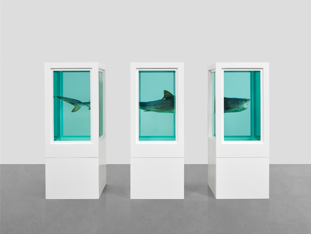
Damien Hirst's infamous shark, philosophically titled The Physical Impossibility of Death in the Mind of Someone Living, (1991), remains the contemporary art world's supreme statement-maker. A monumental two fingers and colossal set of gnashers levelled at what had become Britain's mostly dull, predictable and hierarchical art ecosystem, Hirst literally and metaphorically set out to attack the blubbered elite's complacency with this streamline killing-machine of the deep, chillingly stuck on infinite pause.
Told by a dealer that a young British artist couldn't expect to sell a work - no matter how significant or substantial - for more than GBP10,000, a provoked Hirst smelled art's capitalistic blood and went hunting the money trail. He responded with the pickled predator and sold it to Iraqi-British businessman Charles Saatchi for a staggering GBP50,000. [The specimen, a tiger shark caught off Australia at Hirst's behest, cost GBP6,000]. Detractors said the shark wasn't art and that its title sounded more like literature or poetry. Would Shark: Self Portrait, or Greatest Hit, have been equally compelling titles for the work; or the more surreal, Magritte-esque, This is not a shark? Whatever the visual versus vernacular debate, the creature and the casserole of formaldehyde-d fauna that followed came long before Britain's Tate Modern ever got split into two parts - and Hirst's shark now into three at Gagosian Hong Kong. Seeing it again (this writer saw the original in 1991) even though a smaller specimen than the statement-maker, it still raises the hairs on the back. Entombed yet our tomb simultaneously; an ecstatic agony. And curiously contemporary.
In Roman times, Pliny the Elder wrote of the shark in his Natural History, calling the animal canis marines (dog of the sea). It wasn't until the sixteenth century that new words to describe the selachian terror appeared in French, Spanish and English. And the devouring marine demon we recognise today is a peculiarly modern invention; aided, abetted and famously commercialised by director Steven Spielberg in Jaws (1975).
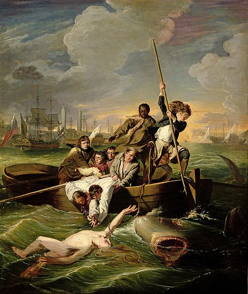
But one man beat Hirst and Spielberg to it; American artist and oil painter John Singleton Copley. He painted Watson and the Shark (1778), which depicts the real-life 1749 rescue of a 14-year-old British cabin boy, Brook Watson, who was attacked while swimming in the sea in Havana, Cuba and rescued by his boat crew. Somewhat miraculously, Watson only lost one foot, and went on to become the Lord Mayor of London, albeit one who hobbled around on a wooden leg. Copley and Watson became good friends and it was the latter who commissioned him to create the work. Reaction to Copley's romanticised yet shocking rendition of the nautical contretemps was no less boisterous than that which greeted Hirst 200 years later. Sharks were art then, moreso now.
But it's not all gills, guts and gore. Hirst's shark forms part of Visual Candy & Natural History, thirty-two works of his paintings and sculptures from the early- to mid-1990s. Since emerging onto the international art scene in the late 1980s as the protagonist of a generation of creatives, the English psycho of the Brit-art set, Hirst created installations, sculptures, paintings and drawings that examine the complex relationships between art, beauty, religion, science, life and death. Through mediums as diverse as household paint, butterfly wings, cow's heads and flies, he has investigated and challenged contemporary belief systems, tracing the uncertainties that lie at the heart of human experience.
The Candy works revel in colour and pattern through an informal, nostalgic painting technique, which stands in opposition to the mechanical application of colour in Hirst’s spot paintings, which followed later.
Visual Candy takes its title from Hirst's 1993 exhibition at Regan Projects in Los Angeles. It resulted from an art critic branding the spot paintings 'just visual candy' which Hirst couldn't shake from his head. Ultimately, the show boasts some of Hirst's most iconic pieces, expressing what the artist describes as: "That failure of trying so hard to do something that you destroy the thing that you're trying to preserve."
Go get thee to Gagosian and take a final bite.
Until March 3. Gagosian Hong Kong, 7/F Pedder Building, 12 Pedder Street, Central, Hong Kong
IMAGES: (From top): Damien Hirst - Myth Explored, Explained, Exploded, 1993-199; Courtesy Gagosian. Artworks @ Damien Hirst and Science Ltd; John Singleton Copley - Watson and the Shark, 1778, Courtesy National Gallery of Art, Washington. D.C.; Damien Hirst - Happiness, 1993-94; Courtesy Gagosian. Artworks @ Damien Hirst and Science Ltd
your weekend cause: see and shop super girl aka chio's charity art
 Aka Chio was born in Macau and graduated from Hong Kong Polytechnic University in 2008 with a design degree. She lives and works in Hong Kong and is a member of the Cantopop girl group Super Girls. Chio has collaborated with leading fashion brands including I.T, creating drawings for advertisements and merchandise. She also maintains a deep interest in social welfare and community art activities, and has collaborated with Green Power, the Hong Kong Federation of Youth Groups, and K for Kids Foundation.
Her current art exhibition, HER, continues in that vein but finishes on January 8. Presented and organised by AC Arts Company and Jam Cast Management (HK) Ltd. together with ZZHK Gallery in Sheung Wan, it's a sale to benefit the Hong Kong Federation of Women's Centres, and specifically, the Women's Relief and Support Fund.
Chio uses her art to explore her idea of womanhood and female identity in contemporary society. The surreal characters in these 20 illustrative drawings - all new - depict the diverse state, condition and role of women, reflecting Chio's concern with issues of women’s rights and welfare, such as trauma in marriage, financial and parenting stress, and the difficulty in seeking help. By using pen and ink on paper and focusing on the visual power of black and white, Chio draws attention to these vulnerable groups. The Cage, a work in which a woman is imprisoned in a golden cage and suffers feeling of entrapment, isolation and dejection, is typical. ISBN spoke with Aka Chio about her art and her feelings.
ISBN: You’ve been supporting charitable, philanthropic female causes for some time. What tangible benefits can you share with us as a result of your actions so far?
AKA CHIO: So far, all the income from my art charity event has been donated to the "Women's Relief and Support Fund" of Hong Kong Federation of Women's Centre to help more women in need. I have talked to some social workers and knew from them that there could be lots of procedures involved when a woman tries to apply for a fund. The waiting time can be very long as well. But then some of them need urgent help, such as cases that involve severe domestic violence. Those women are in a very dangerous situation where their lives are in jeopardy, not to mention their mental health. So it’s important to save them from those situations as soon as possible. And that is what I wanted to do the most. Donations made solely from the paintings so far has been HK$200,000. And we are still trying to increase the number by selling more souvenirs. The exhibition is open until January 8.
ISBN: What’s the best/worst aspect of showbusiness would you say?
AC: Just like your question states – there are best/worst aspects. The best is: If you are someone with an artistic mind who has always been passionate towards performing arts since being young, then the entertainment industry could be the place for you to express yourself and to make your life colourful. Show business is not only a business but also art of a sort. I wouldn't encourage young girls who are not particularly interested in arts but who think that the entertainment industry is cool and exciting, with the expectation of being famous overnight. This industry is all about hard work and lots of effort. Most days, you could be living an unstable life with no guarantee of any jobs at all. And if you are not very passionate about working in the industry or are not experienced in performing, you won’t be a good performer naturally. So even if you get a chance one day, you might just waste it. You have to be honest with yourself - can you really get a sense of satisfaction here? I will say you have to really love performing or you shouldn’t even try entering this field. Because you can only be happy with yourself if you love performing with your heart even in the worst-case scenario – you might not be achieving something great but you would still enjoy what you do simply because you genuinely love what you are doing.
ISBN: Art can be intimidating to judge for some people. How do you judge good art from bad art?
AC: For me, to judge whether an art work is good or not, no matter it is a painting or a sculpture, I have to understand the meaning behind it first. Then, it’s about whether it can elicit any emotion. For me, I don’t “see” beauty in something but “feel” it.
ISBN: Where do you get your art inspiration?
AC: I mainly get inspiration from reading the news and reflecting on it. And I have been to quite a lot of galleries this year, in Germany, Shanghai, Taiwan and Hong Kong.
ISBN: Which Hong Kong/Macau artist's work do you particularly like and follow?
AC: Paul Lung.
ISBN: Can you explain more about the image showing the skeleton and the rhinoceros? What is the significance of that idea?
AC: This painting is about a white rhinoceros. I remember reading some news about how the white rhinoceros will soon be extinct. It's because the last male white rhino has refused to mate with any other females after his partner had died. The world could only watch the last male white rhino grow old slowly and eventually die alone, leading to the extinction of the whole species. As my theme is about women, and I really want to express fidelity in the painting, I was thinking, if only such fidelity and love exist in marriages nowadays in the society, many problems wouldn't even be problems anymore. I really want to express and preserve this spirit. As for the skeleton, though some people say a soul still exists after one dies, the only tangible thing left is the skeleton. So I want to draw the only thing that is left to the world after death, a skeleton, and let it embrace and hug the white rhino. And the spiral implies that the white rhino will become extinct. As I really admire the spirit of the white rhino, I also drew a helium balloon, implying that his spirit will remain and be transported into the sky. These are basically the different layers of meanings in the painting.
ISBN: How long did it take you to produce this series of 20 works?
AC: It took me about half a year. Actually, there were more than the 20 pieces originally. But I wasn’t satisfied with some of them, so I threw away around 8 of them and didn’t include those in the exhibition. So to be exact, if it doesn’t count the ones that are not included, it took me less than half a year. I had to finish the art works in quite a short period of time. Plus I was busy with work, so I had to work around the clock continuously on the pieces.
ISBN: What’s your favourite work in the exhibition and why?
AC: There are actually more than one favourite - the one you have just asked about – the one with the white rhino, is one of them. Also, I really like the one with two girls under a mushroom – it was about the power and the expression of motherly love.
ISBN: When did you first form an acquaintance with the HK Federation of Women’s Centers and what got you involved?
AC: Since the beginning of the year, I had wanted to put together a charity art exhibition. So I did some research online. The group I wanted to help the most is women. Then I saw the name of the HK Federation of Women’s Centers online. I noticed it’s a non-profit organisation that provides courses for women who want to learn some skills in order to make a living for themselves. So I contacted the organisation, as well as asking my company to contact them, making this exhibition possible in the end.
Visit: ZZHK Gallery, 3 Wa Lane, Sheung Wan, Hong Kong (zzhkgallery.com) #akaHERexhibition
last chance to see: the weight of lightness - ink art at M+
Ink is the principle medium in Asian art and most commonly represented by calligraphy and landscape painting. Ink is a discipline with its own system of technique, vocabulary, philosophy and circulation, which has entered into a transnational dialogue. Ink aesthetics (aesthetinks) have become a source of inspiration for contemporary writers, dancers and even composers. And since the mid twentieth-century, this M+ exhibit reminds us, many Asian artists have re-examined and re-evaluated ink in search of techniques that best express their time and personal experience.
In matters calligraphic, this evolution bears particular scrutiny, as the 'written character' has passed from finite meaning and practical communication into the realm of abstraction in which the characters are unrecognisable and meaning elusive.
Notable in this respect is Taiwanese artist Tong Yang-Tze's large scale calligraphy, (below), Spirited, like a far-journeying steed; Floating like a duck on water (2002). The work shows her loyalty to the Chinese written word, yet she pushes it to abstraction. Her virtuosic, expressive strokes the signature expression of ink's dream and dilemma. Contrast that with Hsiao Chin's early painting, (left), Huen-Tuen (1962), which depicts a controlled state of chaos at the beginning of the universe. Both remind us of the fine line between ink and meaning, the physical and intangible, and how its boundless potential can be articulated through a range of poetic, metaphorical, and sensorial interpretations, be that in writing, in rocks, flowers, trees and everything in between.
Images: ©Tong Yang-Tze; ©Hsiao Chin Until Jan 14, 2018. (mplus.org.hk/inkart)
Leonardo da Vinci's Salvator Mundi

Solar power, submarines, why the sky is blue and space is black, aeroplanes, optics, robots, diving equipment, tanks, parachutes, astronomy, architecture, machine guns, cars, and human and animal anatomy; all were subjects that filled the waking and working hours and extensive notebooks of military and naval engineer Leonardo da Vinci, a handsome Florence-born aesthete, who perfumed his hands with lavender, had a sartorial penchant for the colour pink, and also happened to be an artist. It's a remarkable irony of Da Vinci's legacy; for a man whose scientific and investigative research in notebooks was so prodigious, his painted output was costive. Da Vinci, proclaimed by many as the world's most famous artist, painted just 16 artworks during his 67-year lifetime, or at least, only that number survived. He started hundreds, yet his conversion rate was low, or his attention span elsewhere so high, that he quickly acquired a reputation for being slow, if not indifferent. But that was only part of the story. Da Vinci was a perfectionist in matters of painting, working for five or six years on individual canvases, altering colours or shade, here and there, as he saw fit. Part of that is explained by the agony and ecstasy of newfound technology; Da Vinci's art moment coincided with the development of oil paint, and art's switch from tempura colour to oil. As such, art, and specifically painting, took on a whole new dimension, and layering, and Da Vinci was oil paint's pioneer. When his master Andrea del Verrochio saw Da Vinci's first work in oil, he proclaimed, according to Renaissance artist, writer and historian Giorgio Vasari: "Alas, my work is done".
Imagine then, being an astronomer today and discovering a planet. Such a scientific finding could be likened to the discovery of Leonardo Da Vinci's painting, Salvator Mundi in 2005, thought to have been lost or destroyed, but which now represents a sale of biblical proportions through auction house Christie's in New York on November 15. Lest you think the planetary analogy is too grandiose, consider two of Da Vinci's canvases; the Mona Lisa and The Last Supper. This latest discovery is the first since 1909, when the Benoit Madonna, now in the Hermitage, St. Petersburg, Russia, came to light. There are fewer Leonardo paintings in existence than there are Shakespeare plays, yet the work of these two reclusive men and their magnificence, set a course for Western culture that's still palpitant 500 hundred years later. Ironically, for two men who depicted humanity in such detail, neither left behind a defining self-portrait of themselves.
Dating from around 1500, the enigmatic oil-on-panel Salvator Mundi depicts a half-length figure of Christ as Saviour of the World, facing frontally and dressed in flowing robes of lapis and crimson. He holds a crystal orb in his left hand as he raises his right hand in benediction. The painting was long believed to have existed but was generally presumed to have been destroyed until it was rediscovered in 2005.
The painting was first recorded in the Royal collection of King Charles I (1600-1649), and thought to have hung in the private chambers of Henrietta Maria – the wife of King Charles I – in her palace in Greenwich, and was later in the collection of Charles II. Salvator Mundi is next recorded in a 1763 sale by Charles Herbert Sheffield, the illegitimate son of the Duke of Buckingham, who put it into an auction following the sale of what is now Buckingham Palace to the king.
It then disappeared until 1900 when it was acquired by Sir Charles Robinson as a work by Leonardo’s follower, Bernardino Luini, for the Cook Collection, Doughty House, Richmond. By this time, its authorship by Leonardo, origins and illustrious royal history had been entirely forgotten, and Christ’s face and hair were overpainted. In the dispersal of the Cook Collection, it was ultimately consigned to a sale at Sotheby’s in 1958 where it sold for £45. It disappeared once again for nearly 50 years, emerging only in 2005 when it was purchased from an American estate at a small regional auction house. Its rediscovery was followed by six years of painstaking research to document its authenticity with the world’s leading authorities on the works and career of da Vinci.
“Salvator Mundi is a painting of the most iconic figure in the world by the most important artist of all time; the Holy Grail of the art world," says Loic Gouzer, Chairman, Post-War & Contemporary Art at Christie’s in New York. More remarkable still, is that despite the conservation process on the painting, both of Christ’s hands, the curls of his hair, the orb, and much of the drapery are well preserved and close to their original state. The painting retains a remarkable presence and haunting sense of mystery that is characteristic of Leonardo’s finest paintings. Above the left eye (right as we look) are still visible the marks that Leonardo made with the heel of his hand to soften the flesh.
British painter Lucien Freud once said he disliked the paintings of Raphael (a painter who learned a great deal from Leonardo and Michelangelo), because his faces look homogenised, more synthetic than particular and that “there’s no sense of weight, flesh, of the texture of the skin.” Da Vinci didn't just capture sensibility and skin anew, he made reality of art, he de-classicised the mannered heroics of Michelangelo (the two held a healthy dislike and disregard for one another's styles) and prioritised human vulnerability; he took art from the pantheon and made it the reality television of the Renaissance. And to see it in the flesh is a revelation at hand. And a reserve of US$100 million.
Footnote: As of November 15, Salvator Mundi sold in New York for a record US$400 million.
Image: Leonardo da Vinci's Salvator Mundi. Courtesy of Christie's Images Ltd. 2017
arto wong - hong kong young fashion designer 2017

On a night when you could slice the excitement with a knife, or the proverbial couture needle, fifteen of Hong Kong's emerging design talents converged for the Young Fashion Designers' Contest 2017 awards at the Convention and Exhibition Centre, before a table of top industry players and tastemakers, and iconic Japanese designer, MUG, who was the night's VIP.
MUG, a veteran of the Japan fashion scene through her own sassy label G.V.G.V, carried by Hong Kong's I.T Group, also judges contests at Tokyo's legendary Bunka fashion college, the design laboratory where Issey Miyake, Rei Kawakubo and Yohji Yamamoto cut their textural teeth. How did she find the comparison between Tokyo and Hong Kong's designers in 2017. "I found them very close," she says. "The work has similar attention to details and fabrics, and some feels very commercial. You could sell some of the work straight away that I've seen today," she told ISBN, one hour before heralding Hong Kong's design champion.
Which in this case was Arto Wong Hiu To, also winner of the New Talent award, whose collection (left) elevated the mise-en-scene to another level. Her looks graced the runway, a quartet of canvases in quiet harmony. Already a full-time designer, Wong was inspired by the possibilities of transforming molecules into matter. She played with weight and proportion for the ruffles in her knitwear and created patterns from scratch which formed vivid and striking motifs. Voluminous yet light and uplifting, the collection [Zero to Unlimited] and its energy derived from a less-is-more, stealth philosophy. Small molecules, big moment and Wong finds herself HK$35,000 richer, receives mentorship from Joyce boutique to develop a capsule collection of shoes. She will also make a study trip abroad, which includes a visit to G.V.G.V studio, courtesy of Sun Hing Knitting Factory Limited.
Where Wong was stealthy and linear in mind and material, other designers couldn't raid their cupboards fast enough and lacked the same coherence. Stuff was piled high and low, like multiple walking catalogues; one particular standout though was Sonic Lam's outsized red bag [Barren Land], which helped him win First Runner-up prize. There were great themes and ideas elsewhere, too - Jason Lee [Kingdom of the Underground] asked the question: what if grunge rocker Kurt Cobain found himself living in Qing Dynasty China? While the answer wasn't nirvana, Lee's looks, a sort of mashed-up 'China grunge', won him the Best Footwear Design Award (right).
Murfi Lau enacted iconic singer and actor Leslie Cheung as inspiration, exploring the idea of fluid sexuality through gold foil embroidery and cheongsam tailoring techniques [Les Lie]; Helianthus To treated humans as scientific experiments [Lab Rats] in silk organza and yarn, along with ropes and hangar knots, symbolising transparency and constraint. A dotted pattern on the trousers spelled out the Morse Code for "lost" and "SOS", suggesting a cry for help. Oddly, they felt more like angels than laboratory agents and more serene than sterilised. Yoyo Ng [Humeur} reacted to the distorted reality wrought by social media in overlapping and asymmetrical techniques distinguished by digital print, silver foil and netted heads. A particular shout-out must go to Ayumi Kwan [Primordial Hue], an environmentalist whose coral-influenced renderings in an array of pastel felting, hand-painted and weaved embroidery, were as popped-out as Murakami, and surreal as big, fluffy soft toys. The other prevailing trend was black, tribal, utility, functional, sportswear-y street, in styles reminiscent of Yamamoto's Y3, both in Wong Ka Wai [Streamline], and Second Runner-up winner Wilson Choi [The Stolen Soul].
A vibrant, compelling and vivid night for Hong Kong fashion was concluded by MUG addressing the designers. She said each should "try to express their own style through designs that are true to themselves". She noted the originality of Arto Wong's winning knit collection which she said showcased "originality, personal style and market value", and believes Wong is destined for a buzzy career. She also added a word of caution, too. "While marketability is important, designers should not easily be influenced by trends, nor should they find ways to adapt their works to the trends." Ultimately, Wong's collection, Zero to Unlimited, dressed not just the body but best expressed the mindset of the competing designers - four of whom represent The Hong Kong Polytechnic University (HK PolyU) - and watching students, too.
superior interiors
 To walk into Ben Brown Fine Arts in Hong Kong and observe Dutch artist Jan Worst's Interiors is an almighty visual deception. On first sight they appear to be photographs, on which the artist has played some trick of light, and we wonder what elevates them to the realm of 'art'. But closer inspection reveals the creative 'wow' of the work; these are paintings, right down to the last methodical and meticulous detail of the letters on every leather-bound book spine on shelves, gilded door knobs, alabaster statues and folded napkins and wine bottles on dining tables. The photographic realism of these canvases is stunning - almost unsettling - to behold.
Everything's so stately, a sort of Architectural Digest meets Grace Coddington mood board for Vogue, and rendered in a style reminiscent of photographer Robert Polidori's visual diary of the restoration of The Palace of Versailles in France, yet redolent of the Dutch Golden Age in the 17th century and painters such as Jan Vermeer.
Worst portrays lavish interiors of seemingly historic, presumably European, grand homes. Incongruously confined within each dimly lit interior is a young woman whose likeness is directly inspired by contemporary fashion magazines - scantily clad, gazing into the distance, languorously perched upon the formal furniture. It makes us think of the current Guccification of the aesthetic, nurtured by designer Alessandro Michele, the Gucci-sponsored exhibition at England's Chatsworth House, and the adverts the Italian luxury house plans to shoot within Chatsworth and the grounds of the historic house for the next three years. Or did it work the other way. Did Worst make Michele think of such mise-en-scene for the Italian fashion house?
But that's just the half of it. Adding to the tension and sense of voyeurism in these paintings, there is often a seemingly aristocratic small child or older gentleman lurking in a corner or shadow, the female figure entirely unaware of or indifferent to their presence. Or in the case of The Lecture, which has a Hockney-esque staging to it, we sense a connection between 'characters' with a past and present. Belgian artist Michael Borremans does a similar thing with a different palette. He depicts contemporary characters in somewhat ludic outfits and settings, but rather than place them in historic settings, he paints in the historic style of Velasquez or Goya to destabilise the viewer's expectations and understanding.
It's suspense. A plot device as old as storytelling. Worst has maintained a very deliberate ambiguity throughout his career. Is he glorifying or critiquing the wealth and privilege of his subjects and their sumptuous dwellings? Why are these seductive women lurking in staid and airless rooms and what is their relationship to the children and men in the paintings? Worst's paintings challenge viewers with these questions while at the same time simply allow us to savour their beauty, opulence and richness of detail, all perhaps a meditation on human desire.
A young, nude model clinging to a black gown (left) punctuates the centre of a stately room in Divine Details (2013-2014), as though she were cut from a fashion magazine or film still and collaged into the scene. (Worst often uses the same figure in identical poses in other canvases) Worst employs playful contrasts in the painting by depicting an antiquated portrait of a white-wigged sitter hanging directly above the youthful model's head, the ornate candelabra on the wall becoming a mock crown. His dexterous renderings of mirrors and reflections demonstrate his painting virtuosity and reverence for old masters such as Johannes Vermeer. The irresistible beauty of both the female figure and the perfectly appointed room with its rose-patterned carpet and flickering candles subtly belies the unsettling and enigmatic nature of the scene. Great to gaze at, gawp at, and gram, (that's Instagram), for those so inclined.
Ben Brown Fine Arts, Hong Kong, 303 Pedder Building, 12 Pedder Street, Central, Hong Kong. Opening times: Mon-Sat 11am-7pm
Images from top:
Objects and Icons, 2017, oil on canvas, 120cm x 120cm.
A Proper Distance, 2016, oil on canvas, 150cm x 150cm
Divine Details, 2013-2014, oil on canvas, 250cm x 200cm
© 2016 BenBrownFineArts
sotheby's greatest hits
 Sotheby's on March 1 at its Impressionist & Modern Art Evening Sale in London will auction a veritable greatest hits of glamorous canvases by the likes of Gauguin, Picasso, and more, the headliner of which is Gustav Klimt's luminous Bauerngarten, (1907, left), dating from the artist’s celebrated and much-loved golden period and from the same year as his famous golden irradiation of Adele Bloch-Bauer I. Innovative in its composition and jewel-like in its blaze of colours, Bauerngarten is one of the Klimt's greatest and rarest works to come to auction. Klimt's landscapes often bear the 'echo' of a figure - here the shape of a woman, or a dress, or a woman in a dress is decipherable in the triangular composition of the flowers. Bauerngarten was painted during summer, when Klimt would retreat to the shore of Attersee to paint, with his lifelong companion designer Emilie Floge.
Influence: Impressionist and Post-Impressionist leanings on Klimt are evident, from Claude Monet's treatment of waterlilies to Van Gogh's dynamic still life flower portraits. Just as Monet used square canvases to depict his waterlily ponds at Giverny, so Klimt chose a square canvas to heighten the work's impact. By stripping away sky, and taking a 'point of view' approach to a scene, their work was more abstract, joyful, patterned and coloured. It is thus possible to look at Bauerngarten and see a quartet of combined influence with dazzling technical ability melded into one: Monet's Nympheas, Van Gogh's Nature more, vase aux marguerites, any Edgar Degas' Four Dancers, and any Toulouse Lautrec promotional Moulin Rouge posters. (Estimates on request, but expect anything up to US$60 million).
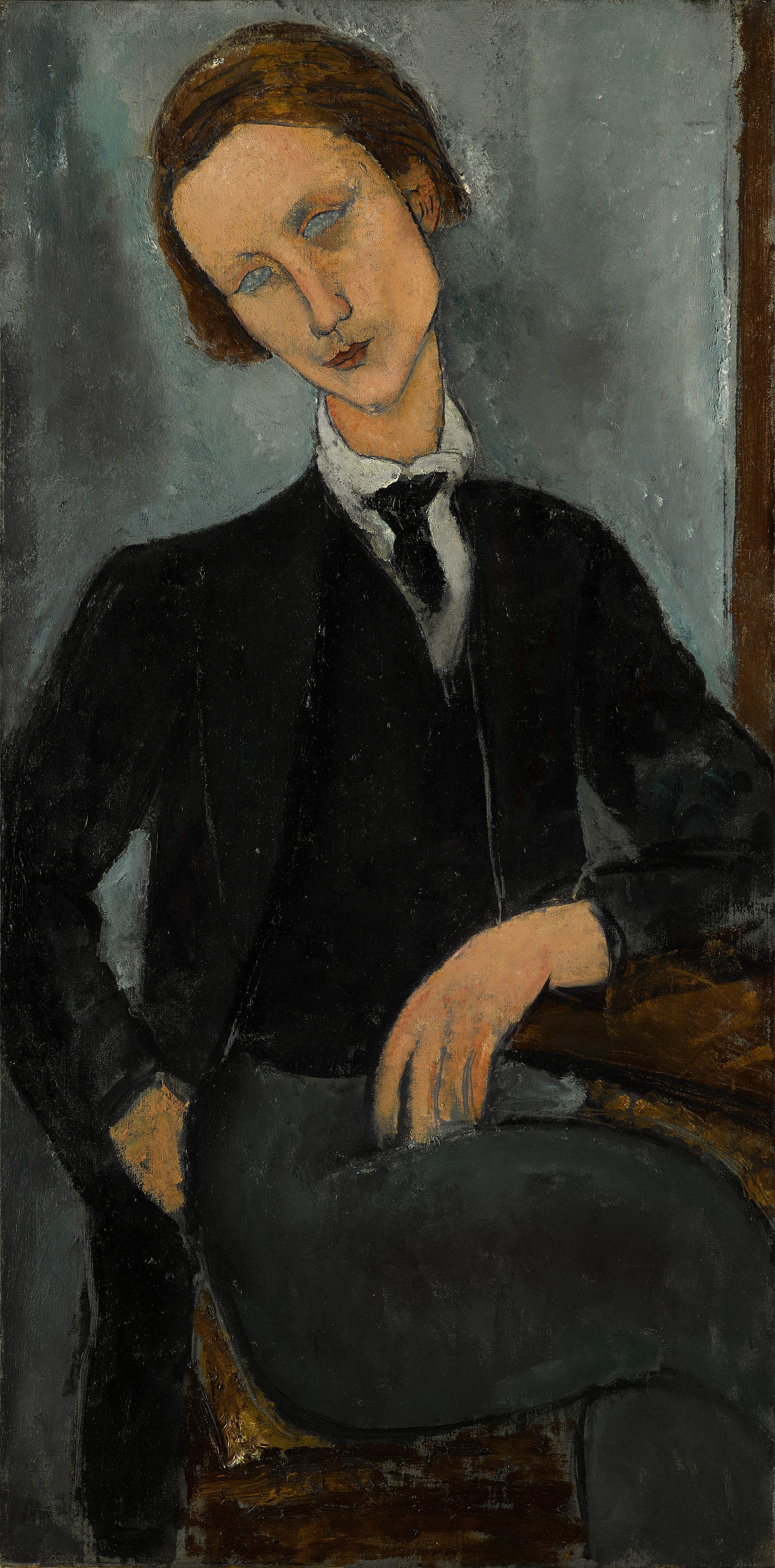
Then there's Amedeo Modigliani, whose Nu couché (Reclining Nude) set a record as the world's second most expensive painting in 2015 at US$170.4 million. This one, Portrait de Baranowski (right) painted in 1918, depicts a young Polish poet and painter - Pierre-Edouard Baranowski - with fragile good looks and a pensive, introspective air which captures typical Modigliani elements - geometric simplification of the stylised human form to the almond, vacant eyes that render the sitter impenetrable. Modigliani was a chronicler of the vie boheme of Montparnasse and this piece is typical. Its estimate is small relative to Nu couché, but its transgendered ambiguity hits a zeitgeistful sweet spot. (He could be the Chanel Monsieur poster-boy should the brand ever launch couture menswear). Estimated at US$18.55 million. Expect US$30m.
Pablo Picasso's Plant de tomato (left) was not a work we knew the existence of. Painted between August 6-9, 1944, (and one of five he painted over nine days) symbolic of victory in Europe, and created in the apartment he shared with his lover Marie-Therese, it's ripe with personal as well as political and cultural significance - reflecting the spirit of hope and resilience of the times. Rarely can a still life - the grey and yellow background of which reflects the smoke and gunfire pervading the city - have been invested with such meaning. Picasso's artwork was blacklisted by the Nazi regime and paintings he completed during this time remained in his studio and were only exhibited after the war. The painting has been in a private collection for the last 40 years. (Estimated at US$18,550, expect US$25 million). All an interesting barometer of the art world market in the time of President Donald Trump.
Images: Courtesy of Sotheby's
points of view
If you only see one art exhibition this spring, make it Swedish painter Jens Fänge's Sister Feelings, showing at Galerie Perrotin in Hong Kong (until March 11), comprising 17 panel paintings created in 2016. And eye-catchingly topical stuff it makes too. You won't discern the exact likeness of the late great David Bowie, but his presence resides in one of the images, or even two. Music and Fänge it transpires, are close bedfellows - the show is named after a former punk album by the band that became Simple Minds. And in a remarkable coincidence, the Bob Dylan-loving Fänge was asked by Stockholm's legendary Nobel Peace Prize organisation to produce an artwork for Dylan's Nobel Diploma. (All Nobel Prize winners receive diplomas with commissioned pieces of art).
Fänge's shifting perspectives, points of view and intertextual references don't make for easy explanation, but do create intrigue, storytelling and provocative symbiosis. It's tempting to view each work as a short story, or narrative game of 'what happens next', or 'what just happened' prior the image in question, but Fänge likens them to "singles on an album". Either way, in each language or listening, or viewing or watching - a series of inter-states we seem to flit between when we stand in front of Fänge's work, this latter-day Pieter de Hooch-like panel-ism makes for the most fantastical parlour game of picture reading.
Fänge's work echoes that of others; he's sometimes compared with Italian surrealist Giorgio de Chirico, whose painting felt as though he were transcribing dreams, though the Swede's work feels more dream as drama, or theatre of the absurd. His assemblage and collage can feel Henri Matisse-ian, his colour palette Andre Derain-ian, his rainbow whisps of colour Wassali Kandinsky-esque or his random patterns the Kasimir Malevich-ian syntax of Suprematism. The relief in the work Kurt Schwitters, the suspense not un-Hopperesque, the perspective Edvard Munchian, a Hockney-an photo splash, his upended - and suspended - figures Baselitzian, his emphasis on found objects Alberto Burri-an. But high or low, fine art or commercial, painterly or post-modern or pre-and-post-pop, Dadaism or Dutch Golden Age, his work has a kind of all-schoolism about it. Strangely the work reminded this writer most of Jan Van Eyck and The Arnolfini Portrait (1434), distinguished by its use of a mirror which reflects the artist's subjects from the back and even hints at the presence of the Flemish painter.
Whatever the surrealistic matryoshka-like aesthetics, the paintings within paintings, the composites, iconic portraits, still lives, domestic interiors, cityscapes and landscapes of geometric abstraction, rendered in oil paint, pencil, vinyl, cardboard and fabric on panel, look out for the work above, Arrivals, which feels for all the world as though Munch's early 20th-century Scream subject has departed his/her haunted bridge and reappeared as cut-out retrospectively gazing back over the last 100 years from the democratised and domestic mis-en-scene of a living room wondering what all the fuss was about - not unlike the passage of art over the same period. Subtle and tantalising, once seen, you won't get this soundtrack out of your head.
IMAGE: Jens FÄNGE, Arrivals, 2016. Oil, vinyl and fabric on panel 65 x 54 cm. Courtesy Galerie Perrotin.
17/F, 50 Connaught Road Central, Hong Kong; T: +852 3758 2180; E: hongkong@perrotin.com
Opening hours: Tuesday - Saturday 11am - 7pm
t.o.p of the class: asia's young art aficionados changing global landscape
The geo-cultural shift in the global art market was clearly felt at Sotheby's Hong Kong early this month. The auction house - in a prescient marketing ploy - enlisted pop phenom T.O.P (real name Choi Seung-Hyun) from Korea's all-boy band BIG BANG to curate an art exhibition for auction. T.O.P's interest in art isn't coincidental - his granduncle is Korea's leading post-war contemporary artist Kim Whanki, and T.O.P has parlayed that influence into good friendships with the likes of Japan's Takashi Murakami and other artists. He also leveraged his artistic clout to borrow Jean-Michel Basquiat's Infantry from Japanese collector Yusaku Maezawa, who bought it earlier this year.
The exhibition and auction, #TTTOP, the result of a year-long collaboration, celebrates the rise of young Asian collectors who seek art across cultural boundaries. By showcasing new and important Asian artists, the sale united various generations, cultures, styles and schools of thought. This selection not only reflected T.O.P’s artistic choices - he commissioned six works from Japanese artists including Murakami - but also the international taste of the young Asian collecting community. A portion of the proceeds of the sale will be donated to the Asian Cultural Council (ACC) to provide opportunities to emerging Asian artists.
Yuki Terase, Specialist of Sotheby's Contemporary Asian Art Department and curator in charge of the sale which raised US$17.4 million, said of the event: "Through video, social media, the web and exhibitions in Korea and Hong Kong, we introduced millions of young enthusiasts to T.O.P's passion for art and the work of this special group of contemporary artists."
Part of that community includes heavyweights like Shanghai's Kelly Ying. China's answer to Moscow's Dasha Zhukova, Ying co-founded Art021 Shanghai Contemporary Art Fair with Bao YIfeng in 2013, on a scale and ambition to rival Art Basel. (This year's Art021, November 11-13, features work Ying especially commissioned from prominent Chinese artist Liu Wei and the inaugural visit of New York art power dealer David Zwirner).
Ying was shopping during T.O.P's art moment and had her eye on a very personal and stunning piece. T.O.P had commissioned Naoki Tomita, a young Japanese painter and recent graduate of Tokyo University of the Arts, to create an oil painting View (T.O.P) from a photo he'd originally taken on his iPhone in Germany and posted to his Instagram. It came as little surprise shortly after Terase registered a telephone bid of US$29,000, to find a joyous message posted on Ying's Instagram account (@kellyyingxoxo): "Finally I got it!!, wrote Ying, "Love the concept and the artist."
Asia is making its voice and presence increasingly felt in the art world, and a 20-something pop and art star with a 5.8 million Instagram following (@choi_seung_hyun_tttop) whose curation and art commissioning is watched and bought by glamorous 30-something artrepreneur and cultural impresario Ying, is a sino the times in a rapidly changing art world.
Image: Naoki Tomita, View (T.O.P). Courtesy of Sotheby's Hong Kong
Degas: the draughtsman's contract
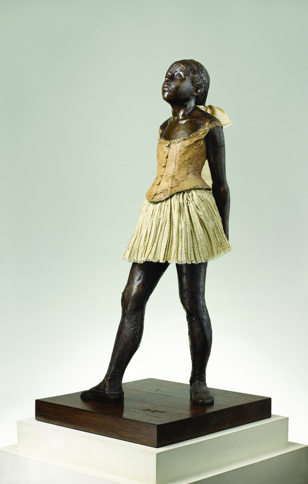
Despite being exhibited with the Impressionist school of painting - with which he was mistakenly associated - French artist Edgar Degas was scathing of the movement. Plein-air, or open air - the creative cry of Claude Monet and his cohorts - was anathema to Degas, the consummate draughtsman and technical innovator. On visiting a Monet exhibition at Durand-Paul in Paris, Degas declared: "I met Monet and said: 'Let me get out of here. Those reflections in the water hurt my eyes!' Degas claimed Monet's pictures were "too draughty" and made him "turn up my coat collar" for fear of catching cold. Furthermore, he referred to the impressionists mockingly as 'the landscapists', and claimed an urge to want to fire at them in the countryside, he told Andre Gide in 1909. "Bang! Bang! There should be a police force for that purpose," he said.
So while they battled mosquitoes and sunstroke in pastoral settings, Degas stuck to his attic studio like a hermit: "I can get along very well without ever going out of my own house," Degas would say. "With a bowl of soup and three old brushes you can make the finest landscape ever painted." Yet he didn't care much for colour either, preferring black and white. Economy of colour and speech, was a Degas trademark. Observing the Japanese Exhibition in 1890 at the Beaux-Arts, he's as pinpoint as his artistic technique: "Alas! Alas! Taste everywhere!"
Degas, contrary to the commonly held belief that his paintings - like photography - captured only fragmented scenes in daily life, resisted the urge to capture 'the moment'. He once said: “No art was ever less spontaneous than mine. What I do is the result of reflection and the study of the Great Masters."
And so it was. Degas' feeling for the modern aesthetic was rooted in a robust sense of artistic tradition. Discussing a red-chalk drawing of a hand he'd purchased by Ingres, here's Degas: "Look at those fingernails, see how they are rendered. That is my ideal of genius, a man who finds a hand so lovely, so wonderful, so difficult to render, that he will shut himself away, content to do nothing but indicate fingernails."
Such obsession accords with Degas penchant for the gestures of individuals absorbed in a particular task - the recurring pose of a ballet dancer tying her slipper, for example. Degas it seems, struggled with the opposition in his work between the contained and the expressive. Don't look for story in a Degas painting, there isn't one, yet each canvas presents the syntax of artistic technique.
To those who called him the painter of the "ballet rats", Degas said later in life: "People call me the painter of dancing girls. It has never occurred to them that my chief interest in dancers lies in rendering movement and painting pretty clothes." Never a truer word was spoke. For memorable paintings of fleshed-out, full-blooded dancing girls look no further than Degas' contemporary Henri de Toulouse-Lautrec, who celebrated dancing's glamour and its characters, not its geometry and calculus. Degas, at times, can feel as much number cruncher as creative spirit, more spreadsheet than starving artist, the latter of which, he never was.
"If one wants to be a serious artist today and create a little niche, one must immerse oneself in solitude. There is too much tittle-tattle. It is as if paintings were made - like speculations on the stock markets - out of the friction among people eager for gain. All this trading sharpens your mind and falsifies your judgement." So wrote Degas, at the tender age of 22, in 1856. It would be another 22 years before he first exhibited La danseuse a la robe de tulle, (pictured) at the World's Fair in 1878. It was, somewhat remarkably, the only sculptural work shown during his lifetime. Pierre-Auguste Renoir called Degas the best sculptor in Paris on account of the little dancer, recalls art dealer Ambrose Vollard, on the very day that Rodin sold The Thinker and the Gates of Hell to a private collector in Paris.
Degas had a private income, and became a high-powered collector (little known to many of his contemporaries) building a veritable art inventory at his home at 6 Boulevard de Clichy in Paris. He acquired Ingres and Delacroix, El Greco and Van Gogh, David and Cezanne, Manet, Millet and Mary Cassatt, among others, mostly from Vollard. At an auction of his collection in 1918, one year after Degas' death, Manet's Grand portrait de familie was withdrawn after the Louvre purchased it for 400,000 French francs. An article in Le Monde by year's end claimed that proceeds from the sales of Degas' collection had surpassed 12 million French francs. Proof that no artist had such an eye and ear for movement, be it art or the stock market's, as the spectacular and speculative Monsieur Degas.
Degas, Figures in Motion showcases 74 bronze sculptures never before shown in Asia, supported by the French Consulate General of France in Hong Kong & Macau through the Le French May at MGM Art Space, MGM Macau, until November 20, 2016. Opening hours: 12pm-9pm, closed on Mondays (except public holidays). Free admission.
Image: The Little Fourteen Year Old Dancer. The M.T. Abraham Foundation for the Visual Arts © All Rights Reserved.
Monet: man of the moment
For a man whose work appears today so art establishment, Claude Monet’s influence on painting was radical and divisive in its day. Monet (1840-1926) urged his friends and peers (which included types like Edouard Manet doing portrait and figure compositions) to abandon formula and get out of their studios, paint en plein air (open air) in front of the ‘motif’. Monet took to the water and had a small boat fitted out as his mobile studio - an effect so dramatic, Manet painted Monet working in his boat, in 1874.
Monet had been influenced by JMW Turner, the British painter whose London seascapes convinced Monet that the effects of light and air combined with water mattered more than practical subject matter. Monet painted in the moment, a technical innovation. As nature evolved by the minute, so Monet said the painter must work fast, capturing light as it was changing. Forget the multi-layered Old Mastery of nature as a finished work, this was pre-photographic shutter speed strokes of the brush, the artist in New-World instantaneousness. And the critics, much like the Establishment, hated it.
In France at that time, the only venue for an artist to gain recognition was the Salon de Paris, an annual and biannual exhibition of the Academie des Beaux-Arts, whose conservative offerings perfectly matched the audience's preconceived notions of the look and purpose of art. Monet and his contemporaries couldn't get their work accepted by the Salon in 1863. (Neither could Manet or Whistler, doubly ironic given that Manet acknowledged his inspiration as coming from the Old Master tradition of Titian, Velazquez and even Goya).
As a result, Monet and friends in 1874 arranged a show at Durand-Ruel, a photographer's studio. One of Monet's pictures - a harbour seen through morning mist - was titled in the catalogue, Impression: sunrise. One of the critics saw the image, and underwhelmed by its ridiculous title, referred to the artists as The Impressionists - it wasn't a compliment; he thought the work unsound from an artistic perspective and more like 'pictures'. He wrote: "What ease in the brushwork. Wallpaper in its embryonic state is more laboured than this seascape." But the label stuck. A satirical magazine of the time labelled them lunatics suffering from collective delusion.
By 1900, at the age of 60, in the same Durand-Ruel gallery, Monet exhibited 22 paintings of his most daring work: the waterlilies in his Giverny garden, into which he’d moved in 1883. Monet had to ask the mayor of Giverny if he could dig a small pond in his garden and install a sluice so he might capture the water from the Epte river flowing alongside it. He grew exotic plants and installed a Japanese bridge inspired by Hiroshige’s One Hundred Famous Sites in Edo; he also had rare flowers delivered to the garden from Japan through Tamada Hayashi, a Japanese dealer and collector living in Paris. The work was a triumph and the influence of The Impressionists and their once called ‘palette scrapings’ assured.
Claude Monet: The Spirit of Place at the Hong Kong Heritage Museum (part of Le French May 2016 festival in Hong Kong) is the largest exhibition ever devoted to the artist in the city. It features some of his most emblematic paintings, pastels and tapestries from site-specific places in his life; Normandy and Brittany Paris and the Ile-de-France region; London and Venice; and Giverny. Proof that over 70 years, his genius and perseverance ensured universal approval. Monet was a free spirit and much like his work, a force of nature.
Claude Monet: The Spirit of Place. Hong Kong Heritage Museum, May 4 - July 11.
Image: Courtesy the Hong Kong Heritage Museum; Le French May
H&M: "The best of the best"
 Magnus Olsson was appointed Country Manager at H&M of Greater China (Mainland, Hong Kong, Taiwan and Macau) this year and has been in Asia for two-and-a-half years. Prior Asia, he worked in various positions and countries within H&M and has been at the Stockholm-based company for more than 20 years. ISBN spoke with him on the eve of H&M's launch of its largest global flagship store [October 29] in Hong Kong’s Causeway Bay and the brand’s current designer collaboration #HMBalmaination with Balmain's Olivier Rousteing [November 5].
What’s your definition of success for the new four-floor Causeway Bay store?
When I see the customers lining up, and hear the excitement coming, and yesterday I passed by a friend of my wife, saying ‘see you on Thursday’, that to me is amazing. Because then we fulfil a need, a satisfaction. If people can, in general, dress a personality regardless of their economic situation, I think we have succeeded.
The billboards outside the store during construction are white and gold. Not an obvious H&M choice.
Is it good or bad?
Good. But when I first saw it, I didn’t think H&M. I was looking for some red.
But the feeling is that it should be something exclusive and gold has that quality.
Will there be a celebrity performance at the event?
We have the Canto-pop singer and actress Sammi Cheng. She’s singing for the first time in-store, and it’s the first in-store performance for H&M. So it’s a first for both of us.
You’ve been in Asia for two-and-a half years. What surprised you most about this market?
The speed of development and the dynamism. It’s a very creative environment with a lot of energy.
Why has it taken so long to open another store on Hong Kong island?
We only came to Asia in 2007, now we have 285 stores in the region. We have worked pretty hard. This year we have also opened up Taiwan as a market and we have opened up Macau as a market. There is a limited amount of large space. We wanted to make sure we had the best location. It also had to be a store that creates this extra shopping experience, an amazing shopping experience. There are a lot of criteria to be fulfilled. It’s not that easy.
The limited amount of supply of great retail space made that process slower. When we open in shopping centres we can see the number of people coming to the centre increases.
How many stores are there in China?
We are in an expansion period. I would say right now we have 205-ish. If you take Greater China the customers appreciate that we’re a global fashion brand and after that comes credibility, and aspiration of what the consumer wants. That’s interesting to me and gives us great confidence in the future of China.
Does Chinese President Xi Jinping shop at H&M?
No. Not that I’ve seen.
And his glamorous wife Peng Liyuan? She’s also something of a celebrity?
You have some very good ideas [laughter]. But we do have a lot of Chinese ambassadors that like H&M and help to promote the brand.
Balmain. Congratulations, it’s a great, young, buzzy campaign.
Thank you. The good thing is that it ticks all the right boxes of collaboration to show that price and design is not necessarily a contradiction. We want to surprise our customers and I think this collaboration was a surprise as well.
Has it got harder to surprise?
More and more companies are doing designer collaboration, but without sounding too partial, I think we are the best one doing it. But I don’t think that anyone else is doing it in the way we do it with the quality of designers. It’s really there. The best of the best.
Can we expect Marc Jacobs soon?

Would that be a surprise though?
Five years ago, yes. Now I’m not so sure.
Obviously I cannot comment. But you’re not the only one that has mentioned Marc Jacobs.
Maybe H&M could start again, revisit the greatest hits. Like Karl Lagerfeld 2.0?
That could be a really interesting surprise, I agree. Karl Lagerfeld was one of my favourites of course. He was the first one as well. A very exciting collection.
You lived in London for eight years. What did you like about it?
There is so much I like about it. You have the history, you have the multicultural aspects all living together, and I love the British humour and the football as well.
COS is based in London. Do you oversee that brand too in Asia?
We work in collaboration with COS locally. It’s a great success, a great brand. Absolutely we’re looking into more COS stores as well, but as with H&M, it’s important that it’s the right location, and the right business terms. COS has a very tight expression, its a very style-sensitive brand. It can also compare to much higher priced labels.
Does anyone ask you what COS stands for?
No. Strangely enough I never get asked that question. It’s just accepted as it is. Of COS.
Tell us about And Other Stories. Where do you place that in the H&M/COS hierarchy?
It’s a fairly new brand. Obviously we would like to bring that to Asia as well. We are looking into it, but we’ll wait until we’re ready. It complements COS/H&M. It’s a very style and fashion conscious concept with a great identity as well. Other Stories do only ladies clothes though. It has a big proportion of accessories. It’s high fashion, style, quality and price.
Where would you recommend people to go in Stockholm?
It depends upon the preference. The archipelago is magnificent, but that’s obvious. I enjoy Liljevalchs, an art gallery [one hundred years old in 2016]. And then the Mood galleria for shopping; the great thing about Mood is that there are lots of H&M stores around it. You would have four opportunities to shop H&M. That’s quite important. There’s a museum called Fotografiska for contemporary photography that is great as well [showing Martin Schoeller Up Close until February 2016]. I’d recommend food shopping at Östermalms Hallen, which is more like an old-style market place, with good quality food in a beautiful setting. There’s a place called Sofo / Nytorget with a lot of shops, though not so many H&M stores. For restaurants, I think Riche is good for both lunch and dinner. A classical restaurant called Prinsen is very good. Then there’s Café Opera. What else? There’s also a place called Kött & Fiskbaren. And I also have on my list Rosendal’s Garden Café which is very romantic and beautiful.
Twenty years at H&M. You and the company must be doing things right. How do you maintain the work/life balance?
H&M is a company where we appreciate work/life balance from the perspective of trying to keep things simple and not overdoing things. We do not promote anyone just because of long hours. Another point, because of our female workforce we are used to having workers on maternity leave, which in fact, isn’t a problem but becomes more like an opportunity, which we all appreciate. I try to be efficient, plan ahead and spend as much time as I can on both. Get a job you enjoy, and the work/life balance takes care of itself.
What’s your favourite Ingmar Bergman film?
Fanny & Alexander. In fact, that’s the only Bergman film I like. While I recognise him as a director, his are not the kind of movies I spend a lot of time with.
So what is your desert island film?
Dead Poet’s Society.
Apple or Samsung?
Apple. But I also like Sony Ericsson.
Art. Do you like and collect art?
I don’t actively collect. I like interior design more than art. But I like the work of John Constable. He’s not modern, but his technique is admirable.
ani-manga memories at sotheby's hong kong
Sotheby’s Hong Kong's Contemporary Showcase “Manga” auction is currently showing at its S | 2 gallery with an accompanying digital sale (from May 5-11). Browsing among the more than 90 highlights from Studio Ghibli and Toei Animation, we made a revealing discovery comprising a quartet of leading female Japanese manga artists starting with Masako Watanabe, the first woman mangaka to be decorated with Japan’s prestigious Order of the Rising Sun in 2006. The other three are Eiko Hanamura, Riyoko Ikeda and Machiko Satonaka, all of whom have signed beneath their works.
The exhibition, billed as the largest Manga portfolio ever offered at auction, has the anticipated 'Manga-fication' of legends such as the 'godfather of manga' Osamu Tezuka, often called the "Walt Disney of Japan'. Tezuka, who invented the large, distinctive eyes of manga, created such franchises as Astro Boy, Princess Knight, Kimba the White Lion, Black Jack, Phoenix and Dororo.
There's also other 'ubiquicons' of anime culture such as the earless robotic 22nd-century cat Doraemon (created in 1969, appointed Japan's first 'anime ambassador' in 2008, and the highest-grossing anime film franchise in Japan); Pokémon, Pikachu (one of the lead characters in Pokémon video games), Dragon Ball (perhaps the most famous manga-turned-anime and published from 1984); One Piece, (published 1997, written by Oda Eiichirō and currently the best-selling manga series in history) which follows the adventures of Monkey D. Luffy whose body gains the properties of rubber; and Slam Dunk (the most popular sports-themed manga written by Takehiko Inoue).
There's also a unique selection of drawings and original Animation Celluloid Pictures (cel-ga) by some of the most prestigious anime houses such Studio Ghibli and Toei Animation featuring Sailormoon, Kiki's Delivery Service, Detective Conan, Saint-Seika: Knights of the Zodiac, Neon Genesis Evangelion, The Return Lum, Mobile Suit Gundam, Apanman, Crayon Shin-Chan, Castle in the Sky, and My Neighbour Totoro.
Go get the ani-manga memories on and snatch a bargain or 60 in the process.
Exhibition Details 29 Apr – 8 May 2020
MON – FRI 10am - 6pm; SAT 11am - 5pm (Closed on SUN and Public Holidays)
Venue: Sotheby’s Hong Kong Gallery, 5/F, One Pacific Place, 88 Queensway, Hong Kong
Guest Visit - By Appointment Only
Email HKGallery@Sothebys.com to make an appointment prior to your visit.
For other inquiries, contact +852 2886 7887.
Digital Auction: May 5 - May 11
Images: ISBN-Magazine
surveillance pinocchio
In these times of Covid-19 and almost total lockdown, visits to galleries are few and far between. Still accessible, and appropriately uplifting, is Whitestone Gallery Hong Kong's Little Fables, a group exhibition featuring the dynamic work of six young artists - Sebastian Chaumeton (UK), Jiang Miao (China), Etsu Egami (Japan), Yuji Kanamaru (Japan), Asa Go (Japan / Korea) and Karen Shiozawa (Japan).
Whilst fables are generally read by children so to teach them how to behave in the society, there are also cultural values embedded in fables coming from different countries and regions, and moreover, some of them even have themes of adulthood that are revealing the dark side of the world.
In this exhibition, the artists compose their own fables. Despite great work across the board, the obvious and catchiest highlight is Sebastian Chaumeton’s art installation that consists of his latest paintings and sculptures, making references to social media, meme culture, art history, politics, etc. He renders all through the puppet Pinocchio and Kermit and appropriates everything from Rodin's The Thinker to the clamour for toilet roll in stores in the wake of the global pandemic.
In addition, young artists Etsu Egami and Karen Shiozawa (the latter a sort of Banksy's little girl goes into the woods, was sold out in the first three days) are showing in Hong Kong for the first time, both of whom explore notions of self-discovery or invoke dreamy landscape. Jiang Miao (whose work channels everyone from Miwa Komatsu to Gutai and Takashi Murakami) and Yuji Kanamaru are both presenting new work. Using themes related to life and death, the artists communicate with the audience through “heavenly eyes”, and animals that carry different meanings. Lastly, Asa Go’s work from 2007 will take people on the path of imagination, being mesmerised in her version of fable. A vivid, tight and fresh show of new talent. (Extended until May 18, 2020).
Whitestone Gallery Hong Kong, 7-8/F, H Queen's Road Central, Hong Kong. whitestone-gallery.com
yonfan q&a: no. 7 cherry lane - best screenplay, venice film festival 2019
One of Asian cinema's auteurs, Hong Kong-based director Yonfan's No. 7 Cherry Lane, his first film in 10 years, his debut animation, and the first Hong Kong film since 2011 to vie for the Golden Lion top prize, won Best Screenplay award at this month's Venice Film Festival. Set in Hong Kong in the 1960s, the film tells of a love-entangled triangle between a mother, her daughter and an English-language tutor, whose visits to the cinema bring them magical moments and reveal forbidden passions. The era coincides with Hong Kong's turbulent times of 1967. Yonfan writes, directs and produces his own films, and also serves as art director on his projects. Two months earlier, ISBN met Yonfan and discussed the process of making his first animation and why the film feels like the director's love letter to Hong Kong, and to Art.
ISBN: You have described No.7 Cherry Lane as a love poem to Hong Kong. It also feels like a 125-minute love poem to Art.
YONFAN: I described my film as a love letter to Hong Kong, not a poem. Poetry is too big a word with which to decorate my humble self. I love the word art. It can be anything - high and low, beauty and the beast, rich and poor, east and west, physical and spiritual, democrat and republican... all the contradictions that give the motivation force, and that makes the art. I am fortunate to know my definition of art. Many people think art means only beauty that pleases one’s senses, but it is not. Art is also not a commodity that is defined by name and money. So if you say No.7 Cherry Lane is my love letter to art, I think you have chosen the right description.
ISBN: There are so many intertextual references in the film - to cinema, literature, to art, to philosophy, and more. Did you manage to include everything you wanted or did you make sacrifices?
YF: Through the years I have tried to learn not to be greedy. But with No.7 Cherry Lane I put many ingredients intoone movie - di erent styles of paintings, a mixture of eastand west culture, music in a classical form that clashes with that clashes with street music and even Chinese Opera, so perhaps I'm greedy putting everything in one oven to cook. I don’t know whether it works or not, but it’s good experience.
ISBN: The classic Marcel Proust novel Remembrance of Things Past is one of the first references made in the film. When and where did you first encounter this book and under which circumstances?YF: That evokes good memories. In 1970, I read the manuscripts of Wen Tong-he’s [Qing dynasty Confucian scholar] diary for Marina Warner’s first book, The Dragon Empress, in a Cambridge university library. I decided to spend a year doing the job. I hitchhiked to the university town and got a lift with an English undergraduate from Peterhouse [the oldest college at the university]. He invited me for tea in his room and told me about Proust. That was the first time I had ever heard about Remembrance of Things Past. Later that year, I saw volumes of the book in the library and thought how intellectual it would be to read it. I started with Swann’s Way but after two pages I decided I was not the literary type. I can still remember that kind, handsome young student though, who resembled one of the characters from Romeo and Juliet, and his name is Justin Shepherd.
ISBN: Much of the film’s drama (both intimacy and intensity) takes place within Mrs Yu’s lounge, and the scenes move very deliberately within it. Tell us about how you ‘constructed’ that high-key yet humble interior space and ‘found’ the speed, or stealth, with which to shoot?
YF: I really cannot tell how I wrote all those scenes and the dialogues in the movie. Probably it’s the magnification of my own ‘remembrance of things past’. You asked about my first experience with Marcel Proust, and coincidentally, it’s almost the same situation as happenedin the movie. I think probably the whole film is based on people and things and conversations with which I am truly familiar. Although this movie happens in a post-modern 1967, it was the period I knew best. I was 20 that year.
ISBN: At one point, a classic Chinese song morphs into a three-minute street rap by Mrs Yu’s 18-year-old daughter Meiling. It’s a remarkable and most unexpected juncture in the film yet epic in effect. What prompted this development and how challenging was it to execute and write lyrics for?
YF: No.7 Cherry Lane is a story about yesterday, today and tomorrow, and we have an original theme song Southern Cross to accompany it. To complete the cry out of the mother, the daughter and the lover, I asked BOYoung to write a rap song for the present and future. But for the past, I thought a traditional tune was needed.
That old-fashioned Chinese song is an excerpt from my musical work 50 years ago. In 1969, I was leaving America to go to Europe and I travelled to the University of Iowa. There I met Paul Engle and his wife Nieh Hualing in the renowned International Writers Workshop. A true poet from Hong Kong, Wen Jianliu, wrote the lyrics for me so I could make the music. I lost the full version of his poem and my melody, but a remnant of it stayed in my memory. Every time I hum it people think it’s old-fashioned. Against all the odds, I used it in the film together with the street-rap music simply because it felt appropriate. Wen Jianliu passed away young, he was 32, and I never became a music composer. But I was once a private student of Sir John Pritchard, music director of the London Philharmonic Orchestra.
ISBN: Many films are personal or autobiographical in nature. But No.7 Cherry Lane feels acutely personal and poignant, as taut and epic and emotional as a violin string. It is an intensely captivating experience to watch - both agony and ecstasy in heart, mind, soul and feeling. Did you write all the material yourself, and how difficult was it to accomplish the writing given its level of sensitivity?
YF: I would say the story of No.7 Cherry Lane is simple, but the love in it is so desperate and my venture into the animation genre is a revolutionary cinematic step. You might call it a personal ego trip but I must take all the responsibility for this work, and that includes the writing. Usually, it takes a long time for me to think, but the actual writing is spontaneous.
ISBN: How easy/difficult was it to ‘direct’ and ‘edit’ this animation as compared with more conventional cinema? Can you illustrate that point by describing a specific scene, part, or line, from the film, by way of example?
YF: I started with my three published short stories, then made a scene-by-scene, shot-by-shot list and gave it to my animator Hsieh Wen-ming in Taipei to do the animatic storyboard. Then I gave that to my other animation master, Zhang Gang in Beijing, to make the picture move. Zhang told me he would do a 3-D animation, and after I approved all the movements of the 3-D version he would then hand-draw a 2-D animation with 60 artists. I believe in 2-D images because they leave more to the imagination.
ISBN: The opening line from Jane Eyre: “There was no possibility of taking a walk that day”, is one of the most iconic in all of Western literature. Your film voices it three times. What is your relationship to that line and why not once, or twice, but thrice?
YF: I repeat the line three times simply because it resonates. The first time is by the narrator, the second time is in Meiling’s imaginary state of mind, and the third time she says it in a desperate, loving way to challenge the man she adores. I just think it’s wonderful.
ISBN: Where would you ‘place’ No.7 Cherry Lane within the canon of your work and how much did the experience of making such an innovative and artful film increase your already passionate love for cinema? Would you ever consider making a sequel?
YF: I wrote a very big part of their lives and what happens afterwards - love, hate and regrets - in novella form already. But I don’t believe in sequels. That is left entirely to people’s imagination. Every movie I made, I thought would be my last picture. No.7 Cherry Lane is no exception.
Images: Courtesy of Yonfan
charlotte ng studio steps out in style with i.t shoe collaboration
Hong Kong fashion designer Charlotte Ng has a lot on her plate. One week before debuting her capsule shoe collection Indie Walker for I.T blue block in Hong Kong's Festival Walk, she's also considering whether she's got the boots right for her own SS19 collection, Rythmization, and the photographs shot for the campaign. Ng just launched her eponymous Charlotte Ng Studio label yesterday, prior the I.T collaboration.
Between lunchtime courses of courgette soup, orange roughy with ratatouille and glasses of Sangria at La Cabane restaurant on Hollywood Road, Ng, wearing a pair of her I.T cutout black leather loafers with a belted dress and split blouse from her own collection, highlights a mismatch between the liberty and adventure of the clothes in her new campaign that doesn't translate to the feet; in Ng's SS19 collection, the model wears military-style corps boots in black/silver metallic but rather than free the spirit, they seem to weigh her down; as though she's ready for her moment of freedom but is all dressed up with no place to go.
"My collection is about a woman ready for adventure," Ng says. She rolls the thought around her head and the Sangria like she's repositioning accessories on a dress. "I'll reshoot the boots," she decides, make them less rigid, more devil-may-care.
It's no small irony that we're discussing shoes with such vigour. "I don't really consider myself a shoe designer," says Ng, a former Institute of Fashion and Textiles graduate from Hong Kong Polytechnic University, despite winning the Best Footwear Design category at the Hong Kong Young Fashion Designers' Contest, 2018 (YDC), in which she also won a prize as runner-up in the Best Fashion Designer category. The footwear award is a Hong Kong Trade Development Council initiative, sponsored by retail group I.T, in which the winner creates a capsule collection available at the brand's stores.
Designers were judged on the following criteria: creativity and originality, market potential, workmanship, use of fabric, and overall visual appeal. What distinguished Ng's fashion collection was a harmonious quality to the concept, a balanced, wearable, layered, mix-and-match look which exhibited mainstream playfulness alongside a more couture-y aristo-Scottish asymmetrical chic, emphasising cut, print, textiles and process. In other words, it ticked a bunch of relatable boxes. The whole collection was influenced by Radiohead's song Everything In Its Right Place, and Ng had even taken sound waves from the track as inspiration for design on the shoes and some of the looks.
Over molten chocolate dessert and coffee, Ng considers her evolution in the context of her new collection. "For SS19 I am inspired by a sort of cow-girl character who seems always brave and tough enough to handle everything by herself. Studs, eyelets, long strings, metal ends, rope, belt and slits show what is happening in her adventure." Versatility matters too. "Items in the collection are flexible, and some of them can be worn in two ways. I want women to be empowered by this collection to have their own style, personality and unique attributes."
Of which Ng seems imbued with plenty. Post-lunch she's sitting on a chair designed by Jean-Paul Gaultier at The Annex, Nan Fung Place, showing as part of French May's Le French Design, so Starck, so Bouroullec..., exhibition of iconic furniture and design. She takes her phone and reveals pictures taken on a recent trip to Paris, inside and outside the Centre Pompidou, with images ranging from geometric, symmetrical street scenes and surfaces to the work of German painter Gerhard Richter. Ng has drawing, art and photographic talent. And she paints. And perhaps as preface or motivation to her Rythmization collection, she creates her canvases in the park, outside. She shares with us an abstract work that evokes both Thomas Ruff and Richter. "I call it 'The Fantasy Moment'," she says.
Ng recalls how her original idea had been to mix two very different feelings of colour and brush texture (hard/strong, vs supple and soft) and technique, hoping the two would 'react' in the middle of the work under the application of chemical liquid. "Where the colours met in the middle I poured on chemical liquid and let them react and mix together. It's a random process but I like the way they reacted and finally resulted in harmony. It's a very simple painting but I liked the process of creating it."
It's a revealing admission - as much for the approach she takes to her art as she does to her fashion.
Which leads us to the matter of branding, and more specifically, how one's name or label should look, i.e. how black-black or light the ink, how thick, which typeface, which font size, any icons by way of animals or graphic design trick or gimmick. "I have thought about this a great deal," says Ng. "I'm thinking that maybe the name on the label could be combined from different elements, or even have something more artful about it. But when I looked at my name, I felt the two 't's stand out somehow, so I wanted to emphasise that part of the name by having a space after the 'o' and before the double 't'." At which point we discuss capsule collections or pop-ups and bespoke or private-client couture-y confections which could take the abbreviated brand name 'tte'.
The first time ISBN spoke with Ng after September's awards last year, she had stressed how important creativity was to her fashion. "It should be the dominating principle when we design. It would be depressing to sacrifice creativity." However, keeping up with the ever-changing demands of the fashion world had made her feel somewhat unfocused. "It was the Radiohead song Everything in Its Right Place that reminded me to strive always to breakthrough. I simply wanted to convey abstract emotions in the sound waves of their song into design in the hope it may inspire and encourage others through visual stimulation."
Ng cites Japan's Rei Kawakubo as the majority of her inspiration and stimulation. "Her avant-garde aesthetics show the greatest creativity in fashion. Every single piece of her work is just like an art piece."
One week later at I.T blue block Fashion Walk on June 11, the i.t. shoes x YDC Best Footwear Design Award Capsule collection arrives and goes on sale. It comprises two styles; loafers, and sandals/slides, with lines on the surface inspired by musical sound waves and the metal element inspired by plugs used for audio equipment. Celebrity Charmaine Fong and dynamic stylista Chloe Mak arrive to support the winning designer, both looking appropriately snazzy and dandy in Ng's shoes. "I hope the collection encourages people to be brave and move forward, set out your own path and live your own life fully," says Ng. "I'm delighted that my winning design has been commercialised and launched in the market. This marks a significant step in the development of my personal fashion brand."
Of which we're keen to learn two things. First, which music inspired her upcoming third collection AW19, debuting in September, and second, for one so seemingly shoe-shy, what form will her award-winning next steps take.
Images: ISBN; The Fantasy Moment, courtesy Charlotte Ng Studio; HKTDC
murakami vs murakami at hong kong's tai kwun contemporary
After so many years of viewing the seemingly shiny, happy, ubiquitous iconography of Takashi Murakami’s splashy canvases and figurines in the white-walled confines of private art galleries, or the stature of Louis Vuitton’s Fondation in Paris, it’s somewhat remarkable to be made to reappraise one’s relationship to the work by the artist’s expansive, ambitious and intimate show, Murakami vs Murakami at Tai Kwun Contemporary, developed in tandem with curator, Tobias Berger, which opens tomorrow, June 1.
And where the surrounds in one of the vast rooms bear the distressed, splattered black and grey hues of gloom and doom. Murakami feels as though he has channelled the peeling, sabotaged walls lining the back alleys of nearby and aesthetically gentrifying yet atrophying old-Sheung Wan, and invoked their ’ruin porn’ as backdrop. Such huge scale, yet poignant local intimacy, brings new perspective to the panglossian palettes of his inanely smiling flowers and endless anime-style characters and 'emojiggery'. It’s the dark side, a darker avant-grade, or de-mojification; Murakami as contemporary Munch Scream, simultaneously delineating the agony and ecstasy of aesthetic creation, and of life, or living, itself. Are the flowers smiling at all, in fact, or last-gasp laughing as panacea to the excruciating pain of existence. There’s always a punchline with Murakami.
What lends this show inestimable value over price are the insights; Murakami’s thoughts about contemporary art, creating icons, working with Berger and Tai Kwun, are posted around the rooms, thus aiding and abetting our understanding of what we see, and helping us discover and decipher Murakami’s mind - and strategic positioning - in relation to the art world. There is a room filled with work Murakami has collected from other artists - an eclectic gallimaufry from Julian Schnabel and Andy Warhol to Yuan Yuan and Tohl Narita (creator of Ultraman).
There’s even fashion. Or outfits after a fashion, shown for the first time at exhibition anywhere in the world. Murakami has created mannequins especially for this project (versions of himself) and adorned them with “kaburimono” (whimsical headwear) and zany, cosplay-esque regalia. It’s almost anti-fashion, unwearable except as a bet, and may be another inimitable Murakami punchline as reaction to the rarefied world of contemporary art.
Whatever the raison d’etre, the show is the best possible remedy for those who thought they knew - and often dislike - much of Murakami’s so-called 'superflat' work. Celebratory, challenging and super-dimensional, Murakami vs Murakami makes for full-on Murakamifcation, but is ultimately about You vs You as viewer.
MURAKAMI IN HIS OWN WORDS
WHAT IS CONTEMPORARY ART?
I think the appreciation of contemporary art is an experience that has gone mainstream only over the past 20 years or so, because there didn’t used to be so many museums specialising in contemporary art around the world. In my recollection, in the past, one had to visit specific museums or events in the United States or Europe to see contemporary art. But these days, there are a number of museums popping up not only in all the major cities in the world, but also in regional towns as part of economic revitalisation. As a result, it has become possible to casually experience contemporary art, and in return its audience base has been spreading.
There is a wide range of works available, from easily enjoyable to those that resist deciphering. When I was in high school, I think films used to satisfy my desire for something abstruse. There was a theatre specialising in esoteric films, and I would frequent the establishment on dates or with friends, enjoying the subsequent change of opinions.
Nowadays, things may have shifted so that people go to contemporary art museums to see video art and art films. In fact, I think artworks in general are increasingly abstruse, whether they are paintings or sculptures. So even as contemporary art has become more casual and approachable to a larger audience, the artistic expressions themselves still contain a lot of complexity: I think you could say that it is a genre that appreciates such profoundest. On the one hand, art strives for constancy but the mode of expression is ever-changing along with the needs of time. In the past, painting may have been subsidiary to religious architecture or a means for the wealthy to memorialise that would be replaced by photography: such transitions are self-evident.
So what about my exhibition is contemporary? I myself would say that it’s the nature of my work, wherein at first glance it seems plain and simple yet it contains the inner workings that touch the essence of art. That is, I believe my work visually explores the stupidity and a sense of guilt that we human beings are currently experiencing through simplistic anime-style imagery.
On the surface my work may give a happy impression, filled with countless smiling flowers or anime-style characters; if you notice the darkness on the underside of my work, however, I think you will find the heightened contrast of expressions that is at the base of what makes an artwork powerful and enduring. If you just unthinkingly look at my work, you will only see a happy world. But if you are willing to take on the complicated task of deciphering it, I think you will come to notice my multi-layered messages.
So, after you have read this text, please look back on the exhibition you have just traversed. You might now recognise a slight disconnect from the impression you might have had upon entering the show. And if you now revisit and look at each work, you might discover a piece of the puzzle in each. That, I think, is the true thrill of contemporary art appreciation.
ICONOGRAPHY
Is it possible to create an icon that holds as art? This theme was the reason why I started making Mr. Dob. I wanted to verify the “survival secret”, or universality, of cute characters such as Mickey Mouse, Sega’s Sonic the Hedgehog, Doreamon, Miffy, Hello Kitty, etc, while crossbreeding it with the universality of artists that have managed to survive in art history, such as Cezanne, Duchamp, Warhol, Picasso, etc . Executing and analysing this idea was my initial purpose for the DOB project.
TAI KWUN | HERZOG & de MEURON
Was it two years ago that I first visited Tai Kwun Contemporary at the invitation of Curator Tobias Berger? I was so excited that the building was designed by my absolute favourite architects, Herzog & de Meuron; even at first glance, both the exterior and the interior were superb!
The exterior is a repetition of abstract forms made of several types of carved aluminium. The interior is organised to deftly guide the flow of visitors and the exhibition space on the top floor has such a sense of openness that you can’t help wanting to place large-scale works in it. The best thing about the building is that the concrete of the internal staircase is hand-chiselled all over in detail, giving it a marvellous texture. The creativity of the architecture directly appealed not only to my five senses but to the sixth, making me want to aspire to the heigh of artistry. I hope you would come along on a journey through my brain across time and space found in these contrasts.
Images: ISBN
izzue you is: hong kong label's historic debut at london fashion week
Hong Kong-brand Izzue, part of I.T Group, talked the talk and walked the walk with double happiness for its grand AW2019 debut at London Fashion Week on The Strand, while simultaneously launching a new capsule collection of clothing in collaboration with Central Saint Martins designers at Selfridges on Oxford Street.
The British capital is the perfect fit for the brand, which is celebrating its 20th anniversary, as London's gritty and avant-garde street-style has often influenced the design and thinking of Izzue. And befitting such an occasion, a small but influential coterie of notables had gathered to watch the early afternoon runway, which marked the first time a local Hong Kong brand had staged a show at London Fashion Week.
The A-listers included British singer Lily Allen, designers John Rocha and Markus Lupfer (who sells through I.T Group), blogger, writer and fashionista Susie Bubble, Korean pop star Kim Jae-hwan of Wanna One, and Chinese singer and actor Zhou Rui. Even artist Oscar Murillo, the man art dealer David Zwirner calls “the next Jean-Michel Basquiat”, was there with wife and child.
And just as Izzue’s journey has transformed the label from a local player into a leading Asian fashion brand with more than 90 stores throughout Greater China, Singapore, Canada and the United Kingdom, and also now part of Selfridges contemporary womenswear curation, so the show took on the theme of a journey, and the challenges consumers face as we navigate contemporary life. It delivered escapism for stylish global galavanters, while still being firmly rooted in the realities of the here and now and the classic “Live It Real” Izzue mantra.
The show asked if one were to take a 1,000-day journey or escape, which essential possessions would one rescue and most rely on? Reflecting the zeitgeist, the show questioned what motivates feelings of insecurity or displacement in today’s youth and how they can most readily combat these emotions – clothes as both statement and armour, performance and protection.
Izzue invoked its inimitable brand codes – striped tees, trench coats, MA-1 jackets, shirt/blazers (#izzueessentials), and tilted them a little. Just as time erodes and experience unravels, so the wearers were forced to re-purpose or re-fashion their clothes, hence why the cut and form of each look was deconstructed; Hoodies were dissected, and reconstructed, rendered in bold red and orange, bikers were elongated, and tailoring worked in experimental PVC. Acclaimed Georgian artist Shalva Nikvashvili created sculptural headpieces to accompany the runway looks. It wasn’t so much a protest, more of declaration of daily fashion practicality and fact.
The champagne or trophy moment saw the boss’s daughter, actress and model Shum Yuet, (above) proudly lead out the models wearing dazzling white and metallic. Some show. Shum finale. Izzue you is or Izzue you ain't my baby?
IMAGES: ISBN-Magazine
arto wong f/w19 - playing to the gallery
Fashion designer Arto Wong received the New Talent Award and was named Overall Winner at the Hong Kong Young Fashion Designers’ Contest (YDC) 2017 for her "Zero to Unlimited" collection which invoked the notion of molecular transformation (left). The New Talent Award gave her the opportunity to retail her debut collection in Hong Kong’s multi-brand fashion mecca Joyce last year, visit Japan for three months, and simultaneously launch her own-label ARTO.
ISBN sat front row as Wong debuted her follow-up F/W19 collection at Hong Kong Fashion Week in January. Unlike a conventional runway parade, this presentation featured Wong's work in the form of a story told against a backdrop of a theatre-like stage for audience and buyers alike. And, in keeping with the burgeoning art market in Hong Kong, the models were shown viewing artworks as though in a gallery, which were in fact Wong's own moodboards (think Francis Bacon, Katsushika Hokusai, David Hockney meets Jackson Pollack) for the collection.
What inspired this F/W19 collection - how much is it a natural evolution from the last?
The overall style is the extension of the previous season. Ruffles, colour, and graphic components still make-up the important design elements.
What's been the best and worst of winning the YDC?
First, I'm one of numerous talent designers in the same year who won different fashion contents. The award gave me the chance to broaden my horizons and network. What has surprised me is the number of people and parties who would like to support Hong Kong designers and start-up brands - that exceeded my expectation. I think more and more passionate Hong Kongers would like to help build a reputation for Hong Kong Fashion. It is a huge motivation for me and other designers to run a brand and chase their fashion dreams.
How does the attitude here compare with Tokyo?
I had a study trip for three months which included experiencing Tokyo Fashion Week. One big difference between Hong Kong and Japan's fashion week's is public awareness. What I experienced in Japan is that many reporters from titles like Women's Wear Daily, I-D magazine, digital media, and TV shows reported all the shows and interviewed all the designers. Thus, the atmosphere in terms of promoting their own talents, and their own country label, is really strong.
The fashion world is changing so fast - even since you won. How confusing is it to keep up?
In the past, people who talked about fashion were not only focusing on the "look" or "style" of clothes, they were also paying attention to notions of quality and craftsmanship. With the rise of fast fashion and so-called KOL [Key Opinion Leader] culture, what makes the public spend money is "style" and "trend". One way to describe it would be to say, "Bad money drives out good".
What's the best compliment anyone paid you about the collection you won the prize with?
People who say, "I can recognise your collection even if it was launched one year ago". The image has taken root in their minds.
What did you learn about design/creativity/commerce after selling through Joyce?
Customers were surprised that knitwear could be designed in such a volumed style. I was glad to get such feedback as one of my brand missions is to broaden public horizons and perceptions towards knitwear. On the commercial side, wearability and comfort are the main factors a designer needs to consider. No matter how brilliant the designs are, customers will not pick them up if they can't deal with the clothes in a comfortable way.
And how different was this one?
F/W19 is a completed collection. The preparation process for this is totally different from preparing a capsule collection. In the coming season, I need to widen the product range so as to balance the commercial needs with the brand identification. You will see there are also some 'entry-level' or 'essential' knitwear items in this collection.
We see the influence of Francis Bacon, at least some of his colour palette, and also Hokusai's Great Wave of Kanazawa some Jackson Pollack, perhaps even David Hockney in this FW19 collection.
You always say the loveliest things. I'm not sure that's a conscious decision but I'm delighted you can find those references in the work.
What advice would you give any aspiring fashion designer studying at HK PolyU or HK Institute of Textiles, or SCAD, right now?
Establish your own identity! There are no 'perfect' items fit for ever single customer. So, keep your passion on fire, work hard and play hard.
Images: ISBN-Magazine; HKTDC
kiko and yuka mizuhara debut ok x i.t blue block collaboration in hong kong
Texas-born, Tokyo-raised and -based, 21st-century It-girl Kiko Mizuhara bestrides a multiverse of creative possibility and cultural engagement. The Korean-American who graced the inaugural cover of I-D Japan in 2016 with the tagline ‘The Future of Japan”, and whose Instagram handle matter-of-factly declares @i_am_kiko and counts five-million followers, can Hepburn [her father named her ‘Audrie’ after the actress] any Holly Golightly moment; can Birkin a bag, Gabrielle a tweed jacket, Coach any ‘Charlie’ , and Chung [Alexa] fashion ambassadorships at will, with a gamut of elite names, from Chanel and Dior [she was appointed the brand’s first Asian ambassador] Moschino, Marc Jacobs and Michael Kors to Jil Sander, Uniqlo, Diesel, Adidas and Opening Ceremony. She was the lead actress in Tran Anh Hung’s Norwegian Wood, the baptismal film of the prolific Japanese author Haruki Murakami's work, in 2010. She's also a regular muse for iconic Japanese photographer Nobuyoshi Araki. She sings, too. And appears in both Japanese and Western music videos, notably two years ago as an outer space ‘Stargirl’ in I Feel it Coming by Canada’s The Weeknd - a video with more than 440 million YouTube views - and just two months ago on La Di Da for The Internet. Mizuhara is aesthetic impresario and 'empress-ario" incarnate. And in the trackless empyrean of insouciant style, she's done what all-else have found unthinkable and downright impossible: out-Sevigny'ed the original It-girl Chloë. For Mizuhara has it all, she has it all, and then she has some more. From Kiko to It-finity.
And now this veritable alkikomista has her own label, OK, acronym for Office Kiko, which she launched digitally last year on her birthday (October 15). The real-life store appeared in April in Harajuku, Tokyo then debuted in Taiwan two months ago, and is now in Hong Kong through an OK x i.t blue block collaboration in Hysan Place, Causeway Bay. Mizuhara designed the collection with younger sister, Yuka, also a creative force who DJ's and models in Tokyo. Kiko calls Yuka her "angel". The result is a series of clothes - t-shirts, swimwear, yukatas, accessories and even a special showroom featuring OK bedding, slippers, socks, and decorations in vibrant style. It's girliest, cutest eye-candy of the fun-girl and fan-girl-est kind; think marshmallowy soft, cumulous cotton-wool clouds, butterflies, tulips and cerulean skies. A veritable kikotopia, or ok-topia - of childhood memories, warmth, belonging and fun.
But Kiko being the stylepreneur of street and soigné, she knows a trick or two about leveraging saccharine into serious gaze and growing it up. “Well, the yukata," she tells us, "maybe instead of traditional geta [sandals] you could wear it with high heels, or even Docs. And then, off the shoulder, with a slip-dress. Accessorise new style rules for it."
Which is what Kiko has done throughout her luminous lifetime in the public eye, and why every Tom [Hilfiger], Dick [Mille] and Harry [Winston] no doubt wants a little of Mizuhara's hyper-wattage to enliven and embolden entry-points to their brands. Mizuhara was behind the so-called 'pizza outfit' worn by Beyoncé, which she designed for Opening Ceremony's F/W 2013 collection. Rihanna wore Kiko's designs, too. Sitting next to Mizuhara and her sister on a bed in the OK x i.t. blue block pop-up, Kiko's kineticism is explicit; she detonates charisma like continuous camera flash. She even surpasses her own Instagram. As the face that could launch a thousand luxurious ships the potential for would-be collaborations seems infinite; a Chanel 'Code Kiko' watch; a Louis Vuitton 'Kiko' vanity case, the 'Kiko' Coach bag, or a Dior men's black-tie silhouette with the word 'Kikodorable' emblazoned down the satin stripe and over the ribbon-ties on her shoes; head-to-toe Kiko, made-to-Mizuhara.
Audrey Hepburn's Holly Golightly says in Breakfast at Tiffany’s that it's "better to look at the sky than live there” and Kiko concurs. “I wanted to do clouds because everywhere I go I watch the sky. It always makes me happy. When you’re having a stressful day and you look up at the sky you chill out and feel better,” she beams. Which explains her approach to the collection. “Most of my fans are young, like 12, 14, 16, and they think I’m in high-fashion and that it will be expensive. It’s not. And I didn’t want to do anything too complicated or hard to wear. It has to be easy and every product is buyable and affordable and young people get it.”
It’s this high/low, Kiko Gohighly, Kiko Go-lowly approach which endears Mizuhara to her legions of followers and encourages inclusion. Did Mizuhara, who grew up reading magazines over books, ever feel inspired in any way by the example of Rookie blogger, stylista, magazine maven and now actress Tavi Gevinson in the US?
“I was not really inspired by Tavi but I know what you mean; I feel we don’t have that kind of girl power idea, and we didn’t really have that feeling in Asia before now, but this project kind of gives that. We’re doing Hong Kong, Taiwan, Indonesia, and Thailand, and it’s amazing to see all these girls enjoying our products and being themselves.” She pauses and assesses the sky on the bedroom wall. “We will continue to do different looks with OK, a different feel, totally different, but I don’t know if I’ll continue making products. OK can be a place, or like an events platform, to collaborate with lots of artists, like my friends on this project, a lipstick artist and my best friend photographer (Monika Mogi), or it can be a book, a magazine, a musical, an experience of all kinds, a lifestyle.” When you’re Mizuhara, ideas teem. “I’m trying to connect all the pieces in my head. And it’s really hard to connect all of my ideas.”
In a stream-of-consciousness sixty-second moment she references a photography project with Yuka, “we photograph each other and we want to rent a space to show it”, a book, a collaboration with Japanese shoe-brand Esperanza, (which debuts on October 1); a project with Japanese video artist and cybergeisha Mariko Mori [that's a maybe], a collaboration with a Thai transgender artist, and an album Kiko’s “trying to make” with her sister, as she feels “music in general has become so boring. It’s not creative at all. We want to remind them that we used to have, and still can, make great music and inspire people.”
Nostalgic with new-mondial spin, the Kikoverse is happiness you can wear and share. How long before Tokyo christens a new district Harakiko and Harayuka, or a new creative space yukakiko and kikoyuka. Lead on, girls. Up, up and away, and more than super OK.
OK x i.t blue block, 6/F, Hysan Place, Causeway Bay. (Until September 18).
Images: Courtesy of Office Kiko
ad hoc - arto wong debuts own-label in joyce
One year on from winning Hong Kong's Young Designer Competition (YDC) in 2017, and the week before her collection launches in Joyce boutique, Pacific Place, on August 30, Arto Wong Hiu To sits in Aberdeen Street Social quaffing a detox beetroot cocktail and assessing her lot. Which sounds considerable; having won the competition (she was also the winner of a best New Talent award on the same night) and committed to the collaboration with Joyce, Wong stepped out of her design job and decided to launch ARTO., her eponymous label, which wears a full-stop for emphasis.
The 'on-point' Wong - off-duty when we meet in the pouring rain and dressed in jeans, Docs and t-shirt - aims to empower independent, confident and intelligent women, who want to make a difference and appreciate the inspirations behind her brand. Combining the art world, social movements, culture and nature's inherent beauty, Wong's specialism is knitwear allied to a contemporary, innovative sensibility that presages power, energy and ingenuity.
The Joyce collection, which will also launch in Shanghai's Plaza66, is inspired by the idea of molecular transformations and their infinite potential to combine. Wong used that power to give her Zero to Unlimited collection a sense of grandeur. Structural ruffles and an eye-catching explosion of dots featuring electric blue and shocking orange accentuated the vivid motif. Wong used Japanese polyester to achieve a weightless yet voluminous silhouette, and the collection carries the tagline, "no matter how small you are, you can create unlimited possibilities."
How much is the molecule a metaphor for Hong Kong's young fashion designers trying to stamp their singular styles on a global, regional, or even local stage. "It’s something I’m having to consider," says Wong. "Being a Hong Kong designer is about creating something unique that other people can’t find in other markets. It must be distinct." Such counter-trend thinking - which was little in evidence among her many peers who showed at last year's competition, and indeed this year's Hong Kong PolyU BA catwalk show in May - distinguishes Wong's work. Where other Hong Kong designers point-and-shoot all too explicitly, and often unsuccessfully, for the lucrative trend-driven accessory market, Wong aspires towards head-to-toe balance and sense, delineated by playful experimentation . "In my design process I don't think about what others want. I do what I want and what I like."
That sense of challenge also manifests on September 4 at PMQ's Smart Fashion Runway, 'Canvas of the Night Sky', sponsored by CreateHK, in which 10 fashion designers are paired with visual designers in a cross-disciplinary collaboration which sees them present a mini story on stage. In Wong's case, she's partnered with 3JBK, and has created a woven outfit (right) rather than knitwear. "The outfit is designed with a gradual colour effect by layering mesh and reflective fabric. It's my first time handling this kind of material," says Wong. "The idea is that I expect the outfit's appearance will change under various different visual installations and create a new chemistry." Whatever the result, the creations will be exhibited for five days to the public.
How much did Joyce attempt to change the chemistry of her YDC designs for their collection? "Joyce was light, and pretty open," she enthuses before unravelling the particulars. "They wanted me to downsize some aspects of the looks; also to modify my winning collection, so it was not so bulky, or so layered." The trophy piece, or at least the most expensive, retails north of HK$5,000. "It's made from Japanese polyester – that’s why the cost is a bit higher. Having that Japanese association might be expensive, but is better for my branding," notes Wong.
Wong will hope to sell her collection to buyers around the world, given she faces the financial brick wall of establishing a physical retail space in Hong Kong. "I don't imagine when to have a bricks-and-mortar store, because of rent, logistics, etc... It's most efficient to be in showrooms in different places at the outset."
Part of last year's victory was the chance to visit G.V.G.V in Tokyo, and spend time with VIP judge and designer, MUG. Wong will visit in October, and she's busy preparing some pieces from her spring/summer 2019 collection to take along, or even wear. "It's about emotion. The inspiration this time is flowers," she says. "You know how they form and then the motion of them opening and closing. It means something new is coming, something living, too. So that's my theme. It echoes closely my molecule idea, too."
It will be a small collection, around 10 to 15 different pieces, and between beetroot infusions, Wong admits she's still weighing up the portfolio's balance. "I'm considering whether I should design a total look, or just pieces, separates, like just a top. Because, the total look can also be somewhat boring. So I'm still wondering about this idea."
How do seasons affect her design process in terms of autumn/winter or spring/summer? "More and more I’ve been questioning why we must always conform to those timings as designers. Making spring/summer collections in September/October and making winter collections in March. I question this timeline more now. Maybe in the future, someday, maybe I can control that process better, more like Alexander Wang who does that. Or Martin Margiela, too. He always showed when he felt ready to show. Maybe there can be a sort of Arto Wong, ad hoc idea. I love the ad hoc approach to projects and collections. But yes, commercial weight will always direct timelines."
Nothing was quite so ad hoc as the shoes Wong designed for her winning collection last year (left). Looking part-Elizabethan, or Regency, and part like they belonged to London's Victoria & Albert or the Kyoto Costume Institute, they had topical unisexuality and tomorrow's chic about them. Did the Chinese/English press go crazy for her retro-Regency novelty and experimentation? "No", she sighs. "Not at all. In either the English or Chinese press, no-one picked up on that. I had decided the shoes should be all about ruffles, because I wanted a linkage between the molecules and this idea, like the idea of layering, so I wanted that ruffled effect." Wong isn't making shoes for either her Joyce collection or her spring/summer 2019, but we urge her to. "A complete brand should include everything and most important of all, handbags," she says, laughing. "But I want to focus on the look first - then at some point, I may create handbags and shoes but not now."
Menswear is something she might even do sooner. "There's a challenge in the men's market and I want to do men's fashion. There can be more innovative things," she says, without going into details."You need to create something new in that sector. So I like the idea of that challenge - not a large collection, but a few pieces I may well do soon."
As the rain pelts down and Wong's mind races, what's the most surprising aspect of her character that people wouldn't ordinarily know? "I like to capture emotion, and one thing I love concerns smell. I'm very sensitive to a sense of smell. Books and magazines have smells, and I love those smells. And when you open new things they have smells." Favourite smell? "In my house, where my mother does the housework. [Laughter]. She loves to clean, so it always smells fresh, and clean. So sometimes when I'm outside and smell something fresh I feel like I'm at home."
Does any romance or sentimentality influence her design aesthetic? "No. I don't think too much about romanticism. I don't fantasise that way. I'm more functional and playful. I want more exciting things and I wouldn't think of romance for that. I like to find places that have a lot of narrative or story, like PMQ, or Tai Kwun, here in Hong Kong. That way you're shopping at places that have a provenance and a history." Sounds a lot like somewhere else we know. "Just like Joyce, of course!".
Images and design: Courtesy of Arto Wong
last chance to see posterised: poster art from poland
The world's first ever international poster exhibition was held not in New York, or Paris (where the work of Henri de Toulouse-Lautrec and later Leonetto Cappiello was prominent at the turn of the 20th century), or even London, Berlin, Shanghai or Tokyo, but the unlikely destination of Cracow, Poland, and in 1898.
In the early decades of the 20th century, the Polish government made large-scale use of posters, and commercial enterprises were using the medium to meet the needs of industry.The influence of Russian artists such as Kazimir Malevich and his school of Suprematism along with Wassily Kandinsky, and his first abstract watercolour, were symptomatic of modern art's new mantra which was to ask 'why' and not 'how', as had previously been the case, and went on to influence artistic development in Poland.
The Second World war interrupted creative flow but still the government used the poster medium as a communication channel, spreading Soviet propaganda until October 1956.
By the 1960's, Polish poster purveyors were managing to combine rich, dynamic artistry with a strong commercial bent and in so doing created a Polish 'way' of thinking about the poster and its creative/capital novelty. The movement, which was led by Henryk Tomaszewski, became known as the 'Polish School of Posters'.
As Poland remained for decades behind Russia's iron curtain, the poster became the only credible window onto the outside world. Reacting to global and cultural issues and supporting social campaigns, posters became proactive, hyper responsive and declarative language of their own, and an international language of cross-cultural understanding.
Organised by the Polish Consulate General in Hong Kong, the University of Art in Poznan, Poland, is showing Posterised with venue partner PMQ. The exhibition is an introduction to the most influential, award-winning contemporary Polish poster artists from Poland - Mieczysław Wasilewski, Władysław Pluta, Małgorzata Gurowska (one of the few females in the show and strongly influenced by Malevich) and Lex Drewinski, to name but a few.
There's also a wonderful novelty about this show, which closes on June 10. The participants, many of whom have never visited Hong Kong, were also asked to carry out a project entitled Tribute to Hong Kong, which is their own homage to the city and its long history. The result, much like the Polish work, is dynamic, uplifting, revelatory and innovative; the sheer bravado will put a smile on your face.
Posterised. Poster Art From Poland, runs until Sunday, June 10, 2018, 11am-8pm . Venue: PMQ元創方 |Qube 2 F, 35 Aberdeen St, Central, Hong
Kong. Images: courtesy of the University of Poznan, Poland
true blue: last chance to see yves klein and french new realism from nice at city hall
Le French May in Hong Kong this year hits a summery St Tropez-like moment with its opening exhibition. School of Nice - From Pop Art to Happenings documents the last major art movement in post-war France and illustrates Nice's remarkable contribution to the history of art in the 1960s and 70s. With all work taken from the city's Museum of Modern and Contemporary Art (MAMAC), the show features paintings, photographs, sculptures and objects, by artists who created so-called New Realism, considered Europe's answer to America's Pop Art.
Among a bunch of significant artists, Yves Klein stands out, and there are a handful of his works on show. Klein may well be the most strategically creative and playful artist since Marcel Duchamp. He lived a hard and fast life and died young at 34. Klein didn't so much break rules as ignore them, part of the Neo-Dadist school of art, dispensing with frames, making performative art, and producing works defined by his luminous, Cote d'Azur-influenced blue. And not just any blue but his own. Klein's creative rush was so profound he copyrighted the colour ultramarine IKB, or International Klein Blue, and produced shows of his signature blue monochromes, thereafter painting globes, sponges, busts of Venus - even wanting to paint Cleopatra's Needle blue. Showman, shaman, charlatan, prankster, inventor, marketer and more, Klein divided art opinion. To some he was an alchemistic genius but to others too full of his own artistic posturing, too Lah-di-dah in his Lah-Dada.
At a solo show in 1957 in St Germain des Pres, Klein released 1,001 helium-filled blue balloons; in The Void, the following year, the gallery space in which he showed was empty, yet still it lured more than 2,500 visitors. His famous black-and-white photograph Leaping Into The Void in 1960, (viewable at City Hall) shows Klein suspended mid-air seemingly in flight. He was, but the friends holding a tarpaulin to break his fall were erased from the image.
1960 also marked the year of Klein's most discussed work, Anthropometry of the Blue Period. On March 9, at 7pm, Klein walked into the International Gallery for Contemporary Art at 253 Rue Saint Honore, wearing formal evening clothes. Three women, nude, walked behind him with three pails of blue IKB paint. Simultaneously, a chamber-music orchestra played Klein's composition Symphony Monotone Silence, one chord held for 20 minutes, followed by 20 minutes of total silence. Reports of the event mention one guest heard uttering a parody of Sacha Guitry's witticism on Mozart. "Oh, privilege of the genius! After a piece by Klein, the silence that follows is also signed by him".
For the next 40 minutes Klein guides the creative ritual of the three human brushes, smearing their bodies with IKB, and rolling them on the floor pressing their bodies against the paper and thus, imprinting their "anthropometrics" on it. "What is art for?" one of the audience members asks Klein. "Art is health!" he responds to everyone's amusement.
Why Klein's obsession with the colour blue? Blue, he used to say, evokes the sea and the sky, the utopian and the infinite; all the most abstract things in tangible and visible nature. Klein was experimental in all. He used wind, rain, gold and fire to compose so-called cosmogonic art. He tried to demonstrate that art is nothing if it is not thoroughly unrealistic. It was his passion. Like the remarkable quality of his ultramarine IKB paint, his work seems alive, it shimmers. Klein once said: "At first there is nothing, then there is a profound nothingness, after that a blue profundity." See this true-blue chromatic devotion while you still can, in which Klein created a utopian art category all his own: Infinitism.
Until May 27, Exhibition Hall, Hong Kong City Hall, 9am to 11pm, Monday to Sunday. Free Admission
Image: Pigment Par Bleu, © Succession Yves Klein, ADAGP, Paris
Modigliani's US$150-million muse goes to auction
Is 1917 the most subversive year in the history of art? An adolescent two-fingers directed at the old guard, and the Paris Salon, yet simultaneously, a bold and pre-punky rupture that set a new precedent for the century to come. In the year Sigmund Freud's Introduction to Psychoanalysis saw light of day, the art cognoscenti experienced aesthetic delirium when Marcel Duchamp presented a urinal, which he called Fountain, the most provocative of his so-called Ready-Mades at the Independents of New York exhibition, and declared it 'art'. The seismic gesture still rumbles the art world today as much as it did then.
Sculptural titan Auguste Rodin died the same year, although not from the shock of Duchamp's scatological prank we assume, and with his death the history of art turns a prestigious page just as Duchamp is subverting it. Edgar Degas follows on Rodin's heels. Remarkably, French impressionist Claude Monet is still painting water lilies in his beloved Giverny garden and will go on doing so for another nine years. Meantime in Holland, an avant-garde movement is born when Piet Mondrian and Theo van Doesburg publish the first edition of art magazine De Stijl (The Style). Simultaneously, they establish Abstract Geometric painting and Mondrian's Neoplasticism, a reaction to the Cubism invented by Picasso and Braque. Meanwhile, French artist Ferdinand Leger, gassed at Verdun one pristine, sunny morning during the war paints The Game of Cards, while recovering from burns at Villepinte Hospital in the suburbs of Paris. The work depicts men playing cards between attacks in the trenches, nothing Cezanne hadn't dealt with before, yet in Leger's image, the French soldiers are depicted as disjointed robots, dehumanised like the steel of their helmets and shells.
So for real fiesh and blood of the highest - and most artfully kinetic - order in 1917, if you'd be standing at Berthe Weill gallery, 50 Rue Taitbout in the 18th arrondissement of Paris on the early evening of December 3, you'd have been in the thick of the action, at one of art's most epicentral moments. Police were said to have been "free with their hands" when they confiscated pictures and drawings by Amedeo Modigliani (all nudes) during his vernissage at the gallery. Acting on complaints, they confiscated several paintings by the Paris-based Italian painter "because they were offensive to modesty".
One of which, Nu Couché, sur le côté gauche, above, carried a brief text by the poet Blaise Cendrars in the programme praising "the coming and going of passion". A point not lost on all its viewers before or since it came to Hong Kong in April and prior its May 14 sale in New York through Sotheby's. How was, or wasn't, or will it be, for her. Or is it all a bluff, the only nude of Modigliani's to have her back turned to us, yet staring so directly into our eye, are we, the viewer, unwittingly disturbing her reading. And why is her face so distinctly and geometrically rendered while her feet are all putty and puff.
Modigliani was floating on success at this point. In addition to being the finest example from the series, Nu couché is distinguished further as the largest painting of his entire oeuvre – measuring nearly 58 inches / 147 centimeters across – and the only one of his horizontal nudes to contain the entire figure within the canvas.
And while painting nudes was nothing new in art history, it was Modigliani'a ability to mash-up so much art provenance that made his work so dazzlingly dangerous and glamorous. In this work alone we observe myriad cultures, from Egyptian, Japanese, African, Indian and even Iberian sculpture, to Renaissance frescoes, the influence of Sandro Botticelli, through Romanticism to the cutting-edge of Cubism. It's the history of art with no clothes on in a bunch of rapidly and deftly rendered brushstrokes. Says Simon Shaw, Co-Head Worldwide of Sotheby’s Impressionist & Modern Art Department: “There is the nude before Modigliani, and there is the nude after Modigliani.” That may be but neither category comes close to his vibrancy and remarkable modernity. Now the only question remains, will she or won't she... exceed US$200 million? And counting.
NB: Amedeo Modigliani's Nu Couché, sur le côté gauche sold for US$157.2 million on May 14 in New York. It represented the highest auction price in Sotheby's history. The sale makes Modigliani the first artist to cross the US$150 million auction threshold twice.
Image courtesy of Sotheby's, 2018
Japanese performance artist Miwa Komatsu comes to Hong Kong
Performance art means myriad different things to different people and comes in multiple forms. And it’s now more than 100 years ago that the legendary Cabaret Voltaire was founded – an offshoot of Zurich’s Dada art movement, which comprised performances of poetry, costume, avant-garde music, painting, and more. Something of the same appeared in Japan’s Gutai Association in the 1950s, which staged a mix of theatre, visual art, and philosophy in large multifaceted exhibitions. Most famously in Japan, in 1964’s Cut Piece, Yoko Ono invited audience members to walk on stage and cut away her clothing with a pair of scissors. It accentuated the sense of voyeurism in art and became a strong feminist statement about the dangers of objectification. Two years later, Yayoi Kusama walked the streets of Manhattan in a traditional Japanese kimono with a parasol that was documented in Walking Piece.
Now, more than 50 years later, Japanese artist Miwa Komatsu comes to Hong Kong - as part of her ongoing exhibition at Whitestone Gallery - at the city’s new vertical art tower, H Queens, and its street level Hart Hall pop-up space, to perform a work. But Komatsu takes the ‘Zen-est’ possible approach to her work. She meditates for one hour, before creating a painting in front of an audience. "I meditate and I will pray so I will see something in my mind's eye and then portray what I see," she says. Komatsu paints barefoot, and wears a plain white artist’s smock which in turn becomes something of an artwork in itself. She's currently collaborating with a Japanese designer who will use her prints to make clothes from. "It will be very avant-garde," she says. While Komatsu's performance doesn't embody the voyeurism of Ono, or the faux-exhibitionism of catwalking Kusama, it’s a form of showbusiness on the well-being level, a sort of Picasso meets popular culture meets contemporary mindfulness movement. It's all part of her mantra "to bring art and the people closer together," as she feels young Japanese have become too materialistic and are turning away from art.
Nagano-born Miwa Komatsu grew up in the countryside. She’s inspired by indigenous nature and wherever she happens to be at, and in, the moment. Her work centres entirely on personal themes like the universe, god, equality and perspectives on life and death. She studied at Joshibi College of Art and Design in Tokyo and started out as a photographer staging tiny exhibitions in Japan before finding the confidence to paint what she saw in her head. And the results and success followed with numerous accolades. In 2015, the British Museum acquired her Arita-porcelain guardian dog. Komatsu has been active internationally supplying work to New York’s World Trade Centre, to the movie Hanaikusa in Japan, and mobile video game Terra Battle 2. The latter is a game developed by Hironobu Sakaguchi, creator of Final Fantasy, for which Komatsu drew two guardians, Ajishi and Unjishi. She’s now even leveraging her new-found fame by appearing in television commercials for Sony’s smartphone, Xperia, which started in Tokyo last month. She’s a Vogue magazine darling, except for one rather important detail. She doesn’t follow brands and doesn’t read any fashion magazines at all. "I don't follow brands or buy them for the name. I just buy the clothes I like."
Go see the dynamic Komatsu in action this Sunday (March 25) at 3pm. Hart Hall, 80 Queens Road Central.
Image: Courtesy of Whitestone Gallery
last chance to see: damien hirst visual candy and natural history
Damien Hirst's infamous shark, philosophically titled The Physical Impossibility of Death in the Mind of Someone Living, (1991), remains the contemporary art world's supreme statement-maker. A monumental two fingers and colossal set of gnashers levelled at what had become Britain's mostly dull, predictable and hierarchical art ecosystem, Hirst literally and metaphorically set out to attack the blubbered elite's complacency with this streamline killing-machine of the deep, chillingly stuck on infinite pause.
Told by a dealer that a young British artist couldn't expect to sell a work - no matter how significant or substantial - for more than GBP10,000, a provoked Hirst smelled art's capitalistic blood and went hunting the money trail. He responded with the pickled predator and sold it to Iraqi-British businessman Charles Saatchi for a staggering GBP50,000. [The specimen, a tiger shark caught off Australia at Hirst's behest, cost GBP6,000]. Detractors said the shark wasn't art and that its title sounded more like literature or poetry. Would Shark: Self Portrait, or Greatest Hit, have been equally compelling titles for the work; or the more surreal, Magritte-esque, This is not a shark? Whatever the visual versus vernacular debate, the creature and the casserole of formaldehyde-d fauna that followed came long before Britain's Tate Modern ever got split into two parts - and Hirst's shark now into three at Gagosian Hong Kong. Seeing it again (this writer saw the original in 1991) even though a smaller specimen than the statement-maker, it still raises the hairs on the back. Entombed yet our tomb simultaneously; an ecstatic agony. And curiously contemporary.
In Roman times, Pliny the Elder wrote of the shark in his Natural History, calling the animal canis marines (dog of the sea). It wasn't until the sixteenth century that new words to describe the selachian terror appeared in French, Spanish and English. And the devouring marine demon we recognise today is a peculiarly modern invention; aided, abetted and famously commercialised by director Steven Spielberg in Jaws (1975).
But one man beat Hirst and Spielberg to it; American artist and oil painter John Singleton Copley. He painted Watson and the Shark (1778), which depicts the real-life 1749 rescue of a 14-year-old British cabin boy, Brook Watson, who was attacked while swimming in the sea in Havana, Cuba and rescued by his boat crew. Somewhat miraculously, Watson only lost one foot, and went on to become the Lord Mayor of London, albeit one who hobbled around on a wooden leg. Copley and Watson became good friends and it was the latter who commissioned him to create the work. Reaction to Copley's romanticised yet shocking rendition of the nautical contretemps was no less boisterous than that which greeted Hirst 200 years later. Sharks were art then, moreso now.
But it's not all gills, guts and gore. Hirst's shark forms part of Visual Candy & Natural History, thirty-two works of his paintings and sculptures from the early- to mid-1990s. Since emerging onto the international art scene in the late 1980s as the protagonist of a generation of creatives, the English psycho of the Brit-art set, Hirst created installations, sculptures, paintings and drawings that examine the complex relationships between art, beauty, religion, science, life and death. Through mediums as diverse as household paint, butterfly wings, cow's heads and flies, he has investigated and challenged contemporary belief systems, tracing the uncertainties that lie at the heart of human experience.
The Candy works revel in colour and pattern through an informal, nostalgic painting technique, which stands in opposition to the mechanical application of colour in Hirst’s spot paintings, which followed later.
Visual Candy takes its title from Hirst's 1993 exhibition at Regan Projects in Los Angeles. It resulted from an art critic branding the spot paintings 'just visual candy' which Hirst couldn't shake from his head. Ultimately, the show boasts some of Hirst's most iconic pieces, expressing what the artist describes as: "That failure of trying so hard to do something that you destroy the thing that you're trying to preserve."
Go get thee to Gagosian and take a final bite.
Until March 3. Gagosian Hong Kong, 7/F Pedder Building, 12 Pedder Street, Central, Hong Kong
IMAGES: (From top): Damien Hirst - Myth Explored, Explained, Exploded, 1993-199; Courtesy Gagosian. Artworks @ Damien Hirst and Science Ltd; John Singleton Copley - Watson and the Shark, 1778, Courtesy National Gallery of Art, Washington. D.C.; Damien Hirst - Happiness, 1993-94; Courtesy Gagosian. Artworks @ Damien Hirst and Science Ltd
your weekend cause: see and shop super girl aka chio's charity art
Aka Chio was born in Macau and graduated from Hong Kong Polytechnic University in 2008 with a design degree. She lives and works in Hong Kong and is a member of the Cantopop girl group Super Girls. Chio has collaborated with leading fashion brands including I.T, creating drawings for advertisements and merchandise. She also maintains a deep interest in social welfare and community art activities, and has collaborated with Green Power, the Hong Kong Federation of Youth Groups, and K for Kids Foundation.
Her current art exhibition, HER, continues in that vein but finishes on January 8. Presented and organised by AC Arts Company and Jam Cast Management (HK) Ltd. together with ZZHK Gallery in Sheung Wan, it's a sale to benefit the Hong Kong Federation of Women's Centres, and specifically, the Women's Relief and Support Fund.
Chio uses her art to explore her idea of womanhood and female identity in contemporary society. The surreal characters in these 20 illustrative drawings - all new - depict the diverse state, condition and role of women, reflecting Chio's concern with issues of women’s rights and welfare, such as trauma in marriage, financial and parenting stress, and the difficulty in seeking help. By using pen and ink on paper and focusing on the visual power of black and white, Chio draws attention to these vulnerable groups. The Cage, a work in which a woman is imprisoned in a golden cage and suffers feeling of entrapment, isolation and dejection, is typical. ISBN spoke with Aka Chio about her art and her feelings.
ISBN: You’ve been supporting charitable, philanthropic female causes for some time. What tangible benefits can you share with us as a result of your actions so far?
AKA CHIO: So far, all the income from my art charity event has been donated to the "Women's Relief and Support Fund" of Hong Kong Federation of Women's Centre to help more women in need. I have talked to some social workers and knew from them that there could be lots of procedures involved when a woman tries to apply for a fund. The waiting time can be very long as well. But then some of them need urgent help, such as cases that involve severe domestic violence. Those women are in a very dangerous situation where their lives are in jeopardy, not to mention their mental health. So it’s important to save them from those situations as soon as possible. And that is what I wanted to do the most. Donations made solely from the paintings so far has been HK$200,000. And we are still trying to increase the number by selling more souvenirs. The exhibition is open until January 8.
ISBN: What’s the best/worst aspect of showbusiness would you say?
AC: Just like your question states – there are best/worst aspects. The best is: If you are someone with an artistic mind who has always been passionate towards performing arts since being young, then the entertainment industry could be the place for you to express yourself and to make your life colourful. Show business is not only a business but also art of a sort. I wouldn't encourage young girls who are not particularly interested in arts but who think that the entertainment industry is cool and exciting, with the expectation of being famous overnight. This industry is all about hard work and lots of effort. Most days, you could be living an unstable life with no guarantee of any jobs at all. And if you are not very passionate about working in the industry or are not experienced in performing, you won’t be a good performer naturally. So even if you get a chance one day, you might just waste it. You have to be honest with yourself - can you really get a sense of satisfaction here? I will say you have to really love performing or you shouldn’t even try entering this field. Because you can only be happy with yourself if you love performing with your heart even in the worst-case scenario – you might not be achieving something great but you would still enjoy what you do simply because you genuinely love what you are doing.
ISBN: Art can be intimidating to judge for some people. How do you judge good art from bad art?
AC: For me, to judge whether an art work is good or not, no matter it is a painting or a sculpture, I have to understand the meaning behind it first. Then, it’s about whether it can elicit any emotion. For me, I don’t “see” beauty in something but “feel” it.
ISBN: Where do you get your art inspiration?
AC: I mainly get inspiration from reading the news and reflecting on it. And I have been to quite a lot of galleries this year, in Germany, Shanghai, Taiwan and Hong Kong.
ISBN: Which Hong Kong/Macau artist's work do you particularly like and follow?
AC: Paul Lung.
ISBN: Can you explain more about the image showing the skeleton and the rhinoceros? What is the significance of that idea?
AC: This painting is about a white rhinoceros. I remember reading some news about how the white rhinoceros will soon be extinct. It's because the last male white rhino has refused to mate with any other females after his partner had died. The world could only watch the last male white rhino grow old slowly and eventually die alone, leading to the extinction of the whole species. As my theme is about women, and I really want to express fidelity in the painting, I was thinking, if only such fidelity and love exist in marriages nowadays in the society, many problems wouldn't even be problems anymore. I really want to express and preserve this spirit. As for the skeleton, though some people say a soul still exists after one dies, the only tangible thing left is the skeleton. So I want to draw the only thing that is left to the world after death, a skeleton, and let it embrace and hug the white rhino. And the spiral implies that the white rhino will become extinct. As I really admire the spirit of the white rhino, I also drew a helium balloon, implying that his spirit will remain and be transported into the sky. These are basically the different layers of meanings in the painting.
ISBN: How long did it take you to produce this series of 20 works?
AC: It took me about half a year. Actually, there were more than the 20 pieces originally. But I wasn’t satisfied with some of them, so I threw away around 8 of them and didn’t include those in the exhibition. So to be exact, if it doesn’t count the ones that are not included, it took me less than half a year. I had to finish the art works in quite a short period of time. Plus I was busy with work, so I had to work around the clock continuously on the pieces.
ISBN: What’s your favourite work in the exhibition and why?
AC: There are actually more than one favourite - the one you have just asked about – the one with the white rhino, is one of them. Also, I really like the one with two girls under a mushroom – it was about the power and the expression of motherly love.
ISBN: When did you first form an acquaintance with the HK Federation of Women’s Centers and what got you involved?
AC: Since the beginning of the year, I had wanted to put together a charity art exhibition. So I did some research online. The group I wanted to help the most is women. Then I saw the name of the HK Federation of Women’s Centers online. I noticed it’s a non-profit organisation that provides courses for women who want to learn some skills in order to make a living for themselves. So I contacted the organisation, as well as asking my company to contact them, making this exhibition possible in the end.
Visit: ZZHK Gallery, 3 Wa Lane, Sheung Wan, Hong Kong (zzhkgallery.com) #akaHERexhibition
last chance to see: the weight of lightness - ink art at M+
Ink is the principle medium in Asian art and most commonly represented by calligraphy and landscape painting. Ink is a discipline with its own system of technique, vocabulary, philosophy and circulation, which has entered into a transnational dialogue. Ink aesthetics (aesthetinks) have become a source of inspiration for contemporary writers, dancers and even composers. And since the mid twentieth-century, this M+ exhibit reminds us, many Asian artists have re-examined and re-evaluated ink in search of techniques that best express their time and personal experience.
In matters calligraphic, this evolution bears particular scrutiny, as the 'written character' has passed from finite meaning and practical communication into the realm of abstraction in which the characters are unrecognisable and meaning elusive.
Notable in this respect is Taiwanese artist Tong Yang-Tze's large scale calligraphy, (below), Spirited, like a far-journeying steed; Floating like a duck on water (2002). The work shows her loyalty to the Chinese written word, yet she pushes it to abstraction. Her virtuosic, expressive strokes the signature expression of ink's dream and dilemma. Contrast that with Hsiao Chin's early painting, (left), Huen-Tuen (1962), which depicts a controlled state of chaos at the beginning of the universe. Both remind us of the fine line between ink and meaning, the physical and intangible, and how its boundless potential can be articulated through a range of poetic, metaphorical, and sensorial interpretations, be that in writing, in rocks, flowers, trees and everything in between.
Images: ©Tong Yang-Tze; ©Hsiao Chin Until Jan 14, 2018. (mplus.org.hk/inkart)
Leonardo da Vinci's Salvator Mundi
Solar power, submarines, why the sky is blue and space is black, aeroplanes, optics, robots, diving equipment, tanks, parachutes, astronomy, architecture, machine guns, cars, and human and animal anatomy; all were subjects that filled the waking and working hours and extensive notebooks of military and naval engineer Leonardo da Vinci, a handsome Florence-born aesthete, who perfumed his hands with lavender, had a sartorial penchant for the colour pink, and also happened to be an artist. It's a remarkable irony of Da Vinci's legacy; for a man whose scientific and investigative research in notebooks was so prodigious, his painted output was costive. Da Vinci, proclaimed by many as the world's most famous artist, painted just 16 artworks during his 67-year lifetime, or at least, only that number survived. He started hundreds, yet his conversion rate was low, or his attention span elsewhere so high, that he quickly acquired a reputation for being slow, if not indifferent. But that was only part of the story. Da Vinci was a perfectionist in matters of painting, working for five or six years on individual canvases, altering colours or shade, here and there, as he saw fit. Part of that is explained by the agony and ecstasy of newfound technology; Da Vinci's art moment coincided with the development of oil paint, and art's switch from tempura colour to oil. As such, art, and specifically painting, took on a whole new dimension, and layering, and Da Vinci was oil paint's pioneer. When his master Andrea del Verrochio saw Da Vinci's first work in oil, he proclaimed, according to Renaissance artist, writer and historian Giorgio Vasari: "Alas, my work is done".
Imagine then, being an astronomer today and discovering a planet. Such a scientific finding could be likened to the discovery of Leonardo Da Vinci's painting, Salvator Mundi in 2005, thought to have been lost or destroyed, but which now represents a sale of biblical proportions through auction house Christie's in New York on November 15. Lest you think the planetary analogy is too grandiose, consider two of Da Vinci's canvases; the Mona Lisa and The Last Supper. This latest discovery is the first since 1909, when the Benoit Madonna, now in the Hermitage, St. Petersburg, Russia, came to light. There are fewer Leonardo paintings in existence than there are Shakespeare plays, yet the work of these two reclusive men and their magnificence, set a course for Western culture that's still palpitant 500 hundred years later. Ironically, for two men who depicted humanity in such detail, neither left behind a defining self-portrait of themselves.
Dating from around 1500, the enigmatic oil-on-panel Salvator Mundi depicts a half-length figure of Christ as Saviour of the World, facing frontally and dressed in flowing robes of lapis and crimson. He holds a crystal orb in his left hand as he raises his right hand in benediction. The painting was long believed to have existed but was generally presumed to have been destroyed until it was rediscovered in 2005.
The painting was first recorded in the Royal collection of King Charles I (1600-1649), and thought to have hung in the private chambers of Henrietta Maria – the wife of King Charles I – in her palace in Greenwich, and was later in the collection of Charles II. Salvator Mundi is next recorded in a 1763 sale by Charles Herbert Sheffield, the illegitimate son of the Duke of Buckingham, who put it into an auction following the sale of what is now Buckingham Palace to the king.
It then disappeared until 1900 when it was acquired by Sir Charles Robinson as a work by Leonardo’s follower, Bernardino Luini, for the Cook Collection, Doughty House, Richmond. By this time, its authorship by Leonardo, origins and illustrious royal history had been entirely forgotten, and Christ’s face and hair were overpainted. In the dispersal of the Cook Collection, it was ultimately consigned to a sale at Sotheby’s in 1958 where it sold for £45. It disappeared once again for nearly 50 years, emerging only in 2005 when it was purchased from an American estate at a small regional auction house. Its rediscovery was followed by six years of painstaking research to document its authenticity with the world’s leading authorities on the works and career of da Vinci.
“Salvator Mundi is a painting of the most iconic figure in the world by the most important artist of all time; the Holy Grail of the art world," says Loic Gouzer, Chairman, Post-War & Contemporary Art at Christie’s in New York. More remarkable still, is that despite the conservation process on the painting, both of Christ’s hands, the curls of his hair, the orb, and much of the drapery are well preserved and close to their original state. The painting retains a remarkable presence and haunting sense of mystery that is characteristic of Leonardo’s finest paintings. Above the left eye (right as we look) are still visible the marks that Leonardo made with the heel of his hand to soften the flesh.
British painter Lucien Freud once said he disliked the paintings of Raphael (a painter who learned a great deal from Leonardo and Michelangelo), because his faces look homogenised, more synthetic than particular and that “there’s no sense of weight, flesh, of the texture of the skin.” Da Vinci didn't just capture sensibility and skin anew, he made reality of art, he de-classicised the mannered heroics of Michelangelo (the two held a healthy dislike and disregard for one another's styles) and prioritised human vulnerability; he took art from the pantheon and made it the reality television of the Renaissance. And to see it in the flesh is a revelation at hand. And a reserve of US$100 million.
Footnote: As of November 15, Salvator Mundi sold in New York for a record US$400 million.
Image: Leonardo da Vinci's Salvator Mundi. Courtesy of Christie's Images Ltd. 2017
arto wong - hong kong young fashion designer 2017
On a night when you could slice the excitement with a knife, or the proverbial couture needle, fifteen of Hong Kong's emerging design talents converged for the Young Fashion Designers' Contest 2017 awards at the Convention and Exhibition Centre, before a table of top industry players and tastemakers, and iconic Japanese designer, MUG, who was the night's VIP.
MUG, a veteran of the Japan fashion scene through her own sassy label G.V.G.V, carried by Hong Kong's I.T Group, also judges contests at Tokyo's legendary Bunka fashion college, the design laboratory where Issey Miyake, Rei Kawakubo and Yohji Yamamoto cut their textural teeth. How did she find the comparison between Tokyo and Hong Kong's designers in 2017. "I found them very close," she says. "The work has similar attention to details and fabrics, and some feels very commercial. You could sell some of the work straight away that I've seen today," she told ISBN, one hour before heralding Hong Kong's design champion.
Which in this case was Arto Wong Hiu To, also winner of the New Talent award, whose collection (left) elevated the mise-en-scene to another level. Her looks graced the runway, a quartet of canvases in quiet harmony. Already a full-time designer, Wong was inspired by the possibilities of transforming molecules into matter. She played with weight and proportion for the ruffles in her knitwear and created patterns from scratch which formed vivid and striking motifs. Voluminous yet light and uplifting, the collection [Zero to Unlimited] and its energy derived from a less-is-more, stealth philosophy. Small molecules, big moment and Wong finds herself HK$35,000 richer, receives mentorship from Joyce boutique to develop a capsule collection of shoes. She will also make a study trip abroad, which includes a visit to G.V.G.V studio, courtesy of Sun Hing Knitting Factory Limited.
Where Wong was stealthy and linear in mind and material, other designers couldn't raid their cupboards fast enough and lacked the same coherence. Stuff was piled high and low, like multiple walking catalogues; one particular standout though was Sonic Lam's outsized red bag [Barren Land], which helped him win First Runner-up prize. There were great themes and ideas elsewhere, too - Jason Lee [Kingdom of the Underground] asked the question: what if grunge rocker Kurt Cobain found himself living in Qing Dynasty China? While the answer wasn't nirvana, Lee's looks, a sort of mashed-up 'China grunge', won him the Best Footwear Design Award (right).
Murfi Lau enacted iconic singer and actor Leslie Cheung as inspiration, exploring the idea of fluid sexuality through gold foil embroidery and cheongsam tailoring techniques [Les Lie]; Helianthus To treated humans as scientific experiments [Lab Rats] in silk organza and yarn, along with ropes and hangar knots, symbolising transparency and constraint. A dotted pattern on the trousers spelled out the Morse Code for "lost" and "SOS", suggesting a cry for help. Oddly, they felt more like angels than laboratory agents and more serene than sterilised. Yoyo Ng [Humeur} reacted to the distorted reality wrought by social media in overlapping and asymmetrical techniques distinguished by digital print, silver foil and netted heads. A particular shout-out must go to Ayumi Kwan [Primordial Hue], an environmentalist whose coral-influenced renderings in an array of pastel felting, hand-painted and weaved embroidery, were as popped-out as Murakami, and surreal as big, fluffy soft toys. The other prevailing trend was black, tribal, utility, functional, sportswear-y street, in styles reminiscent of Yamamoto's Y3, both in Wong Ka Wai [Streamline], and Second Runner-up winner Wilson Choi [The Stolen Soul].
A vibrant, compelling and vivid night for Hong Kong fashion was concluded by MUG addressing the designers. She said each should "try to express their own style through designs that are true to themselves". She noted the originality of Arto Wong's winning knit collection which she said showcased "originality, personal style and market value", and believes Wong is destined for a buzzy career. She also added a word of caution, too. "While marketability is important, designers should not easily be influenced by trends, nor should they find ways to adapt their works to the trends." Ultimately, Wong's collection, Zero to Unlimited, dressed not just the body but best expressed the mindset of the competing designers - four of whom represent The Hong Kong Polytechnic University (HK PolyU) - and watching students, too.
superior interiors
To walk into Ben Brown Fine Arts in Hong Kong and observe Dutch artist Jan Worst's Interiors is an almighty visual deception. On first sight they appear to be photographs, on which the artist has played some trick of light, and we wonder what elevates them to the realm of 'art'. But closer inspection reveals the creative 'wow' of the work; these are paintings, right down to the last methodical and meticulous detail of the letters on every leather-bound book spine on shelves, gilded door knobs, alabaster statues and folded napkins and wine bottles on dining tables. The photographic realism of these canvases is stunning - almost unsettling - to behold.
Everything's so stately, a sort of Architectural Digest meets Grace Coddington mood board for Vogue, and rendered in a style reminiscent of photographer Robert Polidori's visual diary of the restoration of The Palace of Versailles in France, yet redolent of the Dutch Golden Age in the 17th century and painters such as Jan Vermeer.
Worst portrays lavish interiors of seemingly historic, presumably European, grand homes. Incongruously confined within each dimly lit interior is a young woman whose likeness is directly inspired by contemporary fashion magazines - scantily clad, gazing into the distance, languorously perched upon the formal furniture. It makes us think of the current Guccification of the aesthetic, nurtured by designer Alessandro Michele, the Gucci-sponsored exhibition at England's Chatsworth House, and the adverts the Italian luxury house plans to shoot within Chatsworth and the grounds of the historic house for the next three years. Or did it work the other way. Did Worst make Michele think of such mise-en-scene for the Italian fashion house?
But that's just the half of it. Adding to the tension and sense of voyeurism in these paintings, there is often a seemingly aristocratic small child or older gentleman lurking in a corner or shadow, the female figure entirely unaware of or indifferent to their presence. Or in the case of The Lecture, which has a Hockney-esque staging to it, we sense a connection between 'characters' with a past and present. Belgian artist Michael Borremans does a similar thing with a different palette. He depicts contemporary characters in somewhat ludic outfits and settings, but rather than place them in historic settings, he paints in the historic style of Velasquez or Goya to destabilise the viewer's expectations and understanding.
It's suspense. A plot device as old as storytelling. Worst has maintained a very deliberate ambiguity throughout his career. Is he glorifying or critiquing the wealth and privilege of his subjects and their sumptuous dwellings? Why are these seductive women lurking in staid and airless rooms and what is their relationship to the children and men in the paintings? Worst's paintings challenge viewers with these questions while at the same time simply allow us to savour their beauty, opulence and richness of detail, all perhaps a meditation on human desire.
A young, nude model clinging to a black gown (left) punctuates the centre of a stately room in Divine Details (2013-2014), as though she were cut from a fashion magazine or film still and collaged into the scene. (Worst often uses the same figure in identical poses in other canvases) Worst employs playful contrasts in the painting by depicting an antiquated portrait of a white-wigged sitter hanging directly above the youthful model's head, the ornate candelabra on the wall becoming a mock crown. His dexterous renderings of mirrors and reflections demonstrate his painting virtuosity and reverence for old masters such as Johannes Vermeer. The irresistible beauty of both the female figure and the perfectly appointed room with its rose-patterned carpet and flickering candles subtly belies the unsettling and enigmatic nature of the scene. Great to gaze at, gawp at, and gram, (that's Instagram), for those so inclined.
Ben Brown Fine Arts, Hong Kong, 303 Pedder Building, 12 Pedder Street, Central, Hong Kong. Opening times: Mon-Sat 11am-7pm
Images from top:
Objects and Icons, 2017, oil on canvas, 120cm x 120cm.
A Proper Distance, 2016, oil on canvas, 150cm x 150cm
Divine Details, 2013-2014, oil on canvas, 250cm x 200cm
© 2016 BenBrownFineArts
sotheby's greatest hits
Sotheby's on March 1 at its Impressionist & Modern Art Evening Sale in London will auction a veritable greatest hits of glamorous canvases by the likes of Gauguin, Picasso, and more, the headliner of which is Gustav Klimt's luminous Bauerngarten, (1907, left), dating from the artist’s celebrated and much-loved golden period and from the same year as his famous golden irradiation of Adele Bloch-Bauer I. Innovative in its composition and jewel-like in its blaze of colours, Bauerngarten is one of the Klimt's greatest and rarest works to come to auction. Klimt's landscapes often bear the 'echo' of a figure - here the shape of a woman, or a dress, or a woman in a dress is decipherable in the triangular composition of the flowers. Bauerngarten was painted during summer, when Klimt would retreat to the shore of Attersee to paint, with his lifelong companion designer Emilie Floge.
Influence: Impressionist and Post-Impressionist leanings on Klimt are evident, from Claude Monet's treatment of waterlilies to Van Gogh's dynamic still life flower portraits. Just as Monet used square canvases to depict his waterlily ponds at Giverny, so Klimt chose a square canvas to heighten the work's impact. By stripping away sky, and taking a 'point of view' approach to a scene, their work was more abstract, joyful, patterned and coloured. It is thus possible to look at Bauerngarten and see a quartet of combined influence with dazzling technical ability melded into one: Monet's Nympheas, Van Gogh's Nature more, vase aux marguerites, any Edgar Degas' Four Dancers, and any Toulouse Lautrec promotional Moulin Rouge posters. (Estimates on request, but expect anything up to US$60 million).
Then there's Amedeo Modigliani, whose Nu couché (Reclining Nude) set a record as the world's second most expensive painting in 2015 at US$170.4 million. This one, Portrait de Baranowski (right) painted in 1918, depicts a young Polish poet and painter - Pierre-Edouard Baranowski - with fragile good looks and a pensive, introspective air which captures typical Modigliani elements - geometric simplification of the stylised human form to the almond, vacant eyes that render the sitter impenetrable. Modigliani was a chronicler of the vie boheme of Montparnasse and this piece is typical. Its estimate is small relative to Nu couché, but its transgendered ambiguity hits a zeitgeistful sweet spot. (He could be the Chanel Monsieur poster-boy should the brand ever launch couture menswear). Estimated at US$18.55 million. Expect US$30m.
Pablo Picasso's Plant de tomato (left) was not a work we knew the existence of. Painted between August 6-9, 1944, (and one of five he painted over nine days) symbolic of victory in Europe, and created in the apartment he shared with his lover Marie-Therese, it's ripe with personal as well as political and cultural significance - reflecting the spirit of hope and resilience of the times. Rarely can a still life - the grey and yellow background of which reflects the smoke and gunfire pervading the city - have been invested with such meaning. Picasso's artwork was blacklisted by the Nazi regime and paintings he completed during this time remained in his studio and were only exhibited after the war. The painting has been in a private collection for the last 40 years. (Estimated at US$18,550, expect US$25 million). All an interesting barometer of the art world market in the time of President Donald Trump.
Images: Courtesy of Sotheby's
points of view
If you only see one art exhibition this spring, make it Swedish painter Jens Fänge's Sister Feelings, showing at Galerie Perrotin in Hong Kong (until March 11), comprising 17 panel paintings created in 2016. And eye-catchingly topical stuff it makes too. You won't discern the exact likeness of the late great David Bowie, but his presence resides in one of the images, or even two. Music and Fänge it transpires, are close bedfellows - the show is named after a former punk album by the band that became Simple Minds. And in a remarkable coincidence, the Bob Dylan-loving Fänge was asked by Stockholm's legendary Nobel Peace Prize organisation to produce an artwork for Dylan's Nobel Diploma. (All Nobel Prize winners receive diplomas with commissioned pieces of art).
Fänge's shifting perspectives, points of view and intertextual references don't make for easy explanation, but do create intrigue, storytelling and provocative symbiosis. It's tempting to view each work as a short story, or narrative game of 'what happens next', or 'what just happened' prior the image in question, but Fänge likens them to "singles on an album". Either way, in each language or listening, or viewing or watching - a series of inter-states we seem to flit between when we stand in front of Fänge's work, this latter-day Pieter de Hooch-like panel-ism makes for the most fantastical parlour game of picture reading.
Fänge's work echoes that of others; he's sometimes compared with Italian surrealist Giorgio de Chirico, whose painting felt as though he were transcribing dreams, though the Swede's work feels more dream as drama, or theatre of the absurd. His assemblage and collage can feel Henri Matisse-ian, his colour palette Andre Derain-ian, his rainbow whisps of colour Wassali Kandinsky-esque or his random patterns the Kasimir Malevich-ian syntax of Suprematism. The relief in the work Kurt Schwitters, the suspense not un-Hopperesque, the perspective Edvard Munchian, a Hockney-an photo splash, his upended - and suspended - figures Baselitzian, his emphasis on found objects Alberto Burri-an. But high or low, fine art or commercial, painterly or post-modern or pre-and-post-pop, Dadaism or Dutch Golden Age, his work has a kind of all-schoolism about it. Strangely the work reminded this writer most of Jan Van Eyck and The Arnolfini Portrait (1434), distinguished by its use of a mirror which reflects the artist's subjects from the back and even hints at the presence of the Flemish painter.
Whatever the surrealistic matryoshka-like aesthetics, the paintings within paintings, the composites, iconic portraits, still lives, domestic interiors, cityscapes and landscapes of geometric abstraction, rendered in oil paint, pencil, vinyl, cardboard and fabric on panel, look out for the work above, Arrivals, which feels for all the world as though Munch's early 20th-century Scream subject has departed his/her haunted bridge and reappeared as cut-out retrospectively gazing back over the last 100 years from the democratised and domestic mis-en-scene of a living room wondering what all the fuss was about - not unlike the passage of art over the same period. Subtle and tantalising, once seen, you won't get this soundtrack out of your head.
IMAGE: Jens FÄNGE, Arrivals, 2016. Oil, vinyl and fabric on panel 65 x 54 cm. Courtesy Galerie Perrotin.
17/F, 50 Connaught Road Central, Hong Kong; T: +852 3758 2180; E: hongkong@perrotin.com
Opening hours: Tuesday - Saturday 11am - 7pm
t.o.p of the class: asia's young art aficionados changing global landscape
The geo-cultural shift in the global art market was clearly felt at Sotheby's Hong Kong early this month. The auction house - in a prescient marketing ploy - enlisted pop phenom T.O.P (real name Choi Seung-Hyun) from Korea's all-boy band BIG BANG to curate an art exhibition for auction. T.O.P's interest in art isn't coincidental - his granduncle is Korea's leading post-war contemporary artist Kim Whanki, and T.O.P has parlayed that influence into good friendships with the likes of Japan's Takashi Murakami and other artists. He also leveraged his artistic clout to borrow Jean-Michel Basquiat's Infantry from Japanese collector Yusaku Maezawa, who bought it earlier this year.
The exhibition and auction, #TTTOP, the result of a year-long collaboration, celebrates the rise of young Asian collectors who seek art across cultural boundaries. By showcasing new and important Asian artists, the sale united various generations, cultures, styles and schools of thought. This selection not only reflected T.O.P’s artistic choices - he commissioned six works from Japanese artists including Murakami - but also the international taste of the young Asian collecting community. A portion of the proceeds of the sale will be donated to the Asian Cultural Council (ACC) to provide opportunities to emerging Asian artists.
Yuki Terase, Specialist of Sotheby's Contemporary Asian Art Department and curator in charge of the sale which raised US$17.4 million, said of the event: "Through video, social media, the web and exhibitions in Korea and Hong Kong, we introduced millions of young enthusiasts to T.O.P's passion for art and the work of this special group of contemporary artists."
Part of that community includes heavyweights like Shanghai's Kelly Ying. China's answer to Moscow's Dasha Zhukova, Ying co-founded Art021 Shanghai Contemporary Art Fair with Bao YIfeng in 2013, on a scale and ambition to rival Art Basel. (This year's Art021, November 11-13, features work Ying especially commissioned from prominent Chinese artist Liu Wei and the inaugural visit of New York art power dealer David Zwirner).
Ying was shopping during T.O.P's art moment and had her eye on a very personal and stunning piece. T.O.P had commissioned Naoki Tomita, a young Japanese painter and recent graduate of Tokyo University of the Arts, to create an oil painting View (T.O.P) from a photo he'd originally taken on his iPhone in Germany and posted to his Instagram. It came as little surprise shortly after Terase registered a telephone bid of US$29,000, to find a joyous message posted on Ying's Instagram account (@kellyyingxoxo): "Finally I got it!!, wrote Ying, "Love the concept and the artist."
Asia is making its voice and presence increasingly felt in the art world, and a 20-something pop and art star with a 5.8 million Instagram following (@choi_seung_hyun_tttop) whose curation and art commissioning is watched and bought by glamorous 30-something artrepreneur and cultural impresario Ying, is a sino the times in a rapidly changing art world.
Image: Naoki Tomita, View (T.O.P). Courtesy of Sotheby's Hong Kong
Degas: the draughtsman's contract
Despite being exhibited with the Impressionist school of painting - with which he was mistakenly associated - French artist Edgar Degas was scathing of the movement. Plein-air, or open air - the creative cry of Claude Monet and his cohorts - was anathema to Degas, the consummate draughtsman and technical innovator. On visiting a Monet exhibition at Durand-Paul in Paris, Degas declared: "I met Monet and said: 'Let me get out of here. Those reflections in the water hurt my eyes!' Degas claimed Monet's pictures were "too draughty" and made him "turn up my coat collar" for fear of catching cold. Furthermore, he referred to the impressionists mockingly as 'the landscapists', and claimed an urge to want to fire at them in the countryside, he told Andre Gide in 1909. "Bang! Bang! There should be a police force for that purpose," he said.
So while they battled mosquitoes and sunstroke in pastoral settings, Degas stuck to his attic studio like a hermit: "I can get along very well without ever going out of my own house," Degas would say. "With a bowl of soup and three old brushes you can make the finest landscape ever painted." Yet he didn't care much for colour either, preferring black and white. Economy of colour and speech, was a Degas trademark. Observing the Japanese Exhibition in 1890 at the Beaux-Arts, he's as pinpoint as his artistic technique: "Alas! Alas! Taste everywhere!"
Degas, contrary to the commonly held belief that his paintings - like photography - captured only fragmented scenes in daily life, resisted the urge to capture 'the moment'. He once said: “No art was ever less spontaneous than mine. What I do is the result of reflection and the study of the Great Masters."
And so it was. Degas' feeling for the modern aesthetic was rooted in a robust sense of artistic tradition. Discussing a red-chalk drawing of a hand he'd purchased by Ingres, here's Degas: "Look at those fingernails, see how they are rendered. That is my ideal of genius, a man who finds a hand so lovely, so wonderful, so difficult to render, that he will shut himself away, content to do nothing but indicate fingernails."
Such obsession accords with Degas penchant for the gestures of individuals absorbed in a particular task - the recurring pose of a ballet dancer tying her slipper, for example. Degas it seems, struggled with the opposition in his work between the contained and the expressive. Don't look for story in a Degas painting, there isn't one, yet each canvas presents the syntax of artistic technique.
To those who called him the painter of the "ballet rats", Degas said later in life: "People call me the painter of dancing girls. It has never occurred to them that my chief interest in dancers lies in rendering movement and painting pretty clothes." Never a truer word was spoke. For memorable paintings of fleshed-out, full-blooded dancing girls look no further than Degas' contemporary Henri de Toulouse-Lautrec, who celebrated dancing's glamour and its characters, not its geometry and calculus. Degas, at times, can feel as much number cruncher as creative spirit, more spreadsheet than starving artist, the latter of which, he never was.
"If one wants to be a serious artist today and create a little niche, one must immerse oneself in solitude. There is too much tittle-tattle. It is as if paintings were made - like speculations on the stock markets - out of the friction among people eager for gain. All this trading sharpens your mind and falsifies your judgement." So wrote Degas, at the tender age of 22, in 1856. It would be another 22 years before he first exhibited La danseuse a la robe de tulle, (pictured) at the World's Fair in 1878. It was, somewhat remarkably, the only sculptural work shown during his lifetime. Pierre-Auguste Renoir called Degas the best sculptor in Paris on account of the little dancer, recalls art dealer Ambrose Vollard, on the very day that Rodin sold The Thinker and the Gates of Hell to a private collector in Paris.
Degas had a private income, and became a high-powered collector (little known to many of his contemporaries) building a veritable art inventory at his home at 6 Boulevard de Clichy in Paris. He acquired Ingres and Delacroix, El Greco and Van Gogh, David and Cezanne, Manet, Millet and Mary Cassatt, among others, mostly from Vollard. At an auction of his collection in 1918, one year after Degas' death, Manet's Grand portrait de familie was withdrawn after the Louvre purchased it for 400,000 French francs. An article in Le Monde by year's end claimed that proceeds from the sales of Degas' collection had surpassed 12 million French francs. Proof that no artist had such an eye and ear for movement, be it art or the stock market's, as the spectacular and speculative Monsieur Degas.
Degas, Figures in Motion showcases 74 bronze sculptures never before shown in Asia, supported by the French Consulate General of France in Hong Kong & Macau through the Le French May at MGM Art Space, MGM Macau, until November 20, 2016. Opening hours: 12pm-9pm, closed on Mondays (except public holidays). Free admission.
Image: The Little Fourteen Year Old Dancer. The M.T. Abraham Foundation for the Visual Arts © All Rights Reserved.
Monet: man of the moment
For a man whose work appears today so art establishment, Claude Monet’s influence on painting was radical and divisive in its day. Monet (1840-1926) urged his friends and peers (which included types like Edouard Manet doing portrait and figure compositions) to abandon formula and get out of their studios, paint en plein air (open air) in front of the ‘motif’. Monet took to the water and had a small boat fitted out as his mobile studio - an effect so dramatic, Manet painted Monet working in his boat, in 1874.
Monet had been influenced by JMW Turner, the British painter whose London seascapes convinced Monet that the effects of light and air combined with water mattered more than practical subject matter. Monet painted in the moment, a technical innovation. As nature evolved by the minute, so Monet said the painter must work fast, capturing light as it was changing. Forget the multi-layered Old Mastery of nature as a finished work, this was pre-photographic shutter speed strokes of the brush, the artist in New-World instantaneousness. And the critics, much like the Establishment, hated it.
In France at that time, the only venue for an artist to gain recognition was the Salon de Paris, an annual and biannual exhibition of the Academie des Beaux-Arts, whose conservative offerings perfectly matched the audience's preconceived notions of the look and purpose of art. Monet and his contemporaries couldn't get their work accepted by the Salon in 1863. (Neither could Manet or Whistler, doubly ironic given that Manet acknowledged his inspiration as coming from the Old Master tradition of Titian, Velazquez and even Goya).
As a result, Monet and friends in 1874 arranged a show at Durand-Ruel, a photographer's studio. One of Monet's pictures - a harbour seen through morning mist - was titled in the catalogue, Impression: sunrise. One of the critics saw the image, and underwhelmed by its ridiculous title, referred to the artists as The Impressionists - it wasn't a compliment; he thought the work unsound from an artistic perspective and more like 'pictures'. He wrote: "What ease in the brushwork. Wallpaper in its embryonic state is more laboured than this seascape." But the label stuck. A satirical magazine of the time labelled them lunatics suffering from collective delusion.
By 1900, at the age of 60, in the same Durand-Ruel gallery, Monet exhibited 22 paintings of his most daring work: the waterlilies in his Giverny garden, into which he’d moved in 1883. Monet had to ask the mayor of Giverny if he could dig a small pond in his garden and install a sluice so he might capture the water from the Epte river flowing alongside it. He grew exotic plants and installed a Japanese bridge inspired by Hiroshige’s One Hundred Famous Sites in Edo; he also had rare flowers delivered to the garden from Japan through Tamada Hayashi, a Japanese dealer and collector living in Paris. The work was a triumph and the influence of The Impressionists and their once called ‘palette scrapings’ assured.
Claude Monet: The Spirit of Place at the Hong Kong Heritage Museum (part of Le French May 2016 festival in Hong Kong) is the largest exhibition ever devoted to the artist in the city. It features some of his most emblematic paintings, pastels and tapestries from site-specific places in his life; Normandy and Brittany Paris and the Ile-de-France region; London and Venice; and Giverny. Proof that over 70 years, his genius and perseverance ensured universal approval. Monet was a free spirit and much like his work, a force of nature.
Claude Monet: The Spirit of Place. Hong Kong Heritage Museum, May 4 - July 11.
Image: Courtesy the Hong Kong Heritage Museum; Le French May
H&M: "The best of the best"
Magnus Olsson was appointed Country Manager at H&M of Greater China (Mainland, Hong Kong, Taiwan and Macau) this year and has been in Asia for two-and-a-half years. Prior Asia, he worked in various positions and countries within H&M and has been at the Stockholm-based company for more than 20 years. ISBN spoke with him on the eve of H&M's launch of its largest global flagship store [October 29] in Hong Kong’s Causeway Bay and the brand’s current designer collaboration #HMBalmaination with Balmain's Olivier Rousteing [November 5].
What’s your definition of success for the new four-floor Causeway Bay store?
When I see the customers lining up, and hear the excitement coming, and yesterday I passed by a friend of my wife, saying ‘see you on Thursday’, that to me is amazing. Because then we fulfil a need, a satisfaction. If people can, in general, dress a personality regardless of their economic situation, I think we have succeeded.
The billboards outside the store during construction are white and gold. Not an obvious H&M choice.
Is it good or bad?
Good. But when I first saw it, I didn’t think H&M. I was looking for some red.
But the feeling is that it should be something exclusive and gold has that quality.
Will there be a celebrity performance at the event?
We have the Canto-pop singer and actress Sammi Cheng. She’s singing for the first time in-store, and it’s the first in-store performance for H&M. So it’s a first for both of us.
You’ve been in Asia for two-and-a half years. What surprised you most about this market?
The speed of development and the dynamism. It’s a very creative environment with a lot of energy.
Why has it taken so long to open another store on Hong Kong island?
We only came to Asia in 2007, now we have 285 stores in the region. We have worked pretty hard. This year we have also opened up Taiwan as a market and we have opened up Macau as a market. There is a limited amount of large space. We wanted to make sure we had the best location. It also had to be a store that creates this extra shopping experience, an amazing shopping experience. There are a lot of criteria to be fulfilled. It’s not that easy.
The limited amount of supply of great retail space made that process slower. When we open in shopping centres we can see the number of people coming to the centre increases.
How many stores are there in China?
We are in an expansion period. I would say right now we have 205-ish. If you take Greater China the customers appreciate that we’re a global fashion brand and after that comes credibility, and aspiration of what the consumer wants. That’s interesting to me and gives us great confidence in the future of China.
Does Chinese President Xi Jinping shop at H&M?
No. Not that I’ve seen.
And his glamorous wife Peng Liyuan? She’s also something of a celebrity?
You have some very good ideas [laughter]. But we do have a lot of Chinese ambassadors that like H&M and help to promote the brand.
Balmain. Congratulations, it’s a great, young, buzzy campaign.
Thank you. The good thing is that it ticks all the right boxes of collaboration to show that price and design is not necessarily a contradiction. We want to surprise our customers and I think this collaboration was a surprise as well.
Has it got harder to surprise?
More and more companies are doing designer collaboration, but without sounding too partial, I think we are the best one doing it. But I don’t think that anyone else is doing it in the way we do it with the quality of designers. It’s really there. The best of the best.
Can we expect Marc Jacobs soon?
Would that be a surprise though?
Five years ago, yes. Now I’m not so sure.
Obviously I cannot comment. But you’re not the only one that has mentioned Marc Jacobs.
Maybe H&M could start again, revisit the greatest hits. Like Karl Lagerfeld 2.0?
That could be a really interesting surprise, I agree. Karl Lagerfeld was one of my favourites of course. He was the first one as well. A very exciting collection.
You lived in London for eight years. What did you like about it?
There is so much I like about it. You have the history, you have the multicultural aspects all living together, and I love the British humour and the football as well.
COS is based in London. Do you oversee that brand too in Asia?
We work in collaboration with COS locally. It’s a great success, a great brand. Absolutely we’re looking into more COS stores as well, but as with H&M, it’s important that it’s the right location, and the right business terms. COS has a very tight expression, its a very style-sensitive brand. It can also compare to much higher priced labels.
Does anyone ask you what COS stands for?
No. Strangely enough I never get asked that question. It’s just accepted as it is. Of COS.
Tell us about And Other Stories. Where do you place that in the H&M/COS hierarchy?
It’s a fairly new brand. Obviously we would like to bring that to Asia as well. We are looking into it, but we’ll wait until we’re ready. It complements COS/H&M. It’s a very style and fashion conscious concept with a great identity as well. Other Stories do only ladies clothes though. It has a big proportion of accessories. It’s high fashion, style, quality and price.
Where would you recommend people to go in Stockholm?
It depends upon the preference. The archipelago is magnificent, but that’s obvious. I enjoy Liljevalchs, an art gallery [one hundred years old in 2016]. And then the Mood galleria for shopping; the great thing about Mood is that there are lots of H&M stores around it. You would have four opportunities to shop H&M. That’s quite important. There’s a museum called Fotografiska for contemporary photography that is great as well [showing Martin Schoeller Up Close until February 2016]. I’d recommend food shopping at Östermalms Hallen, which is more like an old-style market place, with good quality food in a beautiful setting. There’s a place called Sofo / Nytorget with a lot of shops, though not so many H&M stores. For restaurants, I think Riche is good for both lunch and dinner. A classical restaurant called Prinsen is very good. Then there’s Café Opera. What else? There’s also a place called Kött & Fiskbaren. And I also have on my list Rosendal’s Garden Café which is very romantic and beautiful.
Twenty years at H&M. You and the company must be doing things right. How do you maintain the work/life balance?
H&M is a company where we appreciate work/life balance from the perspective of trying to keep things simple and not overdoing things. We do not promote anyone just because of long hours. Another point, because of our female workforce we are used to having workers on maternity leave, which in fact, isn’t a problem but becomes more like an opportunity, which we all appreciate. I try to be efficient, plan ahead and spend as much time as I can on both. Get a job you enjoy, and the work/life balance takes care of itself.
What’s your favourite Ingmar Bergman film?
Fanny & Alexander. In fact, that’s the only Bergman film I like. While I recognise him as a director, his are not the kind of movies I spend a lot of time with.
So what is your desert island film?
Dead Poet’s Society.
Apple or Samsung?
Apple. But I also like Sony Ericsson.
Art. Do you like and collect art?
I don’t actively collect. I like interior design more than art. But I like the work of John Constable. He’s not modern, but his technique is admirable.